Palette Generator
Number of Colors
Interpolation Direction
Background Color
In Context
How to Use
Use the palette chooser to create a series of colors that are visually equidistant. This is useful for many data visualizations, like pie charts, grouped bar charts, and maps.
Note: there are two other modes besides palette mode – check out single-hue scales and divergent scales as well.
Creating visually equidistant palettes is basically impossible to do by hand, yet hugely important for data visualizations. Why? When colors are not visually equidistant, it’s harder to (a) tell them apart in the chart, and (b) compare the chart to the key. I’m sure we’ve all looked at charts where you can hardly use the key since the data colors are so similar.
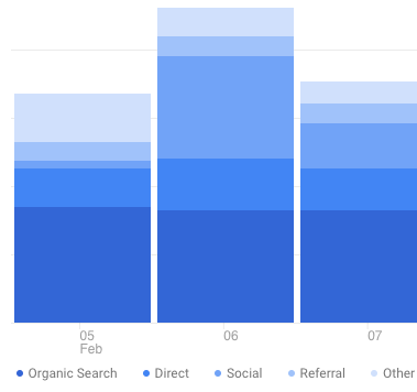
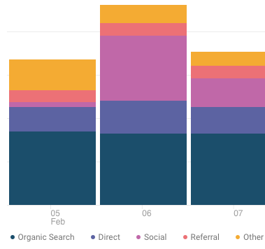
For instance, Google Analytics does a terrible job with this:

It’s better to use use a range of hues so users can cross-reference with the key easier. It’s far simpler for our brains to distinguish, say, yellow from orange than blue from blue-but-15%-lighter.

This color picker allows you to specify both endpoints of the palette. You can choose at least one to be a brand color, which gives you significant flexibility in creating a palette that will work for your visualizations, yet be customized for your brand.
Here are a few tips for getting the best palette:
- Try picking very different endpoint colors – e.g. one warm, one cool; one bright, one darker – so that your palette covers a wider range
- If you’re using a brand color for one endpoint, don’t be afraid to modify the saturation and brightness a bit if it creates a more pleasing palette. Users will recognize your brand color by its hue much far more than by it’s exact saturation/brightness.
- For data visualizations where you’re showing the strength of a single value, try using the Single Hue Palette Generator instead.
Oh, and...
More on Color
If you're new to color in UI design, I highly recommend the following resources:
- The HSB Color System: A Practitioner's Primer
- Color in UI Design: A Practical Framework
- Gradient Generator tool, by yours truly, built to be the most fully-featured on the web 😎
- Design Hacks, my email newsletter where I send original design tips and tactics to 60,000+ of my closest friends.
Anyhow, I've created this to be the tool I wish I had for creating data visualization palettes. Is there another feature you'd like to see in it? Let me know.
Single Hue Scale
Number of Colors
Modify Color Scale
Brightness
Color Intensity
Background Color
In Context
How to Use
The Single Hue Scale generator is most useful for visualizations where you’re showing the value of a single variable. Typically, the darker variation will represent a higher value, and a neutral color (even white) will represent a value closer to zero.
In a pie chart or bar chart, size is used to distinguish higher values. But in some visualizations, the size is set and you need to rely on color. Two examples of this are show in the “In Context” section above:
- A map in which size represents county size; we need to use color to distinguish the value for each county
- A week-by-week calendar in which each day is an equally sized box; we need to use color to show the value for a particular day
Here are a few tips for getting the best single hue scale:
- To transition to a flat gray endpoint, set “Color Intensity” to zero
- To transition to a white endpoint, set “Brightness” to full and “Color Intensity” to zero
- If your color scale actually shows a variable that transitions from one end to a neutral midpoint to another end, try the Divergent Scale Generator (e.g. Republican to moderate to Democrat; hotter to same-temperature to cooler)
Divergent Color Scale
Number of Colors
Modify Midpoint Color
Brightness
Color Intensity
Background Color
In Context
How to Use
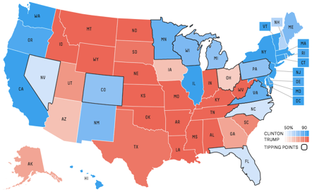
The Divergent Color Scale generator is most useful for visualizations where you’re showing a transition from (a) one extreme, through a (b) neutral middle, and finally to a (c) opposite extreme.
Perhaps the most common example of this is the “how Democrat/Republican is each state in the US” chart.

By default, the neutral midpoint is a light gray. You can change it with the "Modify Midpoint Color" sliders to be slightly darker or more colorful. For the best results, set the Color Intensity to the minimum when the two endpoint hues are significantly different – otherwise, the moderate tones will start to blend together (this will be evident in the map).
As with the other visualization styles, this will pick colors that are visually equidistant. However, if one of the two endpoint colors is significantly darker or saturated, the swatches on that side will have more color-space between them.


