3 Pro Tips on Alignment
Little-known truth of UI design: if your designs look sloppy/cluttered at all, you’re probably not aligning the elements enough.
(If you sign up for my mailing list, you’ll get an email all about this fact)
Today I want to look at a few examples where “just align it” doesn’t seem to be doing the trick. You know – the sorts of times where, if you have already tried aligning your elements and they still look messy, these tips may jus help you out.
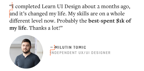
Take a look at technically-true-but-totally-self-indulgent-of-me-to-use testimonial. Technically, everything in it is aligned. Nice typography, high-quality image. Yet it still looks… mediocre. What’s up here?
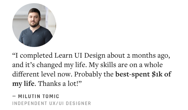
Let’s say we want to make this look absolutely crisp and clean. What’s the worst offender?
I think it’s the headshot. It’s kind of awkward being all the way on one side, with TONS of blank space to its right.
But what do we do – center it?
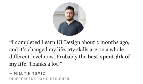
Noooope. Now it looks funny with the left-aligned byline below.
Maybe right-align? But think – if we do that, we should really put it below, where there’s space to the right of the bylines.
I’ve thrown in the ruler lines so you can see it: the image is aligned top and right with other text. Is it dawning on you?
ALIGNMENT TIP 1: Left-aligned text only aligns weakly on its right side (and vice versa).
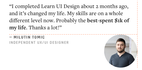
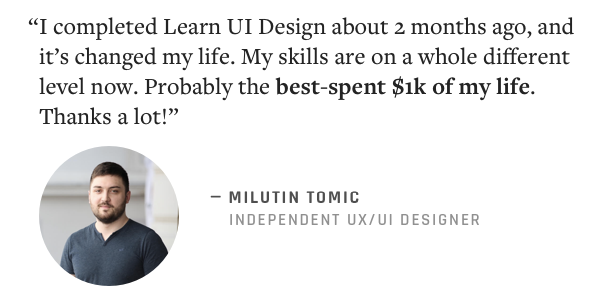
This hardly looks aligned at all. With left-aligned text having variably-sized gaps on the right ends of the lines, no wonder! If we want to buy ourselves more alignment, we need to think of a new scheme.
Weird wording, but useful paradigm. I want you to think of alignment this way: you only have so many elements on the page. You want to MAXIMIZE the FEEL of CLEANNESS between them. Different techniques of alignment BUY you different amounts of CLEANNESS on your page.
In this case, the left-aligned text and right-aligned image, while technically sharing a right boundary, don’t buy you much cleanness.
Let’s switch them up.
Way better! And I did one other thing too. Did you notice?
ALIGNMENT TIP 2: Centering is a valid form of alignment.
I vertically centered the headshot with the byline.
Even though I cover this tip in the Learn UI Design lesson on Alignment, students still miss this in the homework all the time. Centering two items is still aligning them.
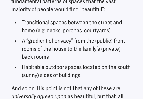
Moving on. The next thing I want to do is a bit more subtle. Look for two dotted orange lines I’ve added in here.
Now I’m not just an anti-punctuation bigot. There’s a good reason I drew a dividing line between normal letters and the preceding punctuation. Punctuation is, in general, smaller “markup” on the content of the text, rather than text itself. Meta-content, more than content. It doesn’t fit in the same way – logically or visually.
So if we want to buy as much cleanness as possible, maybe we should draw our line of alignment ignoring the punctuation?
Yes. We should. There’s a word for this even: hanging punctuation. And it’s literally been done since the dawn of the printed word.
ALIGNMENT TIP 3: Use hanging alignment for details that don’t have the same weight as text.
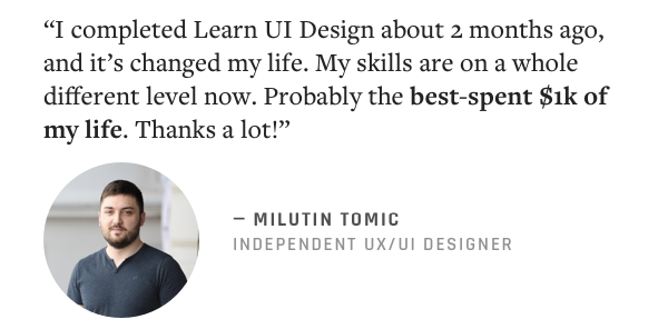
And even though I wrote this tip about punctuation, it also applies to icons…
…and bullet points…
… and little half-icon-half-character supporting shapes…
…and all kinds of other things. Now that I’ve shown you this, you’ll see it everywhere. For instance, do you see it on the finalized design here? (And why in one place there, but not another? Hmmmm 🤔)
But this is just the beginning. There’s even more to alignment that we haven’t covered here:
- How do you align odd or awkward shaped icons?
- Do you center sentence-case text different than uppercase text?
- Do you align headlines and body text the same way?
- How do you align something that has an outer border and inner content? (e.g. a button, table, card, etc.)
- The 2 critical concepts that answer ALL of these questions
That’s covered in Learn UI Design. Hop on Design Hacks if you want to be alerted when the course re-opens.
Loved this email!!! This deserves to be in a ‘how-to content’ hall of fame!
Steven Young
Fractional CMO
This is the first time in my life that I truly, completely, incomparably appreciated a newsletter… I (platonically) love you! Seriously, you have the best content ever.
Marika
Designer, Head of Branding/Graphics
Design Hacks
Over 60,000 subscribed. No spam. Unsubscribe anytime.