5 Practical Exercises to Learn UI Design (For Free)
Trying to get a design education from design articles is like trying to eat a meal of crumbs.
There are tons of design articles and tweets and tutorials out there. But most are pretty short. A bit about one topic, and that’s it 👋
On the other hand, you can go all-in. I teach a 36-hour video course on UI design (called Learn UI Design, appropriately enough), but it’s not free, and it’s not always open.
So: how do you start learning UI design FOR FREE and RIGHT NOW? Where do you look?
Easy. You look here. At this article 👋
This article is the post I wish I had when I first started learning interface design. It’s primarily a list of exercises to build your design skills. But first, I want to impress upon you one unavoidable fact about learning design:
You need to create. Let’s talk about that.
90% Production, 10% Consumption
A few years ago, made the dubious decision to build a floor-to-ceiling climbing wall in my garage. I would say “Don’t tell my homeowner’s association!”, but the thing is so over-engineered it probably makes my house more sturdy. I’m pretty sure a silverback could climb on it, no problem.
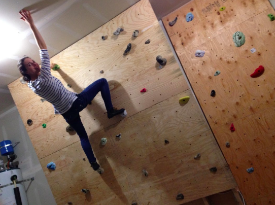
Anyhow, while building this monstrosity, I noticed I had a bad habit. Every time I drilled in a screw, I would step back and admire my work, taking a minute to dream about how cool it would be when done, wonder how many more hours I should work tonight, etc.
Now “Measure twice, cut once” is good, but this was absurd. Why was I thinking 5x more than I was working?
Uh, obvious? Because work is hard, and it’s easier to sit there and dream.
If you’re going to learn UI design, you have to be wary of this trap. It’s 10x easier to read random design articles than it is to actually design. But the latter is far more important to your skills.
Let me put it this way. For every minute you spend reading design articles, spend 10 minutes actually designing.
Does that seem absurd? It’s not. What’s absurd is the idea that you can get better by passively browsing whatever happens to be the most recently tweeted article by your tech friends.
So rather than recommend a bunch of other articles, I’m going to recommend exercises. These will be things that you do to get better at design.
Specifically, here are the top 5 exercises you should do to learn UI design:
- Analyze designs (to build your gut instinct)
- Perform copywork (to learn techniques and tricks)
- Create a fonts database (to make font-picking faster over time)
- Create style tiles (to practice creating a brand)
- Create personal project mockups (to put it all together in a low-stakes environment)
Let’s dive in 😎
Exercise 1: Analyze design (to build your gut instinct)
The problem
One of the most common worries I hear from beginning designers is they don’t have a strong gut instinct for design. That’s to be expected!
No joke – this my first-ever professional design. Spoiler alert: it sucks! 🙈
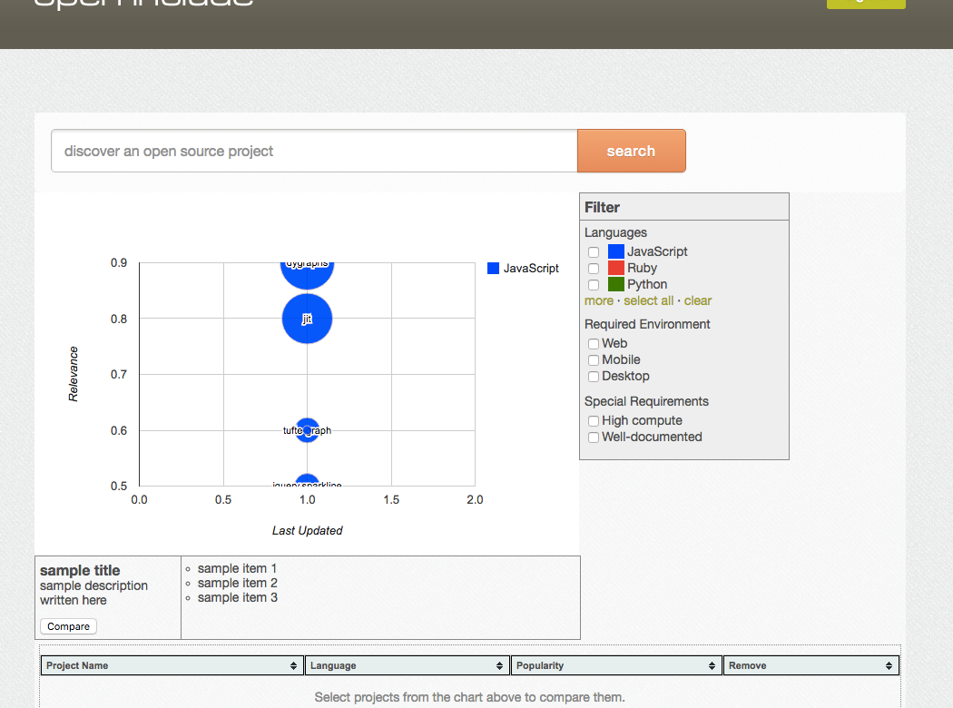
- I struggled to think of a good button color
- As far as layout, I was totally lost
- In terms of fonts, I just stuck with the browser default
- I didn’t have a sense of what colors to use for the data visualization
Years later, as part of Learn UI Design, I recreated this design. It’s much better, and it only took 20 minutes (rather than the hours the original took).
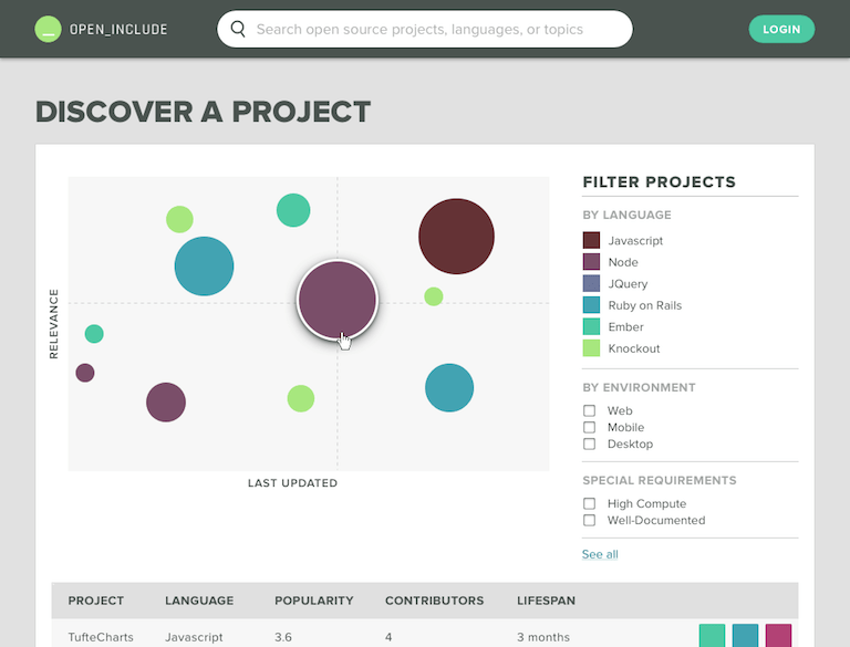
I immediately had a sense of:
- What font to use (Proxima Nova, a font so good it’s almost cheating!)
- What colors to use (visually-equidistant colors created with my Data Viz Color Picker tool)
- How to lay out the page (Just Align Everything, the first lesson I teach on the Design Hacks newsletter)
That’s what gut instinct is: nothing more than your unconscious mind having a good map of the territory.
To build that map though, you need to explore. And we do this by analyzing designs.
The solution
To build your design gut instinct, analyze what works in UI design – and what doesn’t.
For this exercise, you should list apps/sites that have great UI (and those that have really bad UI) and you should articulate, as clearly as you can, why and what you like (or dislike) about them.
You may say “Hey, I don’t have a lot of opinions on what looks nice or awful – I can’t even tell!”, but don’t allow yourself that excuse. Surely you can find something you know looks well-designed 🙂
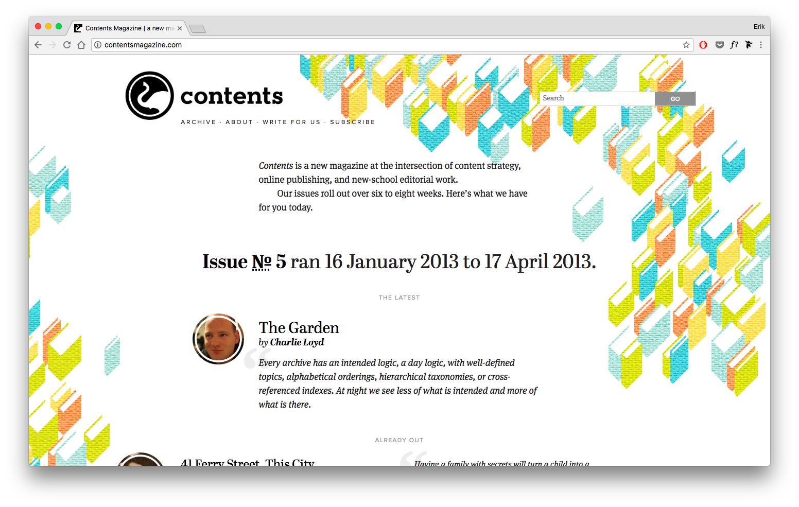
For instance, I like this old above-the-fold design for Abstract.
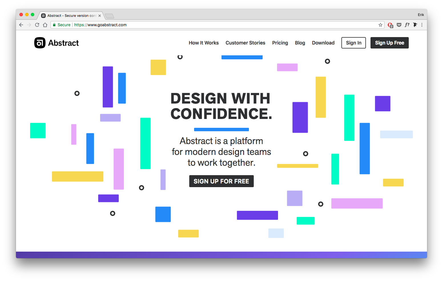
Why? Let me try to articulate it:
- Pastel color palette is fun and relaxed
- Random scattering of rounded rectangles feels playful
- Akzidenz Grotesque, an older grotesque font, feels quirky and “imperfect”, yet clean and straightforward
- Logo, name, and scattering of shapes all back up the “abstract” brand
(If you do this, you may have your own, different reasons – totally fine!)
Here’s the cool thing: every item you articulate can be generalized into a design rule/technique 🤯.
1/ Pastel color schemes are more relaxed than darker/more saturated schemes:
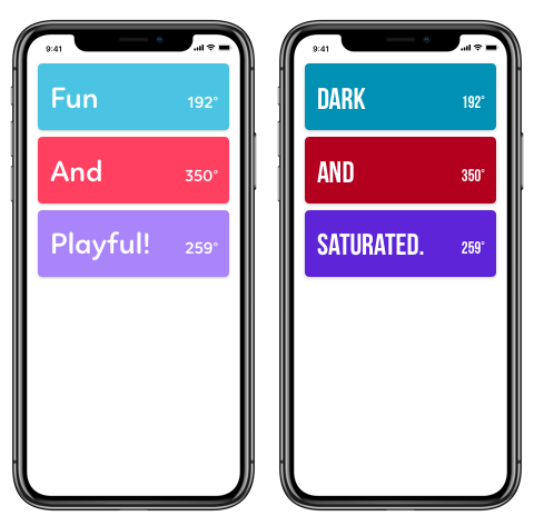
2/ Add playfulness with randomness and “grid-breaking” in your layout:
3/ Fonts that feel “imperfect” (like monospace ones, which are overdefined by their character width requirements) can feel slightly disheveled, almost quirky.
Etc! So: everything you can point out about why a design is great is really a design technique you can keep forever 😎
Weekly exercise 1
List 5 sites or apps with good UI design, and 1-2 with bad design. For each, articulate in your own words why you believe it works or doesn’t work.
Exercise 2: Copywork (to learn techniques and tricks)
Copywork is an incredible exercise for improving your design skills, yet hardly any designers actually do it. I’m going to give an overview of it here, but for a full treatment (with more examples), check out my article on copywork.
In short, copywork is simply recreating an excellent existing design pixel-for-pixel in your design program of choice.
Here’s the original (left) and my copy (right) of Dann Petty’s excellent Epicurrence Oahu site.
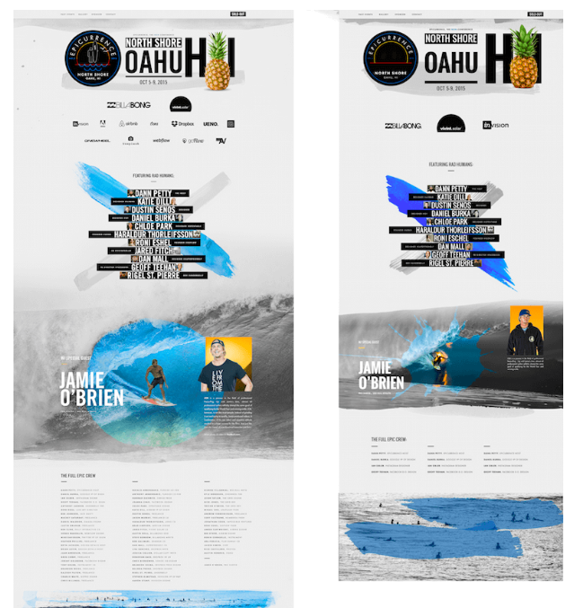
Copying this piece gave me a bunch of new ideas I could take to my own work. For instance, here are things I noticed in the header alone:
- Insanely large font size. My copy of the original included the Hawaii initials “HI” in size 365 font. Never in my years of professional work had I even considered making text that big. Yet he uses it as a visual element, aligning it with the other header elements, even putting an image between the letters. Very cool.
- Paint stroke as “shadow”. A watercolor smudge runs across the bottom of the seal, the header and the pineapple. It’s in the spot where a shadow might be, as if the shadow were painted on the page. Whoa — that’s not the usual way of doing it!
- Uppercase type with generous letter-spacing. No doubt, that uppercase text adds a strong element of alignment, and pumping up the letter-spacing is a textbook way to add some classiness to type, but I find myself getting self-conscious about doing it much. It was cool to see that all of the text here is capitalized, and basically all of it has modified letter-spacing, too.
And that’s the gist of copywork: when you recreate a design, pixel for pixel, you’re forced to remake every decision the original designer made. Which font? How big? How are things laid out? Which images and background and decorations? You immerse yourself in the small design decisions made by awesome designers. As you re-create those decisions, you start to notice the original making decisions you wouldn’t have made, and using techniques or tricks you wouldn’t have picked up on just looking at the design.
Those tricks and techniques you can take away with you for the rest of your design career.
Now, to me, there’s an art to figuring out what to copy. You can pick very specific pieces to copywork off of based on what they do well or what you lack. For instance, if you want to improve your use of color, copy something with some crazy gradients or a bold palette. If you want to get better at luxury branding, copy a preeminent website with a ritzy look and feel.
For more on copywork, read my full writeup on copywork. It goes over other questions, like:
- Where to look for good pieces to copy
- If you have to copy the original perfectly
- How to not plagiarize off the stuff you perform copywork on
And so on.
Weekly Exercise 2
Copy the UI of a good site/app pixel-for-pixel. At the end, write down specific techniques the creator used that “expand your design vocabulary”.
(Note: this could also be done as a 30-minute daily exercise rather than done all at one time)
Exercise 3: Start a Fonts Database
The problem
If you’re serious about learning user interface design, you’re going to need to be on friendly terms with fonts. There’s just no way around it. Some say “web design is 90% typography”, and maybe that’s a huge exaggeration, but it doesn’t change the fact that typography is a critical skill to interface design.
But “typography” is also a rabbit-hole. There are thousands of fonts out there, and so many lists of good fonts drift into the obscure and innapplicable.
The key here is: when you find a great font, write it down (maybe take a screenshot of it in action?), and never let it go.
The Solution
Over time, this list of good fonts will become your own personal database. Everytime you need a good font, you’ll immediately have the best ideas of your past-self at your fingertips.
Here’s my Good Fonts Table, a Figma resource I use all the time (as well as give to all students of Learn UI Design)
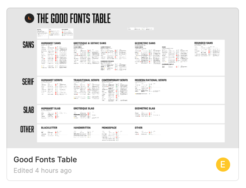
At this point, it has over 100 fonts, with text samples, usage notes, features (yes, fonts have features), links, and more.
For your own font databse, consider including the following for each font (but do whatever works best for you ✌️):
- Font name
- Where you saw it used
- Usages it would be good for – body font, title font, certain types of brands, etc.
- A screenshot of it (particularly if you can’t download it)
- Price
Two logistical notes.
First, you’ll 100% want a font-identifying browser extension. I use WhatFont.
Second, to jump-start your list of good fonts, I recommend my ebook “The Top 10 Free Fonts for UI Design”:
The Top 10 for UI Design
Get a PDF of the 10 best free fonts for web/mobile app design (including which free fonts not to use).
Practical design tutorials. Over 60,000 subscribed. One-click unsubscribe.
Weekly Exercise 3
Record any fonts you particularly like, noting characteristics like when they seem to work well and where you’ve seen them. Include screenshots.
Exercise 4: Style Tiles (to practice creating a brand)
The problem
Now you’ve started compiling great fonts. You’ve got a running list of design ideas. And yet, if you launch into a full site/app redesign, it might still feel overwhelming and go off the rails.
There’s a in-between step, and it’s one that I do in almost every client project I work on: style tiles.
The solution
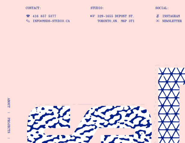
Style tiles are small “doodles” that combine ALL the elements of a brand – typography, color, imagery, form controls, etc. They aren’t the finished product, but they give you a feel for what it will be like.
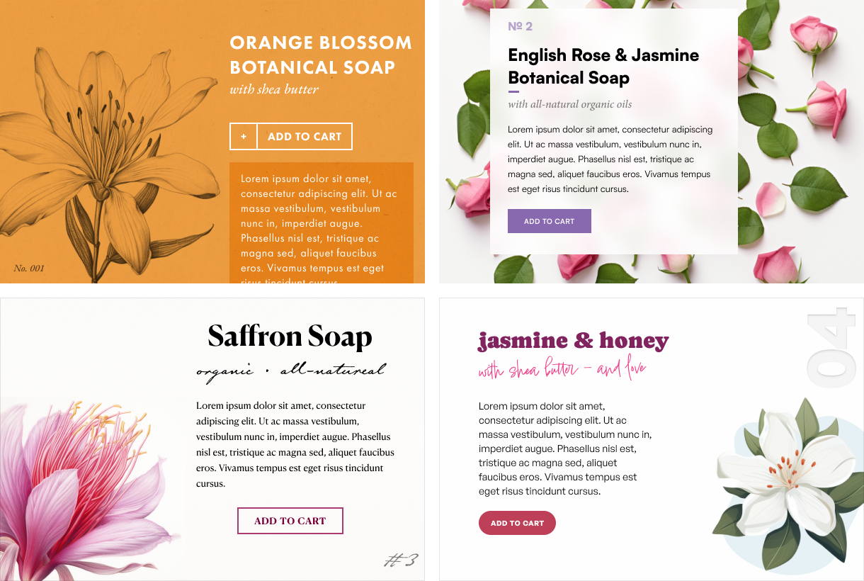
Each of these designs feels handcrafted and modern, yet slightly elegant. Yet each design achieves this feel in a slightly different way.
- The first design combines punchy modern typography with classic botanical illustrations
- The second design combines neutral type with a tasteful, delicate background image
- The third design combines classy typography with a vivid watercolor
- The fourth design combines handcrafted & modern type with a friendly digital illustration
Creating style tiles – even just one – gives you a sense of how to achieve a brand using color, type, imagery, and UI elements.
(For more on this, check out my 42-minute free lesson from Learn UI Design all about brand 😎)
And don’t think you need to create 4 style tiles for every idea. Sometimes I’ll just do one, and the client will approve it straightaway. Totally fine 😅
Notice how this isn’t even, like, a page? It’s just some random elements thrown together.
And that’s great. Part of what makes style tiles useful is that they’re quick to make. Because the faster you can cycle between (A) thinking of an idea, (B) implementing it, and (C) evaluating it, the faster you will learn.
Weekly exercise 4
Create 2-3 style tiles for site/app concepts you have. Include in each:
- Text (labels, headers, body text, whatever! – but include a realistic font choice)
- Color(s)
- Imagery (photos, icons, illustration, etc.)
- Logo (optional)
Exercise 5: Personal Project Mockups (to put it all together in a low-stakes environment)
The fifth and final UI exercise I recommend is to actually work on personal design projects.
This means:
- You’re NOT being paid for them (at least not by a client or employer)
- You – and you alone – have complete creative control
And the project could take on any number of formats:
- You design an app you wish existed, but currently does not
- You redesign an existing app or website that you think you could improve upon
- You design a site for a non-profit or other good cause, and potentially send it to them at the end
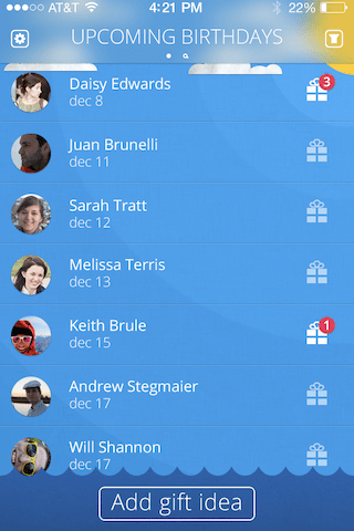
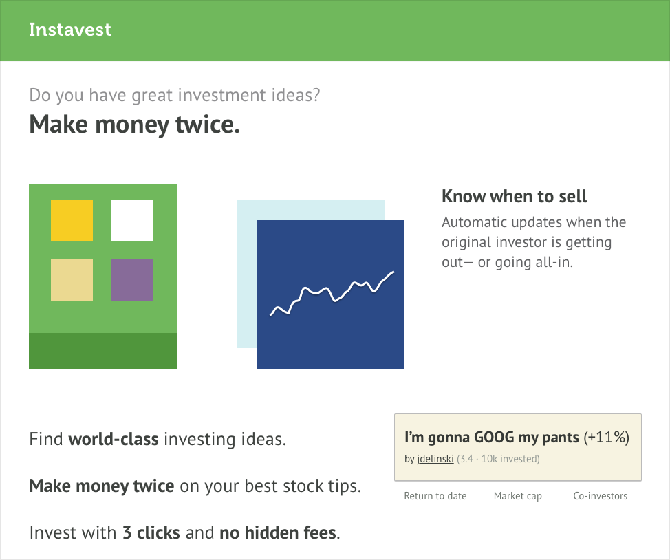
Here’s a screen for a personal project I did to build my UI skills early in my career. There’s plenty I’d change now, yet it was a totally successful project – it furthered my skills, and got some attention in my portfolio 🙂
What should you turn into a full mockup? Start by picking a style tile that’s going well. From there, it might become:
- A personal learning project. Something you do for your own skill-development, but never even necessarily show to anyone else. Design the major screens, but enjoy that you don’t have to fret about every designing single little edge case of the app (”what if the user hasn’t logged in from this device yet, so we a code to their email, but it’s only valid for 30 minutes, but they take too long, and…”)
- A portfolio project. As I recommend for all beginning designer portfolios, creating I-wish-it-existed apps is a great way to show off your skills before you’ve gotten any paid work.
- A real app/site. If you or a partner can implement the design, all the better! You can get real user feedback, and show real results in a portfolio writeup (not showing results is one of the top 4 portfolio mistakes 😬). But beware – you‘re now doing real design work, and there‘s a lot of little states and edge cases to specify. That’s life!
Creating some realistic screens for personal projects will tie together everything you’ve done so far – the design details you’ve noticed and recorded, the lessons you’ve gained from copying the pros, the fonts you’ve collected, and the styles you’ve put together.
Weekly exercise 5
Drawing from the style tiles you’ve created in Exercise 4, design 1-3 screens of an app/website that you’re most interested in working on.
Getting Started Now
Alright, this post is going on 3,000 words, so I’d better wrap it up. If you want to start your journey to learn UI design today, here are the resources that will help you get started today:
- A design app. If you get serious about design, you’ll have to pay for a design app. Most likely, it’ll be:
- My copywork bucket on dribbble. This is where I store dribbble shots of the things I’ve either done copywork on or want to. If you’re not sure where to start with copywork, start here 🙂
- WhatFont. The awesome font-identifying plugin. Also available for Firefox (thanks to Learn UI Design student Zack Michener).
- The complete guide to identifying fonts. This will come in handy when WhatFont isn’t cutting it.
And here is the weekly program of exercises. This pace assumes you can’t devote more than an hour or two per day learning UI design. If you’re available full-time, you should start feeling more confident in your design skills within a day. If you can only eke out an hour here or there, no problem, go at a pace you can maintain – AND MAINTAIN IT.
- List 5 sites or apps with good UI design, and 1-2 with bad design. For each, articulate in your own words why you believe it works or doesn’t work.
- Copy the UI of a good site/app pixel-for-pixel. At the end, write down specific techniques the creator used that “expand your design vocabulary”.
- Record any fonts you particularly like, noting characteristics like when they seem to work well and where you’ve seen them.
- Create 2-3 style tiles for fonts in your database that you particularly want to experiment with. Think of a concept for a site, then design out a style tile featuring:
- Realistic font choices and text elements (e.g. headers, navigational elements, body text)
- Appropriate color palette
- Example imagery
- UI components (buttons, text inputs, dropdowns, navs, etc)
- Logo (optional)
- Design 1-3 screens of an app/website that you’re most interested in working on.
An offer for you
I’d also like to make an offer to you. From the beginning of this article, I’ve said that I want you to spend 90% of the time designing and only 10% of the time reading about design. I realize that is hard, and that the vast majority of people on this page will close the tab, no thanks, time to read another article.
So if you’re one of the few to take me up on these exercises, you start your weekly regimen of learning UI design, and you find yourself needing help, tweet me your question. If I see you’re putting in the work to do these exercises, I will answer your question, full-stop, 100%.
One thing: why twitter? Because it’s public. If our discussion can benefit others, I’d love for others to see it.
But go on and get started. You’ve already read for what, 15 minutes? That’s already couple hours of work before you can go on reading this stuff. What will you choose? – analysis, copywork, finding fonts?
It’s time to start honing your craft. You got this 💪
Watch me do a UI project step-by-step
I’ll walk you through every part of a UI project — just like I’ve done for everyone from Fortune 100 companies to Y-Combinator startups.
Practical design tutorials. Over 60,000 subscribed. One-click unsubscribe.