37 Easy Ways to Spice Up Your UI Designs
Ever been working on a design that feels too plain? Let’s look at a few dozen simple ways to spice things up. Get ready to bookmark this page, because you’ll want to reference this list in the future. It’s unbelievable how many incredible pro-level designs feature solid foundations plus a few techniques listed below.
Note: this guest post is by Anthony Hobday, a London-based product designer and brilliant analyst of design. Follow him on twitter.
Background Techniques
- Angled Background Transition
- Curved Background Transition
- Tilted Highlight Shape
- Background Highlight Shape
- Icon Highlight Shape
- Subtle Pattern as Background
- Subtle Lines as Background
- XL text in Background
Borders & Dividers Techniques
- Dotted Border
- Dotted Divider
- Double Border
- Gradient Border
- Bevelled Border
- Hand-Drawn Border
- Patterned Border
- Thick Transparent Border
- Fading Borders
Shadow Techniques
Text Techniques
- Layered Text
- Inline Imagery
- Interesting Bullet Points
- Thick Underlines
- Font-Change as Highlight
- Width Changes
Other Techniques
- Dot Grid
- Break the Frame
- Hand-Drawn Elements
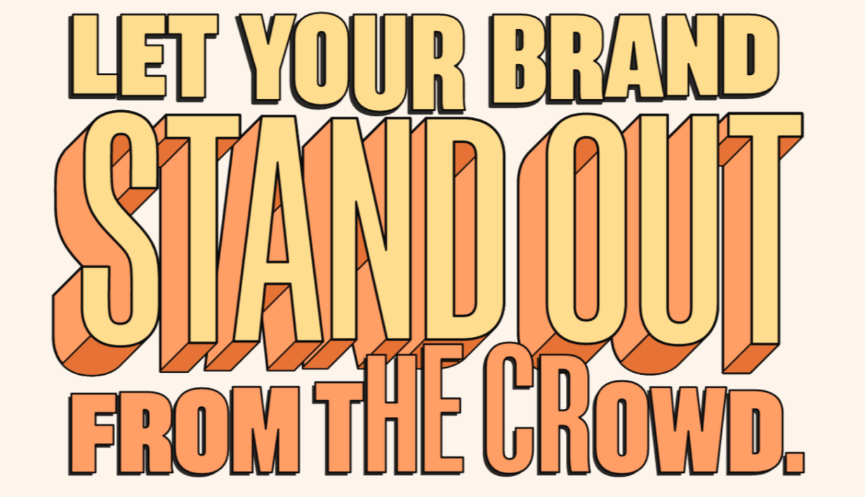
- Enter the Third Dimension
- Offset Background or Border
- Pocket Cut-Off
- Repeated Shape
- Uneven Shape Container
- Tilted Element
- Visible Grid
Spicing up Backgrounds
Every design has a background. Let’s start with some ways of making them a bit more exciting.
Angled Background Transition
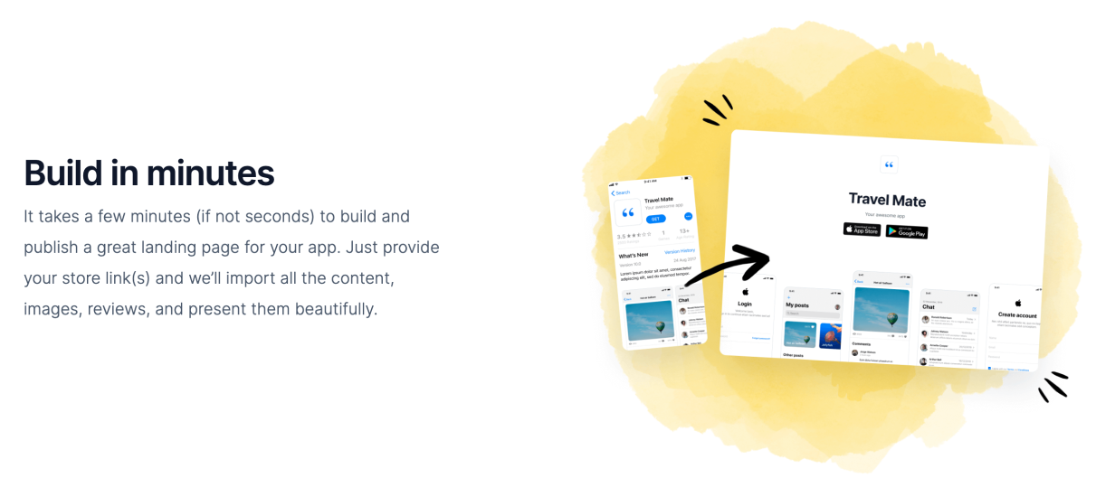
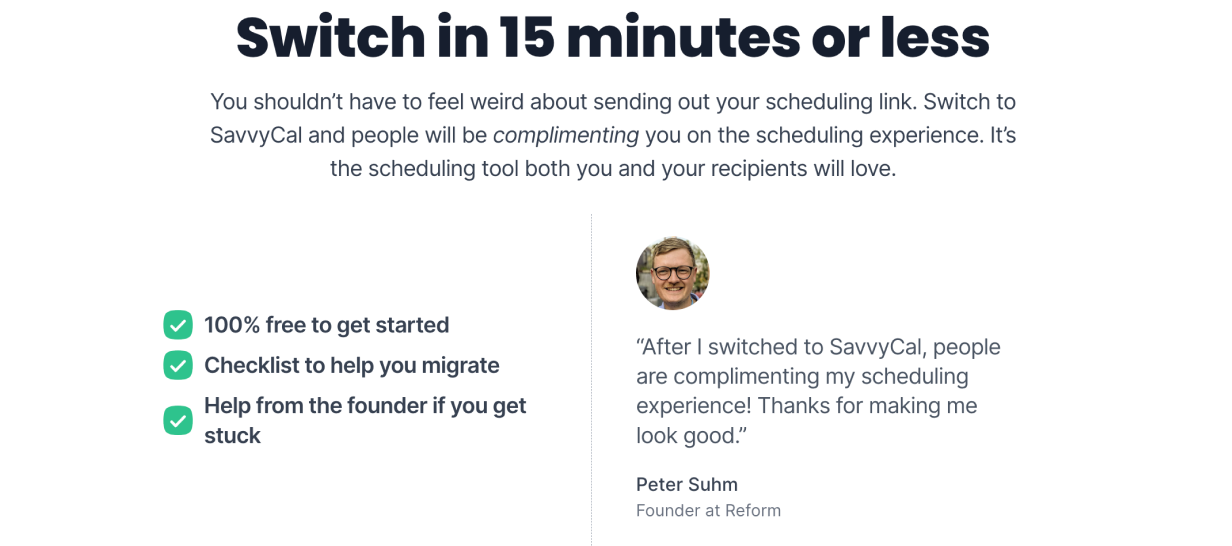
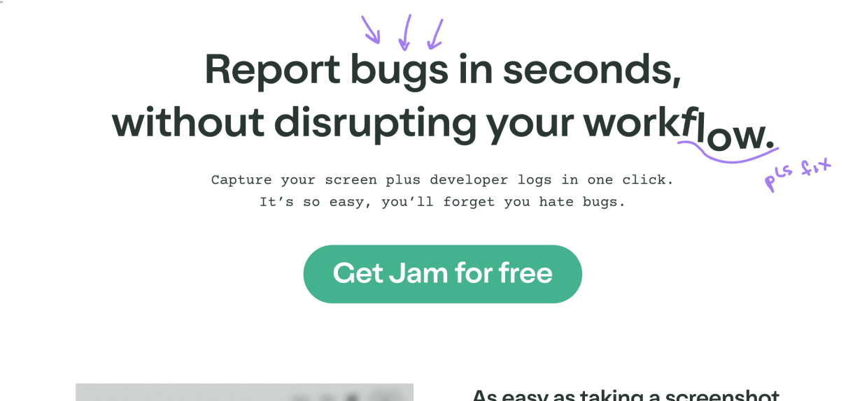
Instead of using a “boxy” horizontal background transition, try an angled background transition to add a bit of extra life.
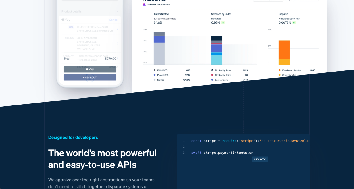
(Note this one also cuts off the product image – a Pocket Cut-Off – adding further interest)
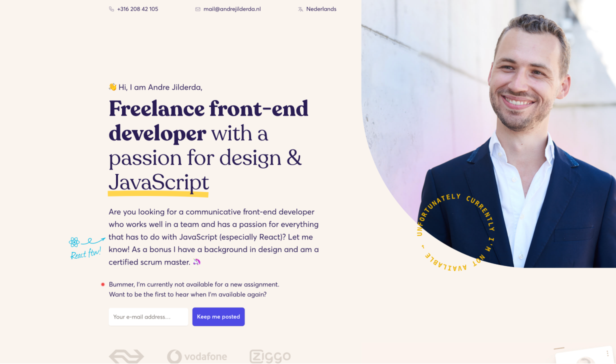
Curved Background Transition
If the style of your website works well with soft shapes, this is another way to skip the ordinary flat background transition.
In this example the title sits across the background transition, which further adds interest.
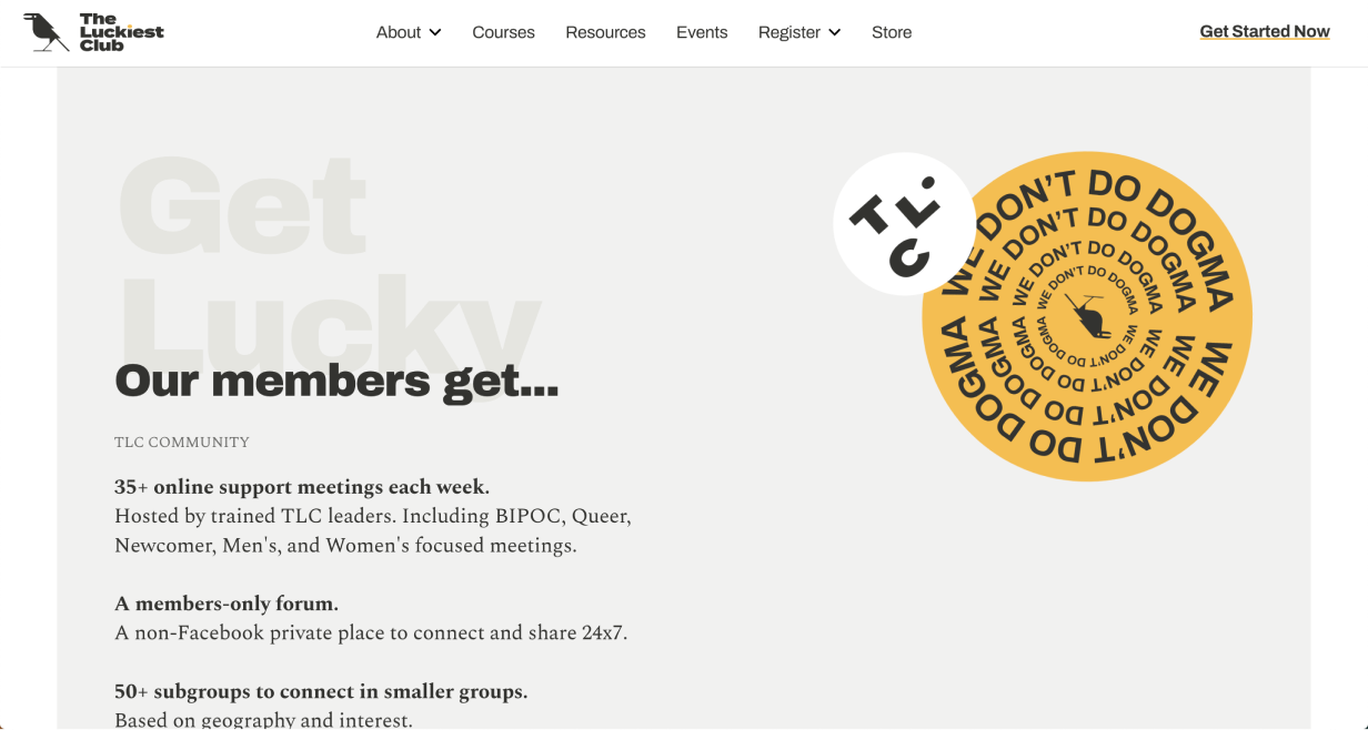
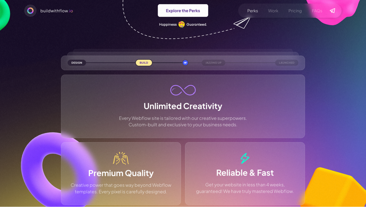
Tilted Highlight Shape
It’s not difficult to add a shape behind an element and tilt it slightly. But especially if it’s colourful, it adds a lot of character to what could otherwise be an ordinary layout.
This example uses a gradient fill for the background shape, which helps add even more visual flair.
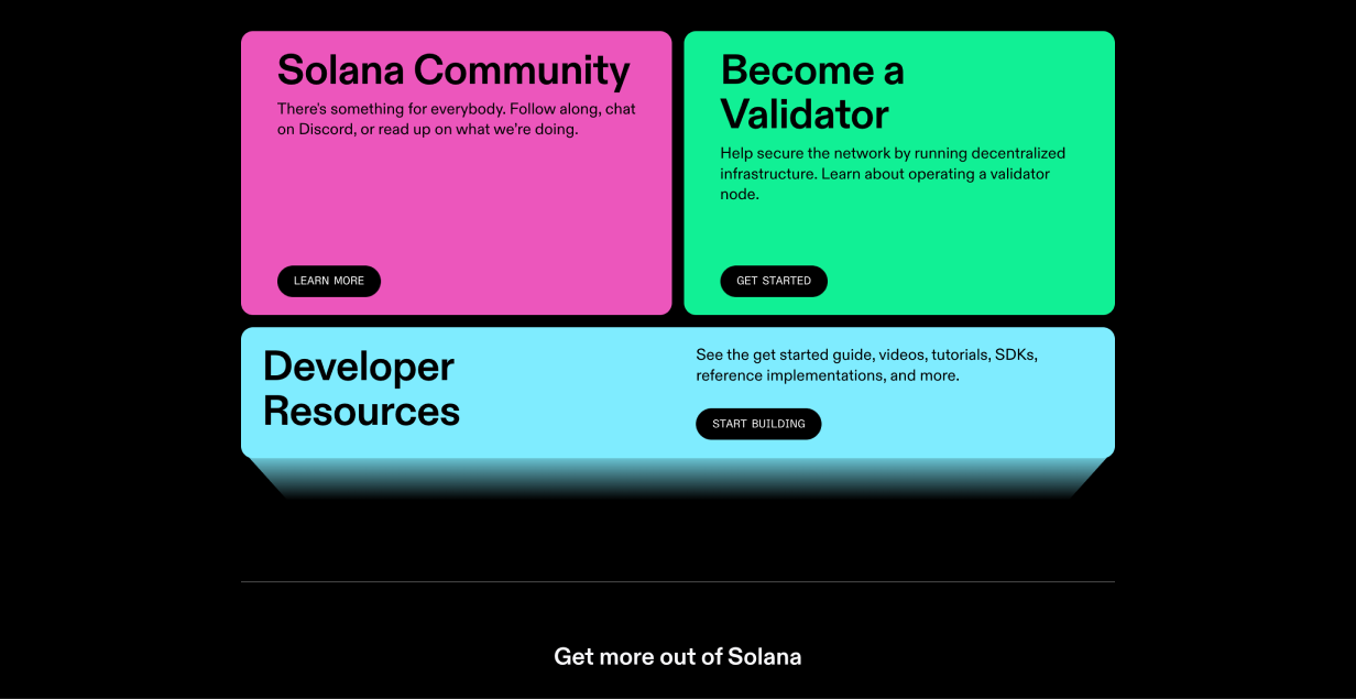
Background Highlight Shape
Sometimes you have a container that blends into the background and you don’t want to put a border around it. Try adding a shape behind the container so that it stands out more.
You could go geometric (above) or textured (below).
Play around, but make sure to find something that matches your brand or motif.
Icon Highlight Shape
Coloured shapes behind icons can reinforce brand colours, reinforce the meaning of the icon, add a bit of variety to an otherwise ordinary grid, and more.
These simple splashes of color add a ton to this design.
Subtle Pattern as Background
To make container backgrounds more interesting (without distracting from the content), try adding a subtle pattern.
Ideally, the pattern matches your brand 👍.
Subtle Lines as Background
Using lines – or other vector shapes – as a background are a simple way to add visual interest.
In this example diagonal lines are used, but any pattern could work as long as it’s not so busy that it distracts from the content.
XL text in Background
If you’re tired of hinting at concepts with abstract visuals, why not use words? Large, de-emphasised background text can communicate without distracting.

Or:
Tip: the larger your words, the lighter a style they should use. Size and contrast are a tradeoff 🙂
Spicing up Borders & Dividers
Be careful not to use too many – or too heavy – of borders. But when you have borders, remember: they can be an opportunity to add style to your design and further reinforce your brand.
Dotted Border
A dotted border around something can make it feel visually lighter and more textured.
In this example the dotted border is used well to reinforce the idea that the shape on the left is in the background.
Dotted Divider
A dotted divider doesn’t separate two sections as much as a solid line. This can be useful if you want those sections to feel like they belong together.
Because the contrast in the above example is so low, it adds flair without distracting from the content.
Double Border
To further add emphasis, a double-border can really set content apart from the background.
In this example, the extra white border helps the form really pop against the background. It’s an ever-so-slight skeuomorphism.
Gradient Border
A gradient border, especially if the colours are vibrant, sends a strong message: whatever is inside this border is exciting, important, or both.
This is a good way to reinforce brand colours without using up extra space.
Bevelled Border
This is a subtle one, but a border designed this way looks as if it’s “catching the light” on a couple of points around its border. This is an effect often seen on pieces of metal with a bright edge.
In this example the element uses a coloured gradient on the edges, instead of just white.
Hand-Drawn Border
Not everything on a website or app has to be drawn by computers. Borders that look hand-drawn can add a lot of character to a design, with not much effort.
Patterned Border
Repeating patterns can make good borders for containers. The extra texture draws the eye, and helps highlight whatever content is inside.
In this example the patterned border is only applied to the left edge of the container, but it does a good job to make the content feel important, especially because it uses stripes, which are common visual language for warnings.
Thick Transparent Border
A large border around an element, set to a lower opacity, helps to highlight, structure, and contrast an element with its background. Importantly, it’s visually lighter than an opaque border.
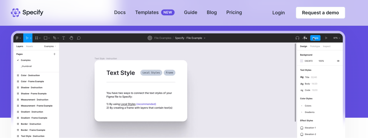
In this example the semi-transparent border around the screenshot uses a background blur, which makes for an interesting effect as it passes over the background colour transition.
Fading Borders
Add a colourful border. Then duplicate it, make it slightly larger, and lower the opacity. Repeat artfully, and you get an interesting fading depth effect.
This example uses the effect well to give the impression of a pulsing light behind a button (with a Dotted Border for good measure).
Spicing Up Shadows
In this section, we won’t be talking about your typical box shadows. Instead, we’ll look at how the concept of a shadow can be played with to add visual interest.
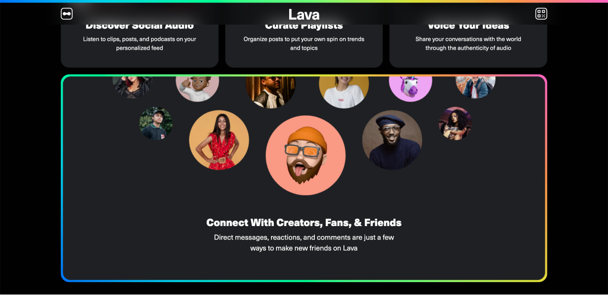
Floating Shadow
Most drop-shadows assume that an element is lying flat on the background of the website. With floating shadows, it is assumed that the website background is a plane stretching towards the horizon, and the element is floating above it, casting a shadow that is below, but separate from the element.
The floating shadows below each author image are paired with a Tilted Highlight.
Solid Shadow
Drop shadows need not be blurred. You can have a “shadow” that is an offset shape of the same size as the container.
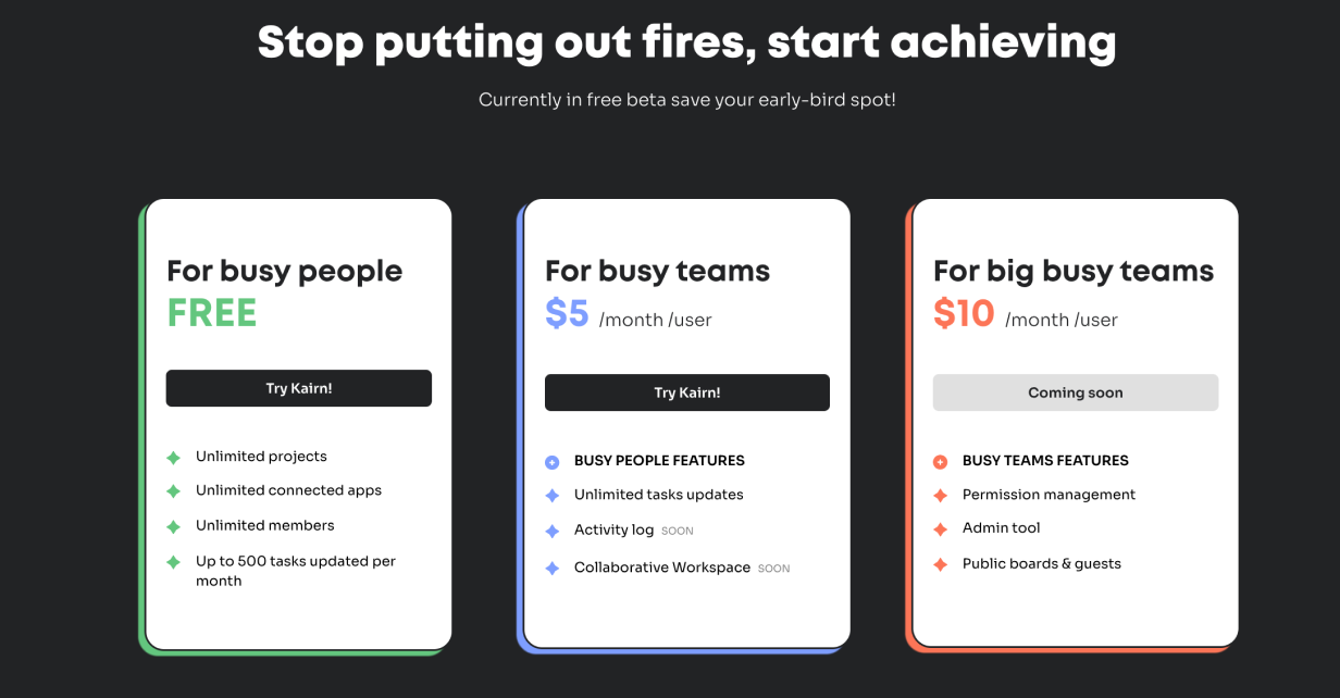
The coloured shapes behind these product tiers help to reinforce their differences, and make the whole section feel more exciting.
Outline Shadow
Similar to the previous technique, you can have an offset outline that functions as a shadow. Look at the “Try Kairn!” button below.
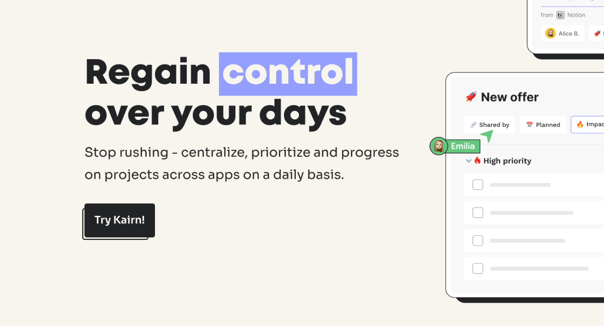
Bonus: the cursor image Breaks the Frame.
Pattern Shadow
Drop shadows can be made of patterns. This is a good way to highlight an element because the texture grabs the eye.
Note that this pattern forms a motif with the space-filling patterned tiles used elsewhere.
Spicing Up Text
It might feel like text has less opportunity to provide visual interest, but there are a number of techniques to add flair with typography.
Layered Text
Interweaving text and imagery is a powerful technique to make the two really feel like they belong together.
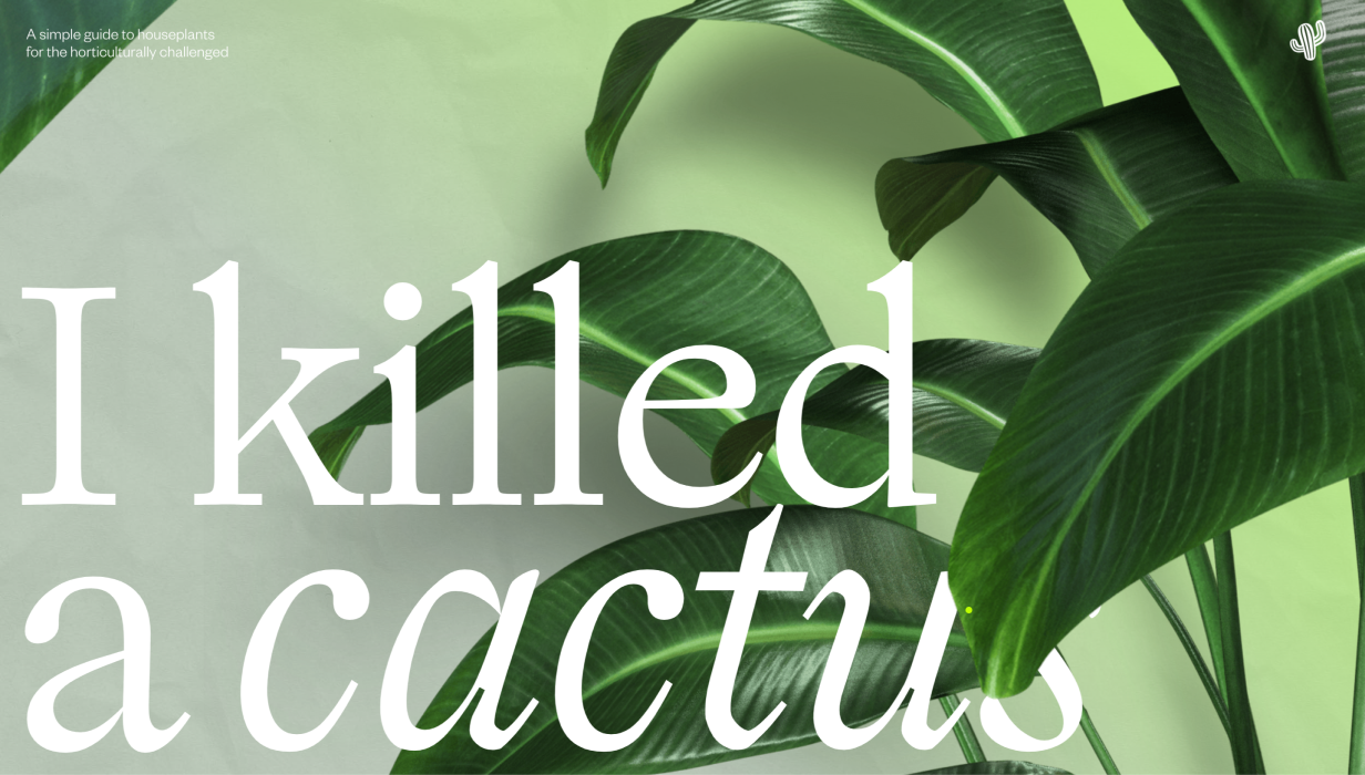
This works best for titles, since the partially obscured text can still be read because of its size.
Inline Imagery
Adding icons, illustrations, or small visual elements in text can be quirky and unique.
Elizabeth Goodspeed has done a fantastic job compiling many such “nouveau rebuses” on twitter, and it’s well worth the look.
Interesting Bullet Points
Bullet points can be a bit boring. Try replacing them with more interesting (on-brand) imagery.
Bonus: bullet points are a great place to use a motif.
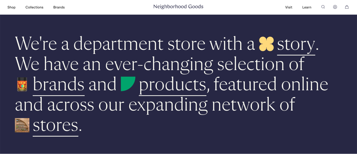
Thick Underlines
Standard underlines on the web are thin, and are often used for links. Thicker underlines like this are an opportunity to use brand colours, and help to highlight certain words more than a standard underline would.
They can be big and bold:
Or subtle and lighter:
Font-Change as Highlight
This method is gaining in popularity in some slightly quirkier sites. It adds emphasis to the switched-out word or phrase.
Here they combined a font-change with italicization, a Hand-Drawn Element, and a Solid Shadow.
Width Changes
You already use bold and italics to emphasize certain text. But have you ever used a more extended or condensed width?
In the above example, the text width of each word is animated for an even more interesting effect. Worth checking out!
Other Techniques
There are a handful of other great ways to add flair to your design. Here’s the rest of them.
Dot Grid
Dot grids have become an easy way to add some visual excitement to a page. They add texture, they’re easy to create, and they can be used to “fill out” a space in the page grid. Because it’s a grid of dots, they’re not too visually heavy, as you’d find with a solid block of colour.
Above, more standard. Below, more stylized:
(Bonus points if you caught the Hand-Drawn Elements and Thick Underlines above)
Break the Frame
Bend the rules of design by having content spill out of its container.
In this example the text on the left is following the rules, and the imagery on the right is getting excited and spilling out of the container. It signals energy and playfulness.
Hand-Drawn Elements
Many websites could benefit from a human touch. Hand-drawn elements are one simple way to add this. They give the impression that someone has taken a pen and drawn on the website.
Note how the hand-drawn examples match the vibe of the product. Debugging is to code as editing is to text.
Enter the Third Dimension
If you want a retro sci-fi look, a fading gradient can be used to give a depth effect to a container.
In this example it almost looks like the blue container is flying towards you, which helps to promote the content.
Offset Background or Border
This is another way to subtly break the rules in interesting ways. An element’s border normally sticks to the edge of the element. But if you offset that border by a little, it can really grab the attention. This is also an interesting way to add depth effects.
Note similarities to Outline Shadow and Thick Underlines.
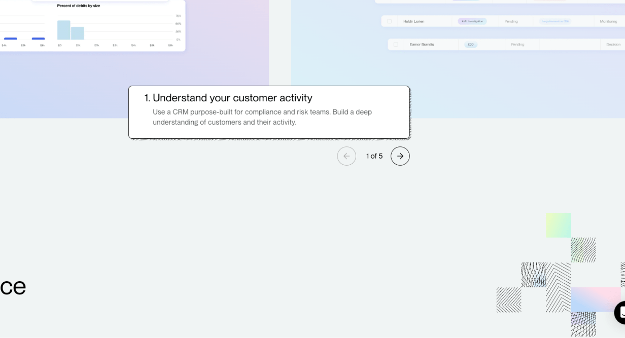
Pocket Cut-Off
Sometimes you don’t need to show the whole image (or you don’t have space). This method of cutting off imagery suggests that the images continue behind the next section of the website.
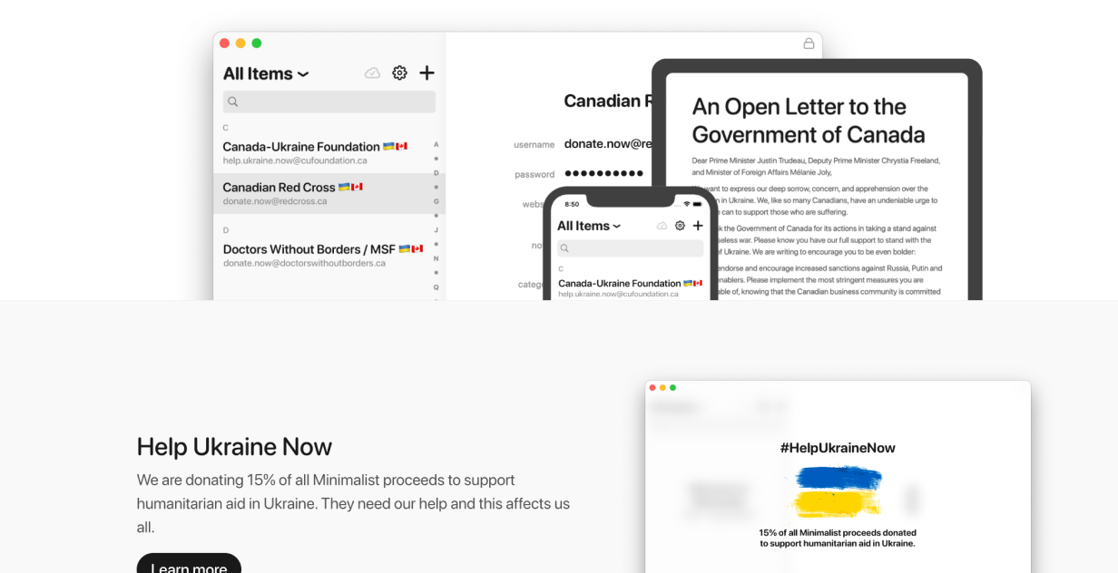
Tip: this can be combined with background techniques.
Repeated Shape
Duplicating a container and making each copy smaller can give an impression of fading into the distance. But, unlike shadows, it keeps everything feeling sharp.
Above, more realistic. Below, more abstract.
Note similarites to Enter the Third Dimension.
Uneven Shape Container
Containers don’t have to be rectangular. That’s what’s easiest in HTML and CSS, but if you break that rule it can help a container stand out a lot.
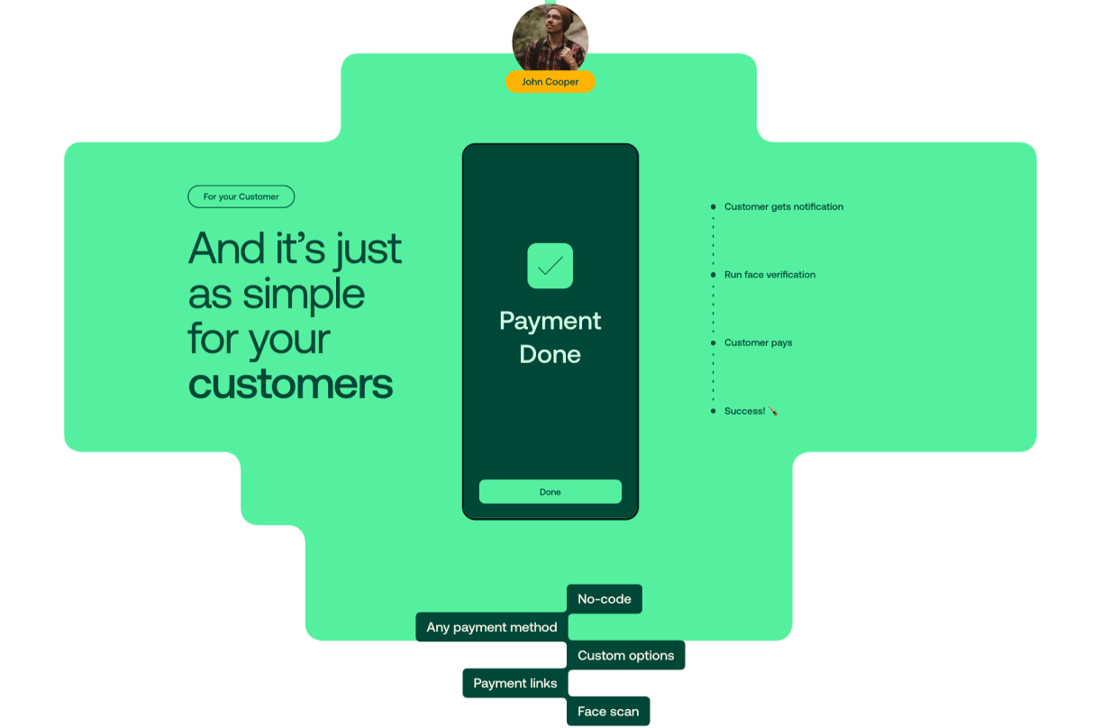
This container is all over the place, but that just grabs the viewer’s attention even more – and matches the 5 features listed at the bottom.
Tilted Element
Clever use of shadows, and potentially even warping the shape of elements, can make them look as if they’re “tilting” in some direction.

In this example the white squares look as if they’re tilting a little to face the top of the website.
Visible Grid
Most websites have a hidden structure that guides the layout. Instead, try making it (subtly) visible.
Simple and satisfying.
That wraps it up. What techniques do you see out there that we missed? Leave a comment below 😎
Watch me do a UI project step-by-step
I’ll walk you through every part of a UI project — just like I’ve done for everyone from Fortune 100 companies to Y-Combinator startups.
Practical design tutorials. Over 60,000 subscribed. One-click unsubscribe.