Free Font Alternatives: The Ultimate Guide
This is not the most popular view among designers, but I’m totally in favor of using free fonts, especially as a beginning designer.
But free fonts get a bad rap. Mention them to many experienced designers, and they’ll complain that free fonts have poor quality, bad kerning, and missing features.
You know what? Those stereotypes are a little out of date. The truth is: you can find extremely high-quality free fonts. But sometimes you need to do a lot of research to find them.
In this guide, I’m going over some of the best free fonts that are similar to or good replacements for some of the most popular pro fonts out there.
Here’s a quick table of contents:
It’s choose-your-own-adventure from here. So click on whatever’s most useful and we’ll get started!
A brief note on free fonts
A guide like this is a bit weird to write, since encouraging the usage of free fonts seems like discouraging the use of paid fonts. However, that is not my intention at all.
As a beginning designer, I wasted a fair share of my own money on paid fonts I lusted after, but rarely or never went on to use. Why? I simply didn’t have the experience to know which fonts would actually be useful in my career, and which were ones that simply looked nice, but I personally would not really need.
It was only after gaining far more experience – mostly with the best free fonts I could find – that I came to appreciate the best in professional fonts, and understood better what was worth paying for. Indeed, with the exception of a few short labels, every font on this page is paid.
So despite this guide’s focus on finding the best free fonts on the web, I encourage you to pay hardworking type designers for their best fonts. It’s not only gratifying, but – selfishly – it keeps the river of innovative and fresh new type flowing.
Alternate Character Styles
Many high-quality free (and paid) fonts live a secret double-life: they include alternate versions of some characters that you can only use if you know how to unlock them.

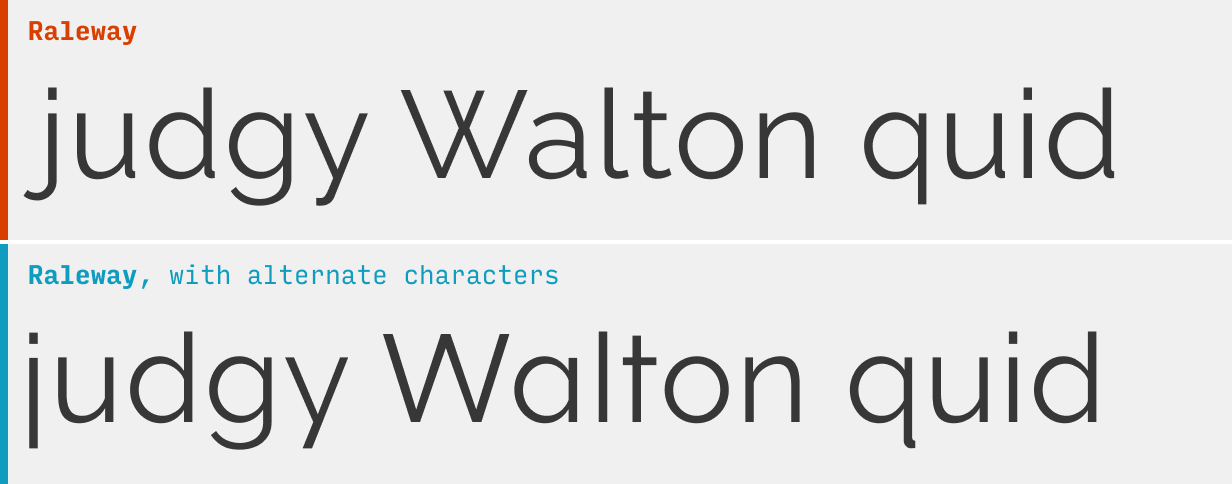
For instance, the above two samples of text are both from the free font Raleway. Yet every other character in them looks different. What gives?
They’re alternate characters, and they can be used to (a) make a popular font a little more unique or (b) give a font a slightly different style.
So: how do you do it? I’m glad you asked.
Using alternate characters styles in Figma
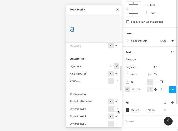
To try alternate characters in Figma, select some text, and click the “…” button in the “Text” section of the right menu.
Not all fonts have stylistic alternatives, but ones that do will list them as “Stylistic sets” if you scroll down through the menu.

Each row (a “stylstic set”) will have two versions of one or more characters that you activate. By default, the version on the left is active, but you can hover and click on the right option to activate the alternates for that textbox. For instance, in the image above, I’m hovering over the alternate “a” for the font Raleway.
When you duplicate the textbox with the alternate styles, the styling will automatically be applied to the duplicate. However, if you create another textbox, you’ll have to re-select the alternate styles.
Using alternate character styles in CSS
To use alternate characters on your website, you’ll use the font-feature-settings CSS property. The value will take the form of:
font-feature-settings: "ss01" 1, "ss03" 1;
Let me break this down a bit:
- The “ss01” (and “ss03”) refer to the first and third stylistic set as they appear in the list in Figma (“Stylistic alternatives” in that menu usually just displays all at once and isn’t counted in this numbering).
- The 1 means on, and you can specify to turn a stylistic alternative off by typing a 0 here instead.
- If you’re only using one alternate style, you don’t need to comma separate anything – but if you’re using multiple, you should comma separate each from each other
For more on the hidden life of fonts, check out CSS-Tricks, as usual.
You’re reading Free Font Alternatives: The Ultimate Guide. Quickly navigate to other fonts: Intro · Apercu · Avenir · Circular · DIN · Futura · Gotham · Helvetica · Proxima Nova · Times New Roman
The Top 10 for UI Design
Get a PDF of the 10 best free fonts for web/mobile app design (including which free fonts not to use).
Practical design tutorials. Over 60,000 subscribed. One-click unsubscribe.


