7 Rules for Creating Gorgeous UI – Part 2 (2024 update)
This is the second part in a two-part series. You should read the first part first.
We’re talking about rules for designing clean and simple UI without needing to attend art school in order to do so.
Here are the rules:
- Light comes from the sky (see Part 1)
- Black and white first (see Part 1)
- Double your whitespace (see Part 1)
- Learn the methods of overlaying text on images
- Make text pop — and un-pop
- Use only good fonts
- Steal like an artist
Rule 4: Learn the methods of overlaying text on images
There are only a few ways of reliably and beautifully overlaying text on images. Here are five — and a bonus method.
If you want to be a good UI designer, you’ll have to learn how to put text over images in an appealing way. This is something that every good UI designer does well and something every bad UI designer does piss-poorly — or just doesn’t do, in which case you’ll have a huge leg up after reading this section!
Method 0: Apply text directly to image
I hesitate to even include this, but it is technically possible to put text directly on an image and have it look OK.
There are all sorts of problems and caveats with this method:
- The image should be dark, and not have a lot of contrast-y edges
- The text has to be white — I dare you to find a counter-example that’s clean and simple. Seriously. Just one.
- Test it at every screen/window size to make sure it’s legible
Got all those? Great. Now never change the text or the image, and you should be good to go 😛
I don’t think I’ve ever used text directly on top of an image for any professional project, and it’s really mentioned here as a sort of “control” method. That being said, it’s possible to do to really cool effect— but be careful.
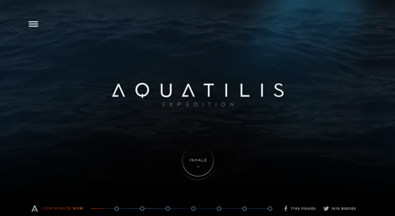
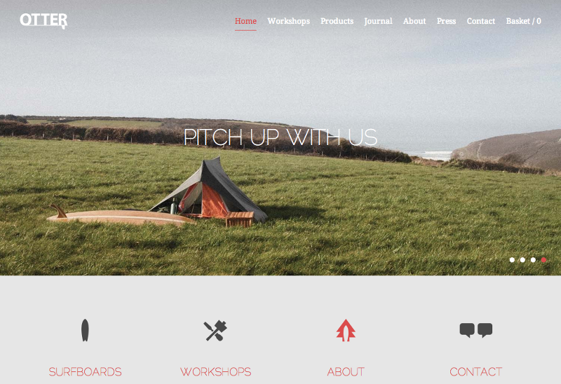
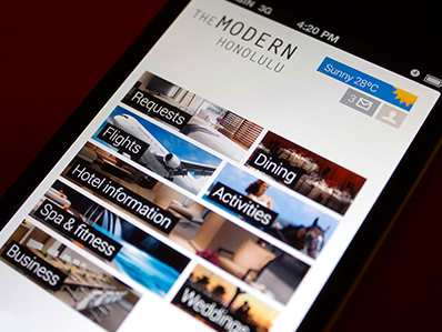
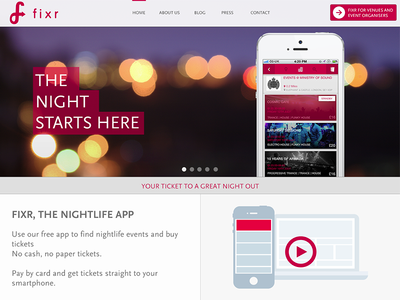
Method 1: Overlay the whole image
Perhaps the easiest method to put text on an image is to overlay the image. If the original image isn’t dark enough, you can overlay the whole thing with translucent black.
Here’s a trendy splash image with a dark overlay.

If you hop into Dev Tools and remove the overlay, you’ll see that the original image was too bright and had too much contrast for the text to be legible. But with a dark overlay, no problem!
This method also works great for thumbnails or small images.
And while a black overlay is simplest and most versatile, you can certainly find colored overlays as well.
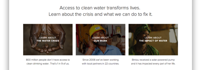
Method 2: Text-in-a-box
This is dead simple and very reliable. Whip up a mildly-transparent black rectangle and lather on some white text. If the overlay is opaque enough, you can have just about any image underneath and the text will still be totally legible.
You can also throw in some color — but, as always, be judicious.
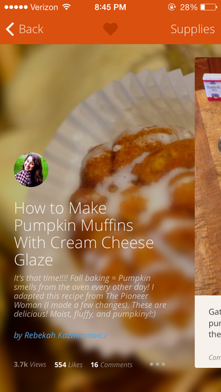
Method 3: Blur the image
A surprisingly good way for making overlaid text legible is to blur part of the underlying image.

iOS does a ton of background blurring.
You can also use the out-of-focus area of a photo as the blur. But beware— this method is not as dynamic. If your image ever changes, make sure the text is always over the blurry bits.

I mean, just try to read the subheader below 😬
Method 4: Floor fade
The floor fade is when you have an image that subtly fades towards black at the bottom, and then there’s white text written over it. This is an ingenious method, and I have no idea who did it before Medium, but that’s where I first noticed it.
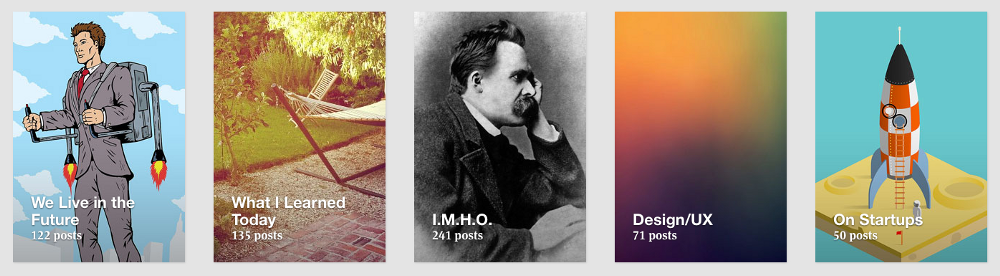
To the casual observer, it appears that these Medium collections are displayed by plastering some white text over an image— but in response to that, I say false! There’s ever-so-subtle a gradient from the middle (black at 0% opacity) to the bottom (black at, ehhhhh maybe ‘bout 20% opacity).
Difficult to see, but definitely there, and definitely improving legibility.
Also notice that the Medium collection thumbnails use a slight text shadow to further increase legibility. Those guys are good!
The net effect is Medium can layer just about any text on any image and have a readable result.
Oh, and another thing— why does the image fade black at the bottom? For the answer to that, see Rule 1— light always comes from the top. To look most natural to our eye, the image has to be slightly darker at the bottom, just like everything else we ever see.
Advanced move: mix the blur with the floor flade… introducing The Floor Blur.
Bonus Method: Scrim
It’s a bit more “advanced”, but there’s one more way of making text-on-images legible. I call it the scrim.
It’s kind of subtle. Here‘s the before:
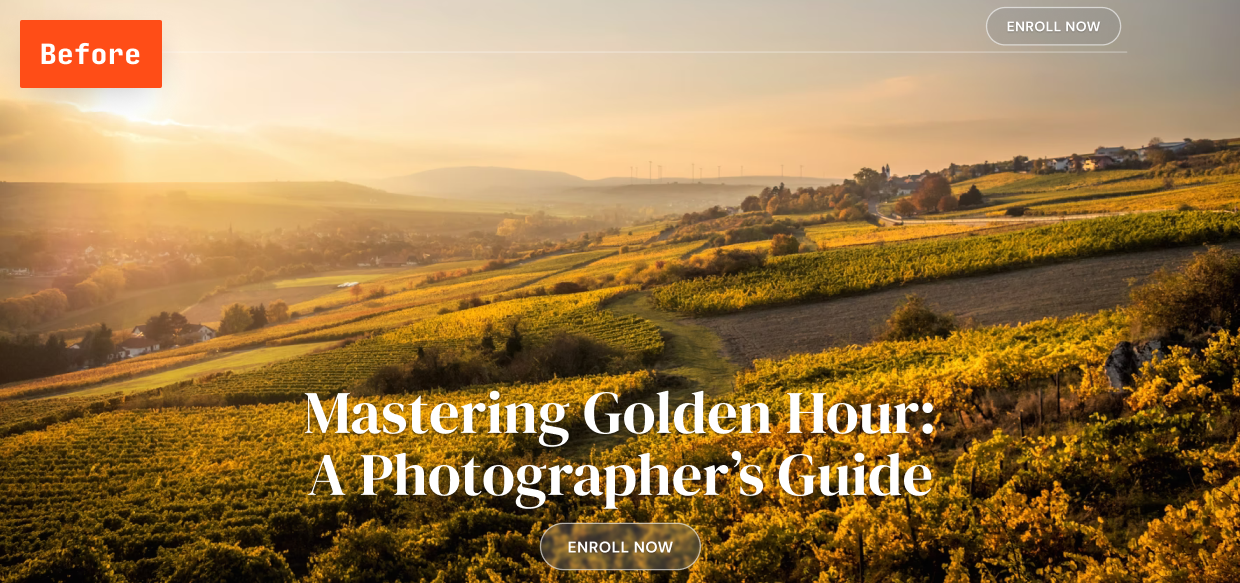
And here’s the after:
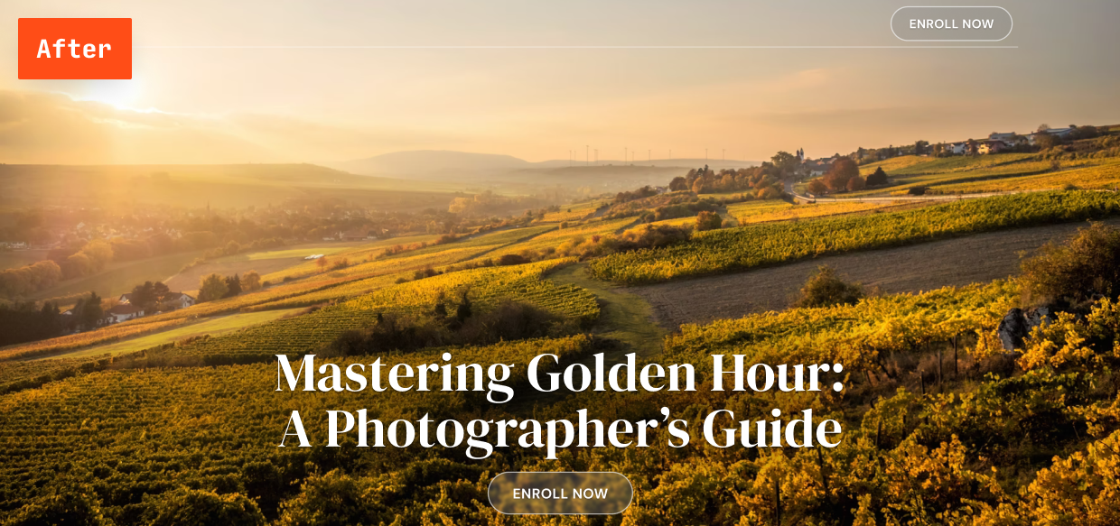
Do you see the difference? The latter’s text is definitely more legible, but it’s hard to put your finger on why, no?
It’s because of this:

A scrim is an elliptical gradient from translucent black (center) to transparent black (edges), strategically placed behind white text.
The scrim is probably the most subtle way of reliably overlaying text on images out there, and very few designs use this technique. Mark it down, though. You never know when you’ll need it.
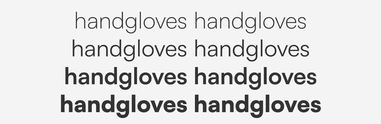
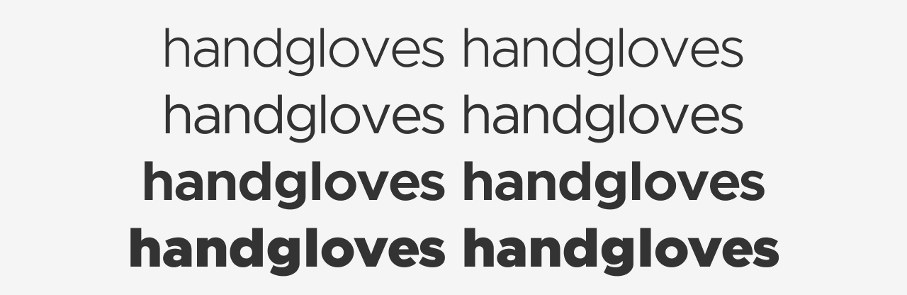
Rule 5: Make text pop — and un-pop
Styling text to look beautiful and appropriate is often a matter of styling it in contrasting ways— for instance, larger but lighter.
In my opinion, one of the hardest parts of creating a beautiful UI is styling text— and it’s certainly not for unfamiliarity with the options. If you’ve made it through grade school, you’ve probably used every method of calling attention to or away from text that we see:
- Size (bigger or smaller)
- Color (greater contrast or lesser; bright colors draw the eye)
- Font weight (bolder or thinner)
- Capitalization (lowercase, UPPERCASE, and Title Case)
- Italicization
- Letter spacing (or — fancy term alert — tracking!)
- Margins (technically not a property of the text itself, but can be used to draw attention, so it makes the list)
There are a few other options that are possible for drawing your attention, but not particularly used or recommended:
- Underline. Underline means links nowadays, and it’s not worth trying to force it to mean anything else, if you ask me
- Text background color. Perhaps interesting as a hover effect, I wouldn’t use this for any common styles.
- Strikethrough. Back off, you 90s CSS wizard, you!
In my personal experience, when I find a text element that I can’t seem to find the “right” styling for, it’s not because I forgot to try caps or a darker color — it’s because the best solution is often a combo of “competing” properties.
Up-pop and down-pop
You can divide all the ways of styling text into two groups:
- Styles that increase visibility of the text. Big, bold, capitalized, etc.
- Styles that decrease visibility of the text. Small, less contrast, less margin, etc.
We’ll call those “up-pop” and “down-pop” styles, in honor of designers’ favorite adjective. We won’t call it “visual weight”, because that is boring.
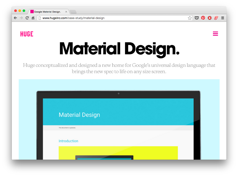
Lots of up-pop going on with the “Material Design” title. It’s big; it’s high-contrast; it’s very bold.
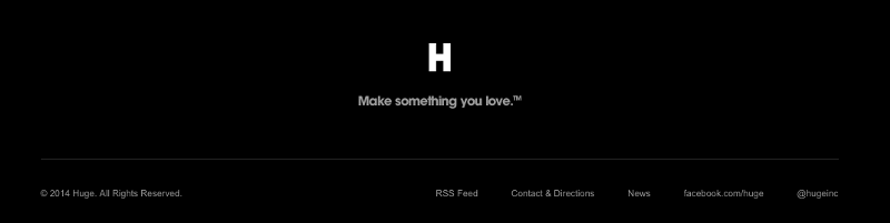
The items in the same site’s footer, on the other hand, are down-popped. They’re small, lower-contrast, and a less bold font-weight.
Now the important part.
Page titles are the only element to style all-out up-pop.
For everything else, you need up-pop and down-pop.
If an element needs emphasis, apply BOTH up-pop and down-pop styles — but slightly MORE up-pop. This will prevent things from being overwhelming, but allow different elements the visual weight they should have.
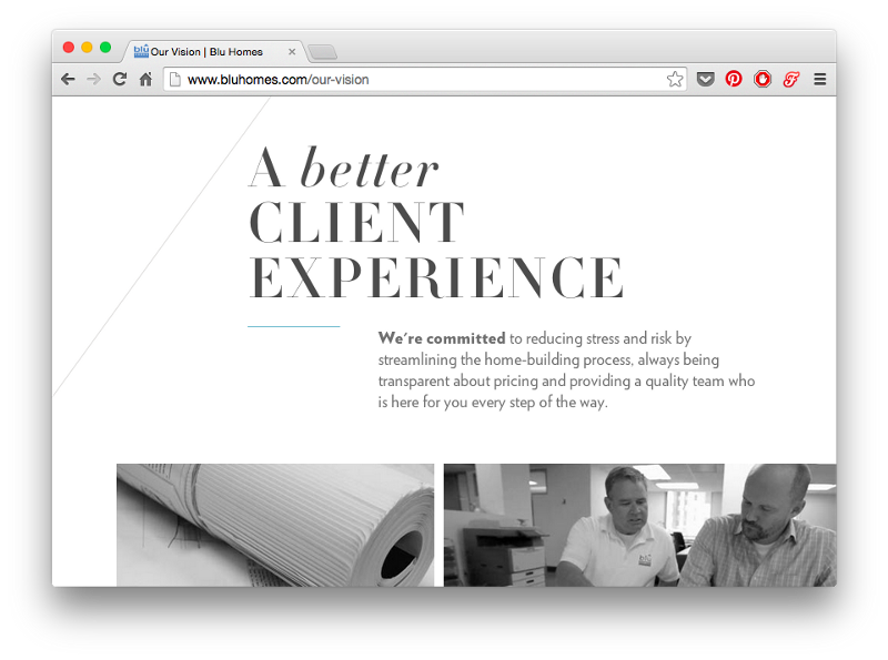
The impeccably-designed Blu Homes website has some big titles, but the emphasized word is lowercase— too much emphasis would look overpowering.
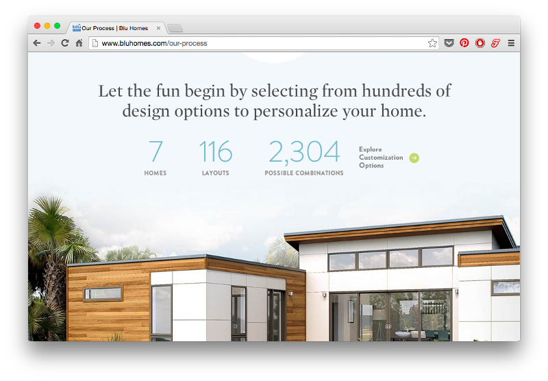
These numbers on the Blu Homes site draw your eye with their large size— but notice that they’re simultaneously downplayed with a very light font-weight and lower-contrast color than the dark gray.
The small labels below the numbers, however, while gray and small, are also uppercase and very bold.
It’s all about the balance.
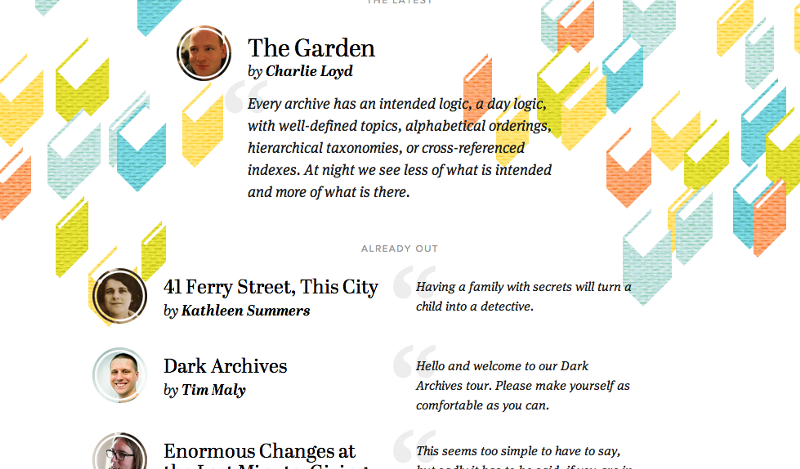
Contents Magazine is a good case study in up/down-pop.
The article titles are basically the only non-italicized page elements. In this case, lack of italicization more effectively draws the eye (particularly in combination with the bold font-weight)
The author’s name is bolded in the byline— making it stand out from the normal-weight “by”
The small, low-contrast “ALREADY OUT” text stays out of the way— but with its uppercase type, generous letter-spacing, and large margins, you can see it the moment you look for it
Selected and hovered styles
Styling selected elements and hover effects are another round in the same game— but more difficult.
Usually, changing font-size, case, or font-weight will change how large of an area the text takes up, which can lead to seizing hover effects.
What does that leave you with?
- Text color
- Background color
- Shadows
- Underlining
- Slight animations— raising, lowering, etc.
One solid option: try turning white elements colored, or turning colored elements white, but darkening the background behind them.
I’ll leave you with this: styling text is hard.
But every time I’ve thought “Maybe this text just can’t look right”, I’ve been wrong. I just needed to get better. And to get better, I just had to keep trying.
So I offer you this bit of consolation: if it doesn’t look good, don’t worry– it could if you were better. But hey, let’s keep on trying and make ourselves better.
Rule 6: Use Only Good Fonts
Some fonts are good. Use them.
There are no strategies or things to study in this section. I’m just going to list some nice free fonts for you to go download and use.
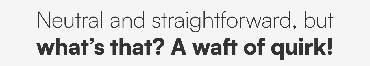
In particular, I’m going to list clean, simple fonts. Why? Because sites with a very distinct personality can use very distinct fonts. But for most professional UI design, you just want something pretty neutral & clean. That’s right, buddy, put down the Wisdom Script.
Also, I’m only recommending free fonts. Why? This is a guide for folks who are learning. There’s more than enough out there at the zero-dollar price point. Let’s use it.
In no particular order:
1/ Satoshi
This font is one of Indian Type Foundry’s amazing FontShare free releases. Satoshi a perfect font for apps that need to feel modern and neutral, yet with just a bit of quirky friendliness.
The top-heavy “a” and gangly “g” are some of the more idiosyncratic glyphs. But these are fairly subtle details. The main vibe is: modern, simple.
Props to Indian Type Foundry for releasing this one to the world! If it’s overused in 10 years, it certainly deserves to be.
Get it at: FontShare
2/ Metropolis
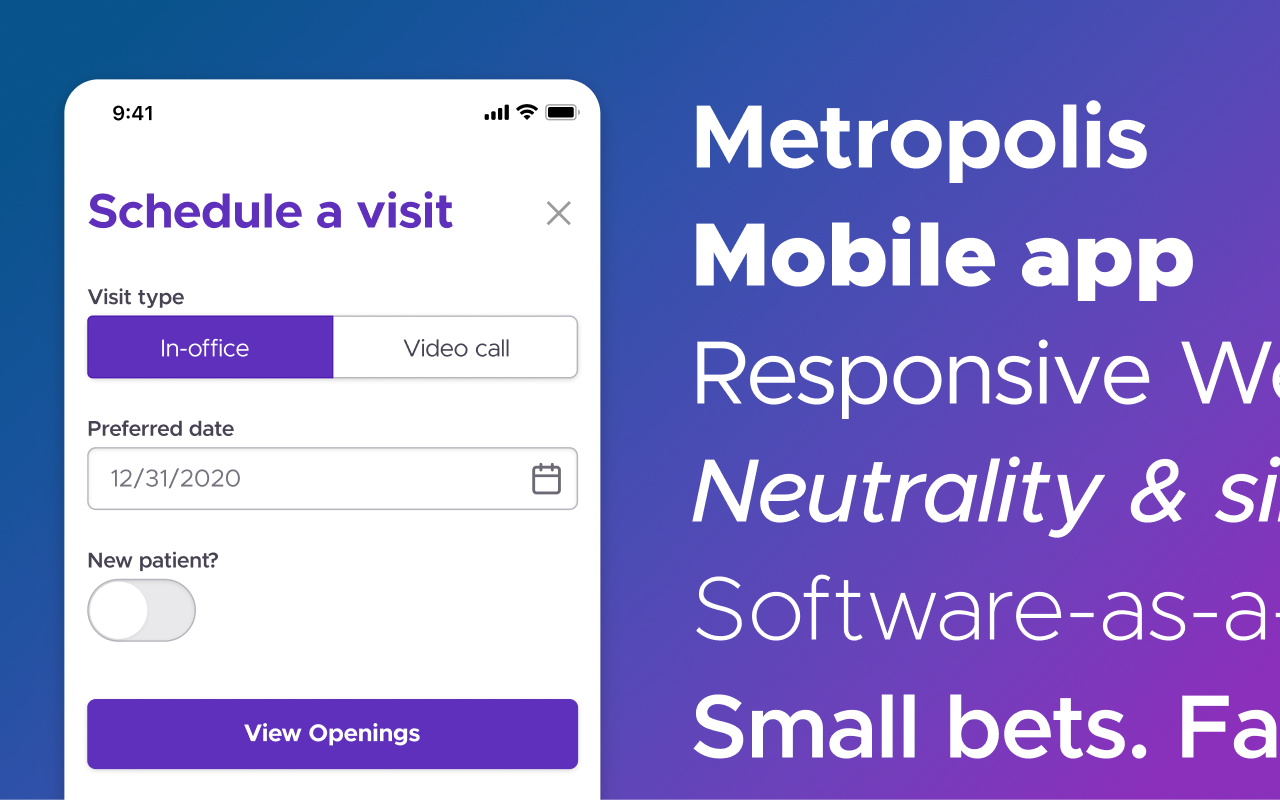
This font is a clear homage to the similar Gotham (note the name 😏) and Proxima Nova. And, just as those fonts are excellent, so is this one.
Metropolis, like Proxima Nova and Gotham, is sturdy and simple. It can be bold without shouting. And while it’s neutral enough to not contradict a friendly brand, it’s still a handshakes, not hugs kind of font.

This one is still underused on the web at large, and is worth trying out all sorts of applications.
Get it at: Github
3/ Source Sans
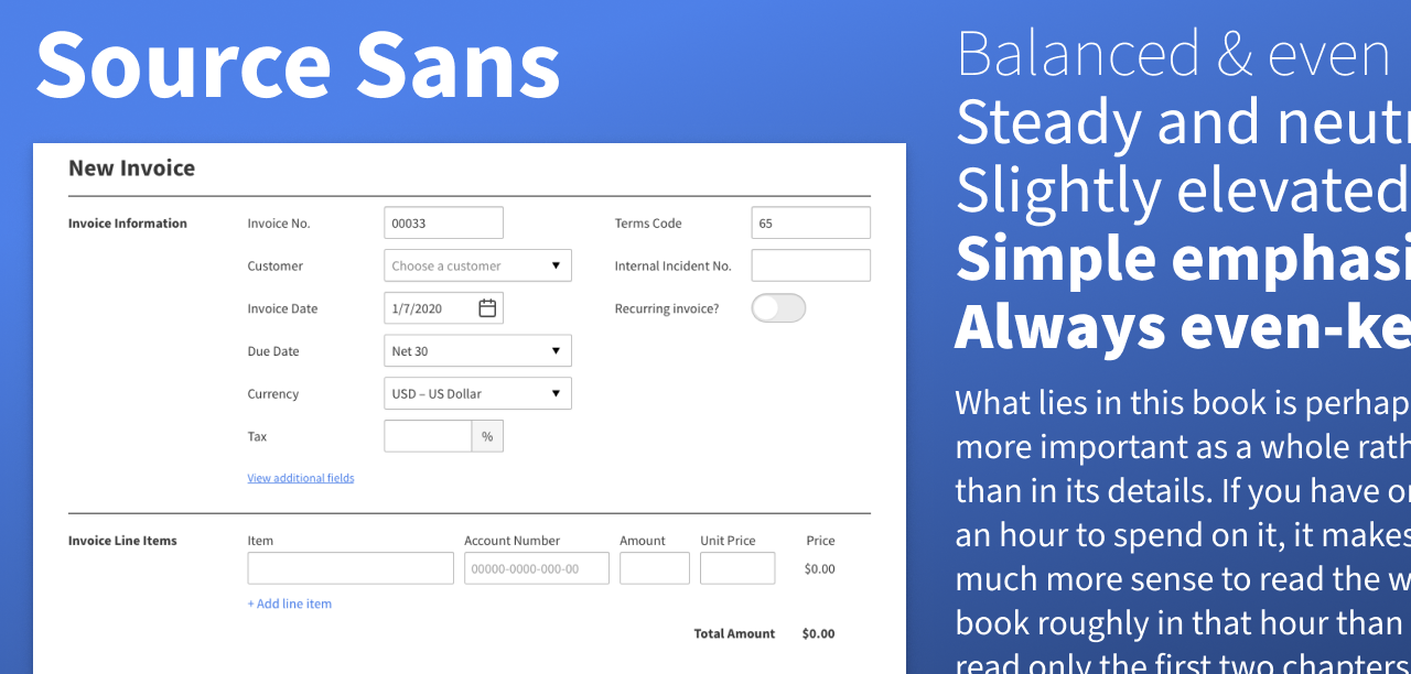
Source Sans is a humanist sans. That means that its letterform shapes, at their most fundamental level, are based on human handwriting (as opposed to e.g. geometric shapes).
So while Source Sans appears, on the whole, neutral, steady, clean, and clear, it retains some aspect of neat, upright handwriting. I think of it as being therefore ever-so-slightly elevated and considered.
In the lightest weights (PSA: these are very difficult to make look good in UI; useful for studying, but worth avoiding if you’re still starting out), you can see the skeletons of the letterforms are far from plain – they’re filled with details! Yet as the font becomes heavier, the even width of the stroke makes it feel clean and simple.
The thicker weights make for solid titles and headers. I would add a slight bit of negative letter-spacing. Here’s -1%.
There’s also a Source Serif and a Source Code (monospace), which makes for easy pairing. That being said, you need not pair Source Sans with anything – it stands alone just fine.
Get it at: Google Fonts
4/ Figtree

OK, first, a confession: I made this font.
So, am I terribly biased in recommending it? Absolutely. Will I anyways? Yes 🙂
Because I noticed there was a gap in the “free font market”. Apart from the overused-as-all-get-out Montserrat, there weren’t good Open Source fonts that felt friendly yet neutral. So I made one.

Overall, Figtree has a clean-yet-casual appearance. Nothing is made to stick out too much, yet I tried to keep things rounded, circular, playful.
For more, check out my design notes.
Get it at: Google Fonts
For 6 more high-quality free fonts…
Just a brief (related) interlude: I send out my best design tips to Design Hacks subscribers. If you subscribe below, you’ll get my PDF ebook of the top 10 free fonts for UI design 😎
The Top 10 for UI Design
Get a PDF of the 10 best free fonts for web/mobile app design (including which free fonts not to use).
Practical design tutorials. Over 60,000 subscribed. One-click unsubscribe.
Where to find great fonts
- Google Fonts. You probably already know this one, but it’s still the #1 source of great free fonts. The issue is its the #1 source of mediocre free fonts as well 😅. Nonethless, expect to spend a lot of time here.
- FontShare. An awesome set of lesser-known free fonts, put out by Indian Type Foundry.
- Adobe Fonts. If you are on Adobe Creative Cloud (i.e. subscription Photoshop or Illustrator, etc.), then you have free access to a ton of amazing fonts. Even better than what I recommended above: Proxima Nova, Adelle Sans, DIN, Freight Text, and more.
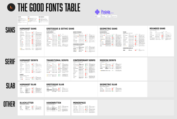
- The Good Fonts Table. A bonus for all students of Learn UI Design, this is my personal database of 100+ high-quality free fonts – including samples, usage notes, brand, features, and links, all organized by type (serifs, slabs, monospace, handwritten, etc.). If you liked the free fonts above, you’ll love the Good Fonts Table.
Rule 7: Steal like an artist
The first time I sat down to try and design some app element— a button, a table, a chart, a popup, whatever— was the first time I realized how little I knew about how to make that element look good.
But as luck would have it, I haven’t had to invent any new UI elements yet. That means I can always see how others have done it and cherry-pick from the best.
But where should one cherry pick? Here are the resources I have found absolutely the most useful while designing for clients. Listed in descending order:
1. Dribbble
This invite-only “show and tell for designers” site has bar-none the highest quality of UI work online. You can find great examples of almost anything here.
In fact, you should follow my work on dribbble here. Here are a few more people for you to follow as well:
-
Jamie Syke. Posting new UI basically ALL THE TIME. Consistently top-notch stuff. Huge breadth of experience and designs. What can I say? Easy follow.
-
Balkan Brothers. It seems to be this weird dribbble truism that the closer the designer is to Russia, the more adept at colors they are. These Croat designers are fantastic with keeping flat interesting. Always great gradients, colors, and shadows.
-
Elegant Seagulls. If you’re ever thinking “man, how do I make something more interesting than a standard Bootstrap grid?”, just browse a few of their shots. There’s your answer.
-
Cosmin Capitanu. An awesome wildcard. He makes things that look crazy-futuristic without being garish. Really good with colors. He doesn’t really focus on UX though— which is also a criticism of dribbble at large.
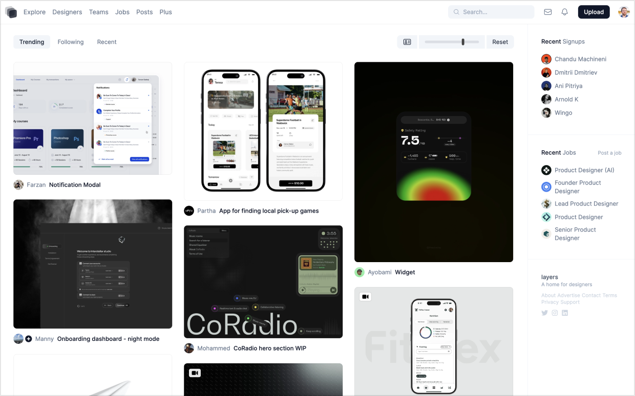
2. Layers
Another work-sharing site for designers, Layers is trying to dethrone dribbble and become the established place to post beautiful UI.
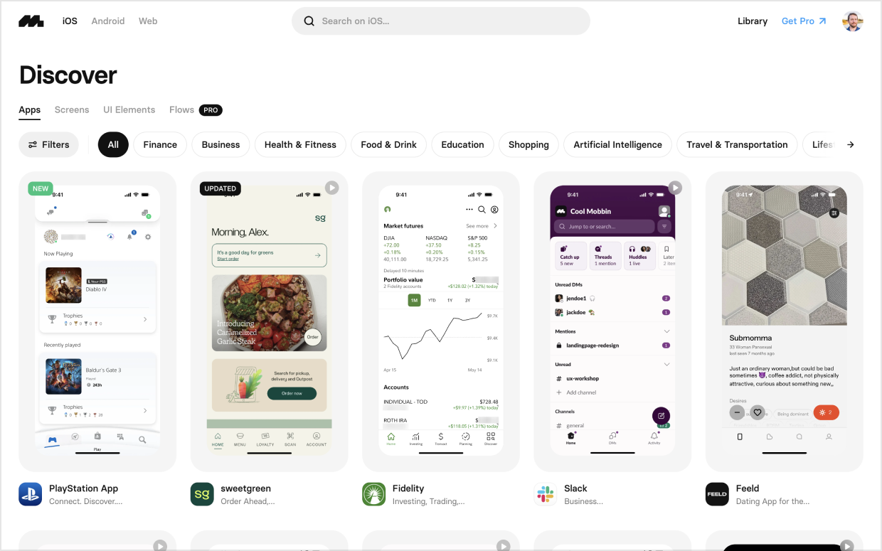
3. Mobbin
A directory of over 300,000 (mostly) mobile app screenshots from 1000+ different apps. You can filter by UX pattern or interface element, which makes it very nice to quickly research whatever piece of interface you’re currently working on – be it a login page, a user profile, search results, etc.
I’m a firm believer that every artist should be a parrot until they’re good at mimicking the best. Then go find your own style; invent the new trends.
In the meanwhile, let’s make like thieves.
And, in the spirit of this section, the title “Steal Like an Artist” was lifted from an eponymous book that I have not read, mostly because the title seems to sum up anything that the pages might contain 🙃
Conclusion
I wrote this because I would’ve loved to see this a short time ago. I hope it helps you. If you’re a UX designer, do a nice mockup after you’ve sketched the wireframes. If you’re a dev, take your next side project and make it look good. I don’t want UI to seem like it takes magical art school skills to do decently. Just observation, imitation, and telling your friends what works.
Anyhow, this is just what I’ve learned so far, and I am always a beginner.
If you’re still with me, you’ve read two articles totaling over 5,000 words and seen scores of illustrations and screenshots. But I’m not dead yet, so it ain’t over.
If you liked this, check out Learn UI Design, a complete video course for developers, UX designers, and UI designers who want to master the craft of interface design. The content there is the same style of stuff you’ve read above — practical strategies and analysis, not the useless theory that dominates so much internet design writing.
Anyhow, you should also hop on board the Design Hacks newsletter for more writing like this (if you can stand it) 😉
Watch me do a UI project step-by-step
I’ll walk you through every part of a UI project — just like I’ve done for everyone from Fortune 100 companies to Y-Combinator startups.
Practical design tutorials. Over 60,000 subscribed. One-click unsubscribe.