UI Tutorial: Scheduling App Redesign (in under 10 Minutes)
Note: I’ve made this post into an 8-minute video posted on YouTube. You’re welcome to watch that, or read below for the original text version.
Last month, a Learn UI Design student reached out to me about how he might redesign his meeting scheduling web app – timezon.es. This sounded like an awesome challenge, and I ended up doing an hour-long call with some other students where we talked about techniques and tips for redesigning his site.
We covered a bunch of strategies while doing a make-shift redesign, and I want to talk about some of them today:
- The “squint test” and how it’s useful in UI design
- A method for making sure you don’t forget to design certain states/flows
- A UX/layout tip on where to add new elements
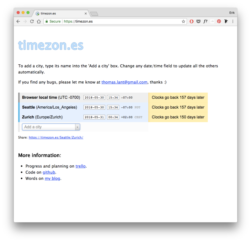
But first, here’s the BEFORE:
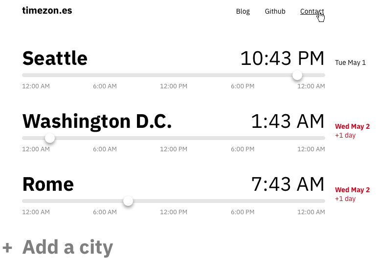
And here’s the AFTER (note: margins have been removed so it fits in this blog post):
Let’s talk about how we tackled this, and we’ll hit a whole bunch of design hacks and heuristics along the way.
The Goals
OK, strategy #1: know your goal. If you haven’t defined goals for a redesign, you can only meet them on accident.
(Makes sense, doesn’t it?)
Here are our goals for this redesign, as described by Tom, who built the site:
- Allow users to answer the question “When it’s 10 PM in Tokyo, what time is it in NYC?”, etc.
- Allow users to schedule meetings between people in different time zones
- Make sure users aren’t taken by surprise by daylight savings time shifts
Sounds legit. Let’s keep moving.
Keep it Proportional, Stupid
In a nutshell, the Squint Test means that when you squint, you should see the most important stuff first, the second-most important stuff second, the third-most important stuff third, and so on. If you squint at your design and the first thing you see is a secondary sidebar that’s only useful in very limited cases… that’s bad news.
Yeah, this forces you to define exactly what’s most important, exactly what’s second-most important, etc. – but guess what? If you don’t know what’s important on your website, you can only create a good design on accident. (sound familiar?)
Let’s use blur to fake the squint test here.
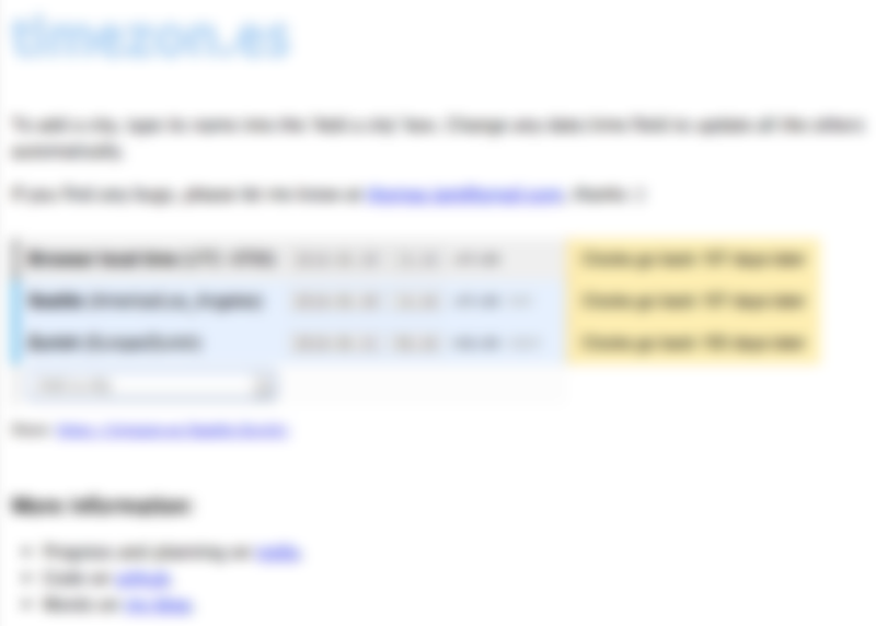
What stands out here? To me, it’s (1) the page title and (2) the yellow box on the right.
What should stand out here? Scroll up and look at our goals again. To me, the most important bits, in order, are:
- The cities and their local times
- The ability to view times in the future
- The page title (somewhere around here)
- Need-to-use functionality like adding a city
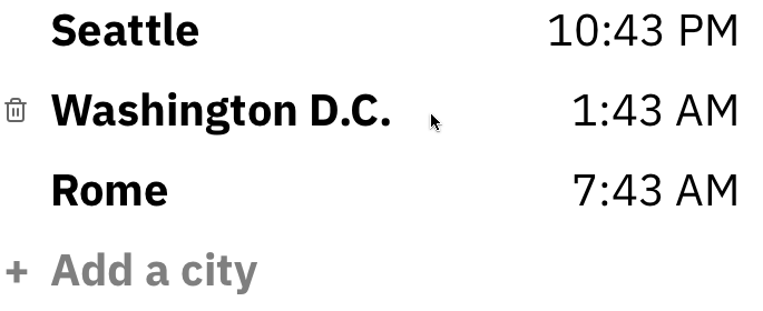
So we’ve got a few things we know we want to correct for. Let’s start our redesign by adding in #1, the city names and their local times.
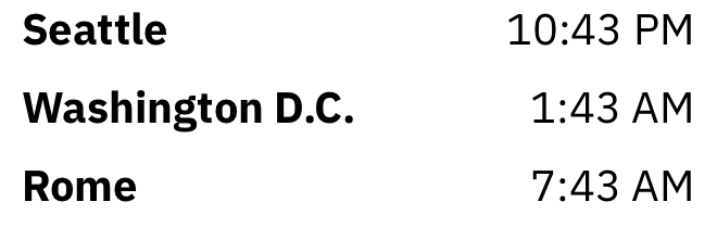
Bam. Too easy. I right-aligned the times so the digits match up (the minutes in “1:23” will match up with the minutes in “12:23”). The cities are nice and big. The whole thing has a really strong sense of alignment, and it’s only 620px wide. Even though I’m not dealing with the mobile version in this blog post, I’m already starting to think if this basic layout would work on down to the smallest screens. Oh, and the font, Plex Sans? It only meets reasons #1, #2, #4, #5, and #6 of how you can justify a font choice.
Crud, I Forgot Something
It’s easy to design the state where everything is hunky-dory, already entered, no errors. But that’s only a small slice of what the user will go through using the application. So anytime we add a new object in that the user can manipulate – in this case, a city – we want to follow the developer’s acronym CRUD and make sure we cover our bases:
- Create: How can the user add a new time? Uh oh. They can’t right now.
- Read: Got this one covered – easy to view the city and the time.
- Update: Would you ever want to edit the details of a city? Not really. If you added the wrong city, I think you’d delete it and re-add a new one.
- Delete: Hm, we forgot this too. No way to remove a city.
Now there’s a bit of an asymmetry here: Create is mega-important and every single user will have to add multiple cities before getting any use out of this app. But Delete will probably not happen at all, unless they made a mistake or added too many cities or something. So following the way of the Squint Test, creating should be more visible than deleting.
According to this little addition, the Delete functionality only appears when I hover over a specific city. The Create functionality, however?
The “Add a city” button uses the same size/style font as the city. Why? Consistency always wins. We styled it at 50% opacity though – at least until you hover on it – so that you don’t get it confused with a normal city that’s already listed. Oh, and we added the plus button off to the left so that the sense of alignment with the other cities was stronger.
BUT… where did we put the “Add a city” button?
The Law of Locality
We put it exactly where a new city appears. That’s where.
That’s critical here, and one of the most basic UX pointers I can give you. I call it the (first) Law of Locality. Put elements near where they change the current state. If a button adds to a list, it should either go where a new element will be added (or, if the list is long, on top of the list). If the button deletes something, put it by the element it deletes. If it, say, minimizes an entire window, put it at the tippy-top of the entire window, where it feels like it commands everything in the container below.
If you’re not too into UX, I highly recommend doing an audit of whatever project you’re working on right now: are all my controls near where they affect change?
Let’s move on.
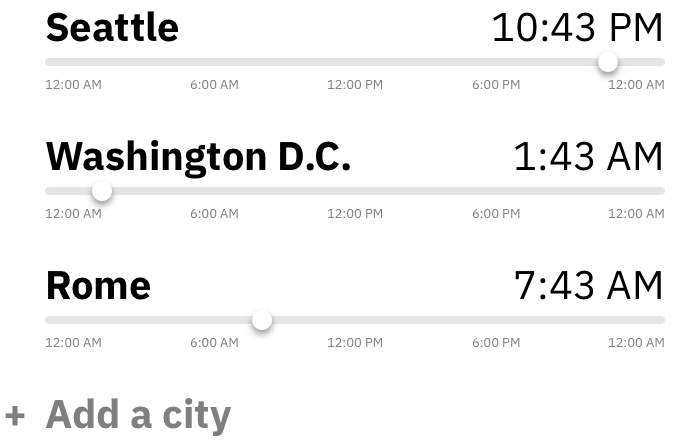
What’s up now? We’ve added a way to change what time of day you’re looking at and compare it across cities. The way I imagine this, whenever you move the slider for one city, all the sliders on the corresponding city will update in real-time (along with the timestamps), so that you can really easily compare any time. It’s also possible, since this is fundamentally about scheduling meetings, that the times would snap to :15 increments, since meetings don’t really ever begin not on those increments. But honestly, I might need to play around with a bit to tell how much of a pain that would be.
Notice any issues though? I do. The times are date-agnostic. It might be really important if you’re scheduling a meeting for Friday, yet you accidentally push it to Saturday in an earlier timezone, etc. So we’re going to need to add some way of showing which date the user has selected – and additionally, a notice if they’re pushing into a separate day.
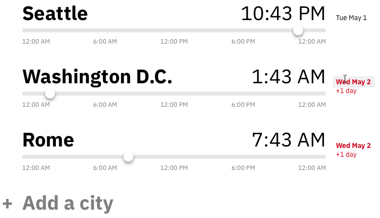
Because the date isn’t as important as the time, we made it much smaller. Like the squint test says, if something isn’t that important, it shouldn’t be that visible. Yet if a date is actually a different day than the primary (top) city, it will turn red – a different day IS important info. You’ll also note that, thinking about CRUD, I’ve given the date a hover-state, so you can edit it with a calendar control if you click it.
This also has the added benefit of allowing us to handle non-synced daylight savings times. Tom was particularly proud that his app would let you know when various cities were next shifting their to/from daylight savings time. Surprisingly, not all places do this in sync. Arizona doesn’t even have daylight savings time, the rascals (who am I kidding – I’m jealous). But in the original design, the big yellow boxes saying when cities were shifting to/from DST was the most noticeable element. Squint test: failed.
Now, however, we can simply move a slider automatically if you choose a date such that the relative times change. Same smarts, zero additional UI.
Speaking of our goals, let’s see how we’re doing here:
Allow users to answer the question “When it’s 10 PM in Tokyo, what time is it in NYC?”, etc.
Pass with flying colors.
Allow users to schedule meetings between people in different time zones
Pass with a caveat – maybe we could hook into a calendar API and create Google or iCal invites, taking the next step the user is going to do anyways. That’s something I don’t know very much about, so I’d have to talk with Tom to figure out what is reasonable and with his users to find out what they’d want.
Make sure users aren’t taken by surprise by daylight savings time shifts
Pass!
Reviewing the content of the old design, I think we can subsume the rest of the stuff into a few links at the top – Blog, Github, Contact – and call it a day.

Overall, I’m pumped about this design. I love the neat, clean appearance. I think it meets the goals we set out to meet, and it was a good excuse to cover some of the tips and tricks that I use on a daily basis as a UI designer.
If you want to see more case studies like this, check out Design Hacks, where I send original design tips and tutorials every however-often-I-feel-like-it.
Watch me do a UI project step-by-step
I’ll walk you through every part of a UI project — just like I’ve done for everyone from Fortune 100 companies to Y-Combinator startups.
Practical design tutorials. Over 60,000 subscribed. One-click unsubscribe.