Proxima Nova: Free Alternatives & Similar Fonts
If you’re looking for free alternatives to Proxima Nova, here are 5 of the highest-quality look-alikes and similar fonts.
- Metropolis (best overall)
- Figtree (best on Google Fonts)
- Montserrat
- Raleway (great – if you make one tweak)
- Geomanist
For each, I’ll mention the advantages, disadvantages, and why you might choose it. Ready? Let’s get started.
You’re reading Free Font Alternatives: The Ultimate Guide. Quickly navigate to other fonts: Intro · Apercu · Avenir · Circular · DIN · Futura · Gotham · Helvetica · Proxima Nova · Times New Roman
1. Metropolis
Metropolis is the closest free alternative font to Proxima Nova.
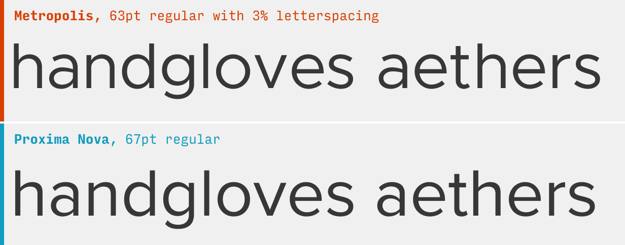
While there are subtle difference in some of the letterforms (Metropolis has stockier characters overall: an ever-so-slightly larger x-height combined with a smaller cap-height), Metropolis is basically a deadringer for Proxima Nova.
Since Proxima Nova is frequently used – and quite distinctive – in uppercase, it’s worth looking at a direct comparison in that setting.
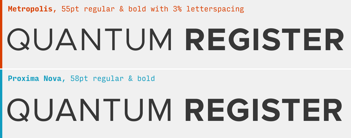
Again, deadringer.
What it’s got: 9 weights + italics
Get it at: Metropolis at Github
2. Figtree
Figtree has a similar vibe to Proxima Nova.
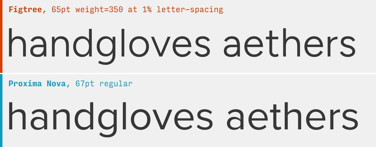
Proxima Nova’s defining characteristic – besides its neat, clean feel – is the way the bowls connect to stems (in glyphs like “a”, “n”, “d”, “g”, etc). Figtree has a more round, friendly way of doing things, but the two share a similar vibe nonetheless.
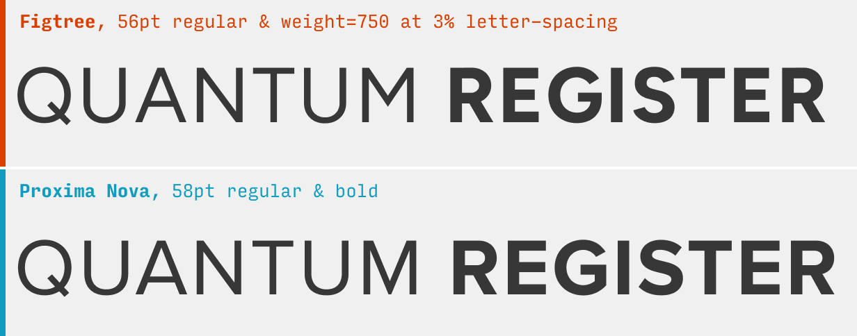
Figtree takes some inspiration from the capitals of fonts like Proxima Nova and Gotham. Proxima Nova has lowered crossbars in “A”, “R”, and “P”, which makes it feel stocky and solid. Figtree follows suit, though not as idiosyncratically.
What it’s got: 7 weights + italics; also available as a variable font
Get it at: Figtree at Google Fonts
2. Montserrat
The nice-yet-overused Montserrat is a classic stand-in for Proxima Nova.
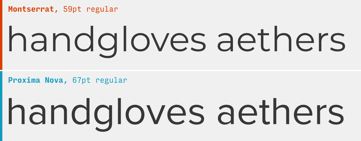
While there are some differences, Montserrat and Proxima Nova are very much cut of the same cloth. If you love the latter but can only afford the former, check it out. With 9 weights and italics, it’s an solid font in its own right – though heavily used, for this very reason.
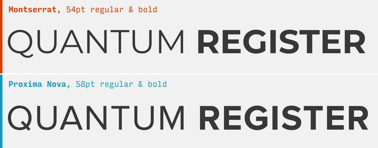
In uppercase, some distinctive characters (Montserrat’s “Q”, “G”) can be dead giveaways for IDing the font, but Proxima Nova’s distinctive uppercase feel (look at the low “A” crossbar or the squat “R” leg) is still there.
What it’s got: 9 weights + italics; also available as a variable font
Get it at: Montserrat at Google Fonts
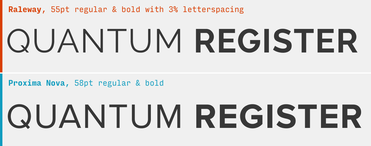
3. Raleway
Raleway is a popular Google Font that I recommend freshening up with some alternate character forms.
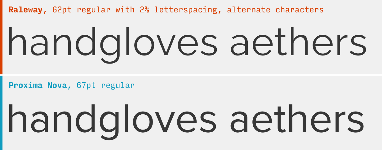
The original Raleway has this “W” that sticks out like a sore thumb, making an otherwise solid body font into something that feels too gimmicky. Fortunately, the font comes with a number of OpenType alternate character styles. For max Proxima Nova feel, you’ll want to use font-feature-settings: "ss01" 1, "ss03" 1, "ss05" 1, "ss08" 1, "ss09" 1, "ss11" 1; in your CSS selectors.
This one tweak alone will not only knock out the overly-stylized “W”, but almost make a number of other characters (“a”, “d”, “l”, “u”, “G”) into their more Proxima Nova-like twins.
What it’s got: 9 weights + italics; also available as a variable font
Get it at: Raleway at Google Fonts
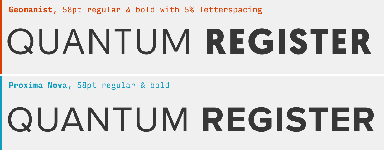
4. Geomanist
The sturdy Geomanist lacks italics for all weights except regular, but has a similar geometric (go figure) vibe as Proxima Nova.
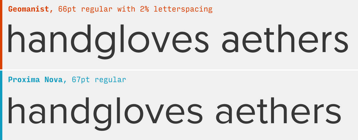
Geomanist has a lot of the same character as Proxima Nova in lowercase, but the reason it appears last on this list is because a lot of that falls away in uppercase. Proxima Nova’s distinctively low crossbars for “A”, “R”, and “P” melt away into something with a lot less punch.
Nonethless, this is an underutilized font and worth considering!
What it’s got: 9 weights + 1 italic weight
Get it at: Geomanist at Atipo
Other Proxima Nova Alternatives
If you’re looking to branch out from Proxima Nova, it’s worth checking out some of the other alternatives in this guide. For instance, the Helvetica alternatives are similarly clean and simple, and the DIN alternatives have a squared-off punchy feeling to them that is similar to Proxima Nova’s uppercase.
You’re reading Free Font Alternatives: The Ultimate Guide. Quickly navigate to other fonts: Intro · Apercu · Avenir · Circular · DIN · Futura · Gotham · Helvetica · Proxima Nova · Times New Roman
The Top 10 for UI Design
Get a PDF of the 10 best free fonts for web/mobile app design (including which free fonts not to use).
Practical design tutorials. Over 60,000 subscribed. One-click unsubscribe.