Color in UI Design: A (Practical) Framework
Yo, question for you. Why so many articles and books talk about color theory and color palettes? In my experience, using a “split complementary palette” is about 0% predictive of me making nice-looking designs.
I have another word for that sort of thing: useless.
So if color theory doesn’t provide a solid basis for color in UI design, what does?
Here’s my take: color variations. It’s the tweaking of color that counts, not the picking of them from the color theory hat.
Or, said another way: The fundamental skill of coloring interface designs is being able to modify one base color into many different variations.
I know this sounds a little odd. Hear me out. I’m going to give you a framework for adjusting color in your UI designs.
This framework will:
- Allow you to modify one theme color for basically any purpose in your UI (this is hugely powerful, and, as we’ll see, what apps like facebook are already doing)
- Help you to predict what color changes will look good
- Make color seem less subjective (“subjective” is often a word for “I haven’t figured out how it works” — and it’s a word you hear a ton when folks talk about color)
Are we cool? We’re cool?
Great.
Darker & Lighter Variations
One thing I’ve noticed across many great-looking interfaces is that they often have darker and lighter variations on a particular theme color.
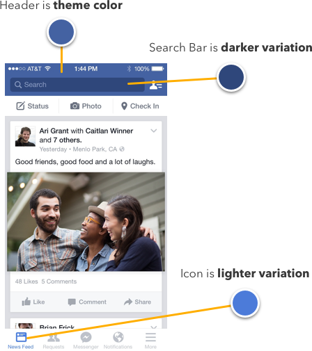
You didn’t think that search bar was just a translucent black overlay, did you? Spoiler alert: it’s not. No opacity of black overlaid on that blue will give you the color of the search bar. It’s a variation picked by some other magic.
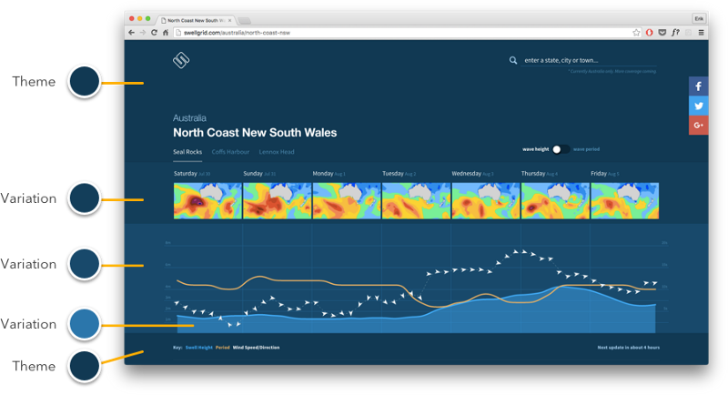
Quick, now look at Swell Grid, the beautiful surf forecast app.
Sha-BAM. We just got hit with a boatload of variations. How many are there? Count ’em! Practically everything on this page is a variation of the initial blue.
Or, here’s another simple example:

Even element states are variations on a color. This isn’t best described as “a palette of 3 blues”. It’s one blue with variations.
But this begs the question: how do you actually modify a color to get good variations?
We’ll get there, but I want you to understand this stuff from the ground-up. So here are our 2 trusty principles for figuring this stuff out:
- We’ll look to the real world for reference cues. Even though our interfaces are “fake”, we still copy like mad from the real world, because after decades of seeing things in the real world, we just expect light and color to work in certain ways.
- We’ll use the HSB color system. The short of it is: it’s the most intuitive color system with broad usage (for my purposes, Figma, Photoshop, and CSS). If you don’t know what hue, saturation, and brightness are, read my primer and meet back in 10 👍
Real-World Color Variations
Alright, look around you. What “color variation” are you undoubtedly seeing two dozen instances of every time you glance around your room?
Shadows.
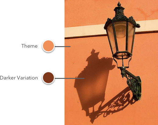
You can think of a shadow as a darker variation on a base color.
With me?
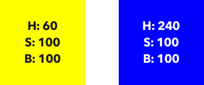
Now let’s jump into Figma and get our color pickers and figure out exactly what happens when a shadow falls on our coral wall.
Like I mentioned, we’ll be figuring this out in HSB.
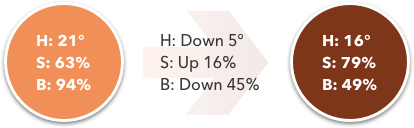
The brightness moves down — OK, so that was pretty obvious. But hold up – before we go generalizing too much, let’s actually look at another example.
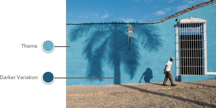
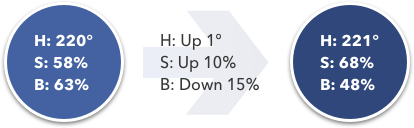
Do shadows work the same way in Cuba? We’re about to find out!

Alright, now we can compare and contrast. Notice a pattern?
When there’s a shadowed variation of a color, you can expect brightness to go down and saturation to go up. We just looked at this in two instances, but as far as I’ve ever seen, it’s a solid rule you can go by.
Now hue is a bit crazier — it went down for the coral wall shadow, and up for the teal wall shadow. There is an explanation for that, but it’s much less important and a bit more esoteric than saturation/brightness — so we’ll come back to hue later.
The Rules
Let’s unpack these concepts a bit more.
Darker color variation = higher saturation + lower brightness
If you look back to our facebook search bar example, you’ll see that’s exactly what’s going on.
The saturation went up as the brightness went down. The reason the search bar couldn’t be an opacity of black overlaid on the base blue is because, in HSB, adding black is equivalent to reducing brightness. Instead, we want to reduce brightness while simultaneously adding saturation. Black doesn’t add any saturation to our color!
Why, in the real world, are darker colors correlated with higher saturations? I haven’t the slightest idea. But I can always make something up: it’s because as the intensity of the light (brightness) overtakes intensity of color (saturation), the color necessarily becomes more washed out — and vice versa.
That might be complete BS, but it kind of makes sense, right?
Lighter Color Variation = lower saturation + higher brightness
Now, being the discerning and erudite readers that you are, you probably guessed that the opposite transform that gives us darker variations will give us lighter variations.
And you nailed it, by golly.
Of course, we can go one step further. If we go on lowering saturation and raising brightness till the cows come home, where do we end up?
Here:
We end up at white.
You can think of making lighter variations as adding white. And there are two very simple ways to add white to a color in Figma et al:
- Reduce the opacity of the element (if it’s on a white background)
- Add a translucent layer of white on top of the element
The Most Important Thing
If you remember only one thing from this article, remember this:
🔥👉 Darker color variations are made by lowering brightness and increasing saturation. Brighter color variations are made by increasing brightness and lowering saturation. 👈🔥
With this simple idea, you will be able to do amazing things with just a single color.
The truth is, so many variations in color between elements — or even states of the same element — are just simple color modifications.
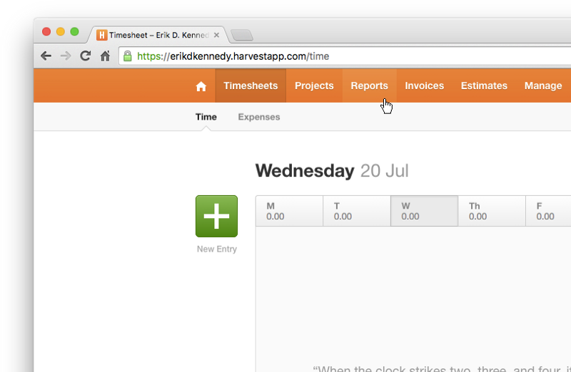
Here’s Harvest, the time-tracking app I use and love.
Look at the header. The hover state is lighter. The selected state is darker.
Or look at the green New Entry button.
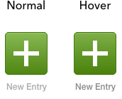
The hover state is a darker variation — higher saturation, lower brightness.
You will use this again and again.
To be fair, not every design follows this rule 100% of the time. In the Harvest header above, the selected state is just a lower brightness (saturation unchanged) and the hover state is just a lower saturation (brightness unchanged). But we’ve looked at how color works in the real world, and we know that why these designs look good is because they approximate the principles laid out here.
What About Hue?
Speaking of approximating the principles laid out here, we should talk about hue. I said it above too, but it bears repeating: hue is so secondary to the whole saturation-and-brightness-move-in-opposite-directions thing that you can often just ignore it entirely when making color adjustments.
That being said, here’s the briefest of explanations.
First of all, each color has a sort of “perceived brightness” to it. This is called luminosity.
Even though this blue and this yellow are both at 100% HSB brightness, which appears brighter?
I mean, like, ask anyone off the street: which is brighter?
“Um. Yellow. Yellow?”
Thanks, rando. You just discovered luminosity.
“So I’m right?”
Yes, yes you are. Even if you hold brightness and saturation constant, and just vary hues, you will get a range of luminosities, or perceived brightnesses, which we measure in values between 0 and 100.
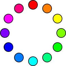
These are our hues in 30° intervals, all at 100% saturation and 100% brightness.
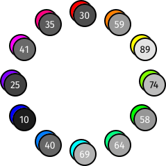
And here are our hues duplicated, put into Luminosity blend mode (on a white background — that’s critical to add if you’re following along in Figma), and overlaid with the brightness of the resulting gray. This gives us a measure of the luminosity of the original color.
In Luminosity blend mode, a bright gray means high luminosity, and a dark gray means low luminosity. If you think about it for a second, this makes perfect sense.
Now, I’ve printed the numbers out for you, but chart’s worth a thousand numbers, right?
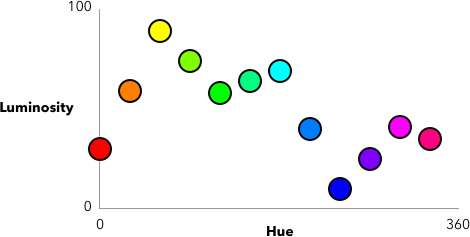
Look, Sherlock, a pattern! 🧐
And this particular pattern answers our question from above. Remember how we saw that sometimes, for a shadow, hue would shift down and sometimes it would shift up? Why does it do that?
Well, first, notice that this graph has three maximum points and three minimum points. The low-points are red, green, and blue. The high-points are cyan, magenta, and yellow.
Does these particular colors ring a bell? Yes. RGB and CMY are popular color systems, but ignore that for now, because it’s leading you astray.
The important bit is this: if you don’t count saturation and brightness, shifting hue towards red (0°), green (120°), or blue (240°) will decrease the luminosity, or perceived lightness of the color. And shifting the hue towards yellow (60°), cyan (180°), or magenta (300°) will increase the perceived lightness of the color.
The trick is to just make the movement of the hue match up with the movement of the saturation and brightness. If you want a darker variation, move the hue towards red (0°), green (120°), or blue (240°), whichever is closest — and vice versa (with cyan, magenta, and yellow) for lighter variations. (Of course, this assumes you’re also lowering brightness and increasing saturation)

That’s why the shadow on the coral wall shifted down in hue — it was shifting towards red, at 0°, which is the nearest minimum point to 21°.
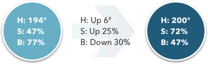
And that’s why the shadow on the teal wall shifted up in hue — it was shifting towards blue, at 240°, which is the nearest minimum point to 194°.
Mind blown yet?
The Way of Color
So when it comes to color variations, ask yourself: do I need simply a lighter or darker variation on a color I already have?
(And if you’re going for something clean and simple, the answer is so, so often yes)
Darker variations:
- Brightness decreases
- Saturation increases
- Hue (often) shifts towards a luminosity minimum (red, green, or blue)
Lighter variations:
- Brightness increases
- Saturation decreases
- Hue (often) shifts towards a luminosity maximum
This will allow you to take one hue, but modify it endlessly for all your UI needs, using darker and lighter variations where appropriate.
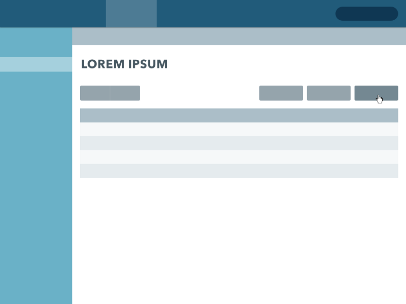
I just whipped together a quick example here. A whole interface being built out of a single color. Say… does that shade of teal look familiar?
Now I’ve been pretty brief with all of this. There are still many topics to cover:
- Do you move saturation or brightness more?
- How is hue even more important in gradients and data visualization? (my gradient generator has more on that 😎)
- When you’re in Figma (etc.), what technique do you use to make darker variations?
- How do you find grays that match your color scheme?
- How do you pick totally unrelated colors that look good together?
- How do you fix it when colors clash?
- And, of course, just why are RGB and CMY the low/high points on the luminosity graph?
These are all things I cover in Learn UI Design, my online video course that is a complete curriculum in user interface design. The color section alone is 9 videos totaling almost five hours. So we got into some serious detail on all of this. Anyhow, you can read more on that here. As for the color stuff? We’re done 🫡
So next time you sit down to start working on a design, switch your color picker over to HSB, recall the power of color variations, and give it a shot. I found these concepts to be a game-changer. I hope the same for you.
Get the (Free & Updated)
UI Color Cheatsheet
Learn how to use color effectively in UI design, even if you aren’t “artsy” & have no design experience. The same strategies I use for my clients – from Fortune 100 to Y-Combinator startups.
Practical design tutorials. Over 60,000 subscribed. One-click unsubscribe.