Why Beginning Designers Don't Need to Learn Grids, Type Scales, or Color Theory (and other “Designer Dogma”)
If you want to be a better designer, it’s pretty natural to Google around for articles on UI design – but the truth is: most of them are not useful for making your designs better. As if there was something else we were all trying to do?
I want to talk today about “Designer Dogma”. These are the things that literally no design blog posts seems to come out against, yet are completely useless when it comes to making crappy designs look nice. BUT rather than just complain, I will tell you what to focus on instead to achieve the same ends.
Here’s the things I’m metaphorically punching in the face today:
Feel free to skip to whichever you’d like!
Grids
Seriously, grids are the bane of my existence. If I had a penny for every time someone asked me about getting better at grids, I’d verifiably have… checking my inbox… a buck and change. OK, fine, but I’m still pissed off about them.
Why do designers always talk about grids? Simple answer: they work brilliantly in print design. But the moment you have a screen that can change size, throw your grid system out the window.
But the moment you have a screen that can change size, throw your grid system out the window.
By the way, here are some instances of screens “changing size”:
- Any website that needs to work across mobile, tablet, and desktop browsers
- Any website or app that needs to work across multiple mobile devices in the same platform (e.g. iPhones come in widths of 414, 375, 360, and 320 pts; don’t even get me started on Android devices)
- Any website or app that needs to work when the device is flipped
- Any website where the browser can be resized
Oh, wait, so, like, EVERYTHING?
Yup.
Also, what does a 12-column grid even mean on a device that’s 320px wide? We’re talking about elements that are, at minimum, 26px wide. That’s not even the minimum tap target size! (by anyone’s standards)
If the user upgrades their 320px phone to a 360px phone, is the proper response to make every grid-aligned element 12.5% wider!? No way.
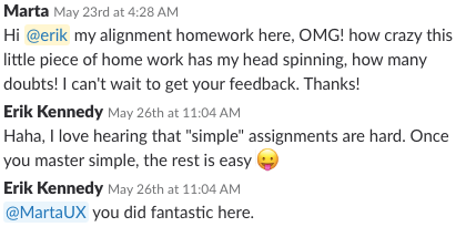
Many of you who’ve written to me have a sense that grids in digital design are not all they’re cracked up to be. So what to do instead?
Instead of grids, focus on alignment
The value of grids is that they line up all your elements. This makes your design look neat and clean. This is a surprisingly difficult skill, which is why I send all new newsletter subscribers an email about alignment AND I wrote a blog post on advanced alignment strategies AND Learn UI Design has a 35-minute video on it which covers even more stuff.
Oh, and it’s why Learn UI Design students are surprised when they do the Alignment lesson homework:
The hassle with grids is that they force the content into a specific width. Content should always dictate it’s own width (another post on this, I promise), and the layout should follow suit.
Content should always dictate it’s own width, and the layout should follow suit
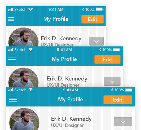
By the way, when you’re working on a mobile project, keep it simple. I just use a few rulers to match the content:
- 16px from left
- Center
- 16px from right (both iOS and Android default to 16px side margins for mobile devices)
(And if the width is odd – like our dear 375pt iPhones – then I’ll place one on either side of the true center. So: 187pt and 188pt)
I’ve found this to be the ideal “mobile grid”, for what it’s worth.
These 3 rulers actually get you almost all the alignment you need with a mobile device.
The moment you run into a row with multiple items across it, just ask “what does the content want?” and do that.
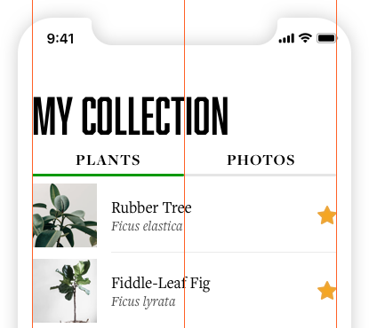
Here the photos are 72px wide, literally only because (A) most photos of plants appear fine at that size, and (B) that’s a nice number that lots of images seem to be scaled down to.
Then the text is indented 16px, since it’s consistent with the outside margin. And the text takes up the rest of the row, save for the little star icon that’s always aligned-right with the ruler.
This works fine, since the photos have enough space, the text has enough space, and everything looks great.
But the main point is: the content dictates the size it wants, and then you just align everything. This is the trick on mobile, it’s the trick on desktop, and it’s one of the biggest tricks for responsive design in general. But more on that later, eh?
Type scales
Much like drinking absinthe or the watching the seventh season of LOST, the golden ratio type scale is something that seems far more mysterious and cool before you actually experience it.
Nonetheless every typography site I can find seems to believe it’s the be-all-end-all of gorgeous typography. What gives?
The general idea is that the ratio between your font sizes should all be the same. So you multiply your body text size by something to get your subheader size. Then you multiply your subheader size by the same thing to get your header size. And likewise for your page title size. You get the idea.
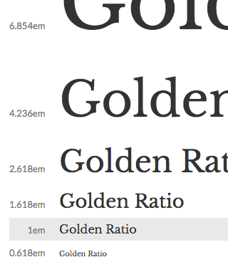
If you’re really feeling spunky, you can use 1.62 as the ratio between each successive size – that’s… like… the golden ratio, dude!
Of course, you could use other ratios too, which, in a bit of pretension I cannot forgive, usually seem to be named after the names of intervals in music theory – “Perfect Fifth”, “Augmented Fourth”, and so on.
OK, so first of all, I’ll save you the effort: if you try this on a design that looks crappy, it will… still look crappy.
But beyond that shocking result, it actively hurts your design if you’re making a responsive app.
Here’s the golden ratio type scale on mobile:
Holy honkin’ headlines, Batman! What is going on here?
Instead of type scales, focus on corralling attention effectively
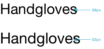
The primary benefit of type scales to your actual designs is that they prevent confusion between various text sizes. For instance, the difference between 10 and 12pt fonts…
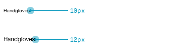
…is not the same as the difference between 50 and 52pt fonts.
As long as you remember this principle, you don’t need to follow the overly prescriptive formalities of a modular type scale. You simply adjust your font size as needed – a few points here or there for small text, but many sizes up or down when it comes to larger text.
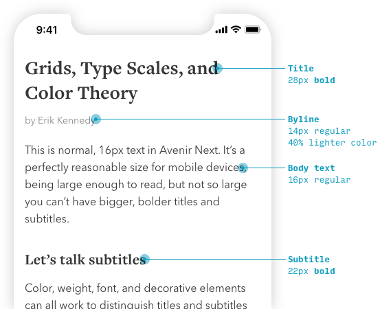
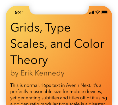
In picking the font sizes for my blog (simplified design pictured above), I didn’t use ratios, but followed this sort of process:
- Started with a good, readable body text
- For the subtitle, make it large enough to be easily distinguishable (while quickly scanning) from normal body text. A bolder weight can help here.
- For the title, make it large enough to stand out from the subtitles, but not so large that any given title will run 3, 4 lines
So, on one hand, your font sizes should be easily distinguishable, but on the other hand, they also need to be consistent. If you use 16px body text on one page, use the same on another. If you use 24px headers for one location in your app, use it for other similar locations. Failure to do this means more confusion for you (what do you pick for a third page then?), more work for the developer, and more code in the codebase.
Overall, the goal is to corral attention effectively. Text that needs to draw your eye should draw your eye. Text that’s the main point of the page should look like the main point of the page. Text that’s supporting but still essential should be findable when you look for it, but not immediately eye-catching.
Overall, the goal is to corral attention effectively.
And, in the end, font size is just one way of corralling attention (though I’ve written much more on font sizes here). You can also use color or contrast or weight or just a bunch animated GIFs, I don’t care. Whatever’s important needs to be seen first. Whatever’s second-most-important needs to be seen second, and so on.
Color theory
Oh, color theory. Where to begin with you? What a disservice that you can hardly search for anything on color in UI design without bumping into it.
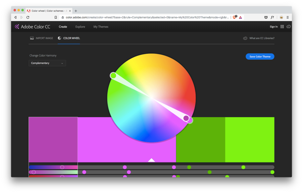
Let me save you a search or two. The top Google result for “color theory” recommends this as a “color scheme based on nature”:

…which should give you a pretty good idea of where this is going. Throw it out, put it in the Met – I don’t care. Just keep it away from any design I have to see.
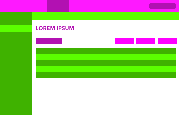
The most insidious issue with color theory is that it names certain color combinations, which make it incredibly attractive-sounding to someone who’s never actually tried to use one of those palettes.
You can’t build websites off this crap, people. Unless you want them to, ya know, look like this:
So what do you do instead?
Instead of color theory, focus on adjusting colors
If “color theory” is ivory tower musings divorced from real-world usage, then color practice is all about making variations on a base color.
It’s something that, once you see it, you can never un-see.
Ready? Facebook uses color variations for, like, all of it’s colored elements.
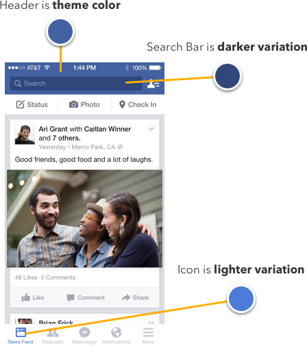
All kinds of sites use variations:
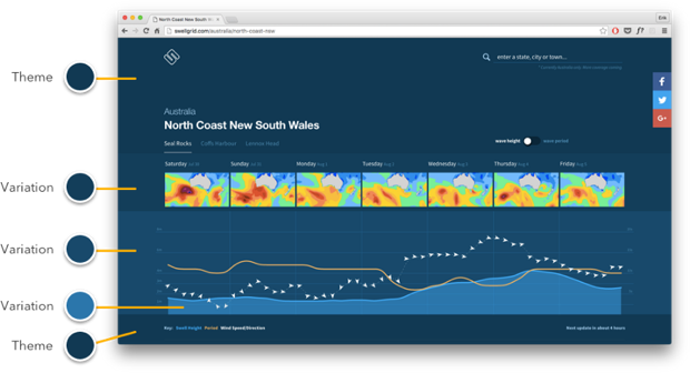
It’s not too hard – first, pick a base color, then vary its saturation and brightness to use it however you need.
I actually wrote a lot more in-depth on it here. But the gist is you can pretty quickly build out an entire interface out of basically just one base color.
Moving on.
Personal style
Much love to all those who’ve emailed me saying they’re having trouble developing a personal style.
Unfortunately, it’s usually a total UI beginner who has this weird misconception that unless their first marketing page is immediately distinguishable from the work of the world’s best designers, they just won’t cut it.
To them, I can only relay this quote from Paul Graham, tech investor and essayist extraordinaire:
At an art school where I once studied, the students wanted most of all to develop a personal style. But if you just try to make good things, you’ll inevitably do it in a distinctive way, just as each person walks in a distinctive way. Michelangelo was not trying to paint like Michelangelo. He was just trying to paint well; he couldn’t help painting like Michelangelo.
And that leads us to…
Instead of personal style, focus on craft
I couldn’t care less about your personal design style. I couldn’t care less about your 10 most-used Sketch plugins. I couldn’t care less about your workflow or your thoughts on design app du jour.
I just want to design good stuff – and hey, teach some others a bit of what I’ve learned.
One day, maybe I’ll have a personal style. Maybe you will too. But first, let’s focus on designing good stuff. There’s no shame in that.
Oh, and frankly, it’s only once you’ve mastered the fundamentals that you’ll be swimming in ideas with how you can do things a little bit differently or a little bit better. Those little ideas will become the natural foundation for your personal style. And what’s more: it will still be great, because the new directions you’ve gone are born of knowledge and experience.
Reducing Pick-a-Number Fatigue
I have a secret theory that many of the Designer Dogmas listed above – grids, type scales, color palettes – are about picking fewer numbers.
See, you may think the job of a designer is to craft usable, beautiful interfaces from cold nothingness, but honestly, we really just pick numbers out of a hat.
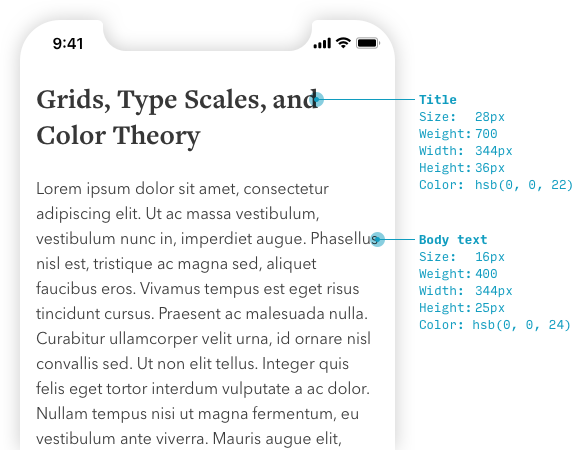
28px font at 700 weight with a line length of 344px, in flat gray (saturation 0% - wait, saturation?) with a brightness of 22%, line height of 36px. 24px of bottom margin later, we’ll have some 16px font and 400 weight with a line length of 640px again, line-spacing of 25px, and paragraph spacing of 20px, also zero-saturation gray with a brightness of 24%.
There you have it folks. It’s all numbers. And that’s just two elements! Imagine designing an entire app!
I believe the dread of picking a thousand numbers out of the void – and having to justify your choices to client and fellow designer alike – it can weigh on us, heavier than the existential dread of our short, pitiful lives, a brief 70-80 years that pass like a flicker of a bad filament, sandwiched between two quiet, cold eternities of darkness… and so type scales it is! Bring out the grids! I don’t want to pick any more than 10 shades of any of 4 colors! AHHH!
OK, hold on… Where were we?
Oh yeah: you can outsource the number-picking of UI design, or you can learn the rationales behind which numbers to pick.
Adding a 12-column grid is easy – mastering alignment is a more difficult task. Type scales are easy – balancing consistency with visual weight? Ah, that’s a deep subject. Creating a complementary color palette is easy – it’s the constant adjusting and tweaking your base colors that takes all the work.
You have two choices: outsource the number-picking of UI design, or learn the rationales behind which numbers to pick.
Let’s wrap this up.
What’s next?
If you’ve had a sense that some “designer dogma” you were told about wasn’t really the answer, you’re not alone. But where are you going to find practical tips and tricks to help you create good-looking designs?
Oh, have I got the newsletter for you. There’s over 60,000 subscribed, and some people like it a lot!
Watch me do a UI project step-by-step
I’ll walk you through every part of a UI project — just like I’ve done for everyone from Fortune 100 companies to Y-Combinator startups.
Practical design tutorials. Over 60,000 subscribed. One-click unsubscribe.