Do What's Hard To Do In Figma: A Design Manifesto
The designs we make are hugely influenced by our tools.
What our tools make easy becomes commonplace; what our tools make difficult remains rare.
If a design has a style that is both rare and done well, that design stands out. It feels fresh.
Inversely, if a design just uses the most readily-at-hand techniques our tools offer, it feels boring. I think it’s no accident that “boxy” is such a common complaint of clients. Rectangular images and rectangular textboxes, wrapped in rectangular containers? And you’ve done nothing to distract us from this fact? Sorry, you need to make it pop 😉
But if you, as a designer, want your designs to stand out, you should seek to use techniques and styles that are difficult in prevailing design tools. Perhaps the most simple way to phrase it is this:
Do what’s hard to do in Figma.
There are many levels at which you could take this advice.
For instance, by looking at what Figma makes easy, you could look for ways to slightly spice up a design’s visual appearance, while still remaining in Figma.
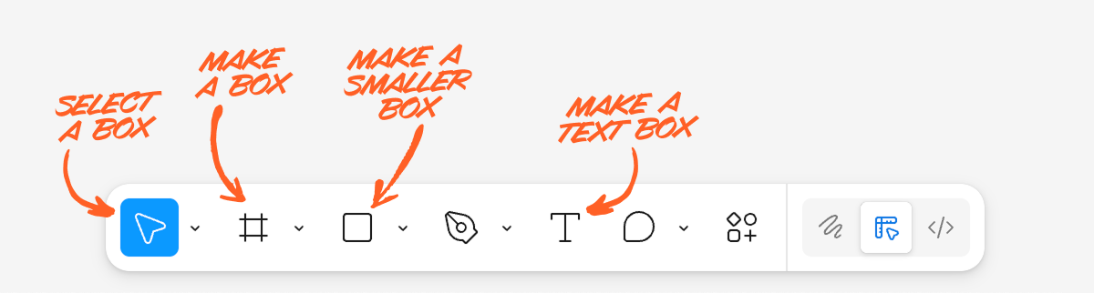
So what does Figma make easy? For starters:
- Rectangular text boxes with uniformly styled text
- Rectangular images
- Rectangular containers
And when we try to get one step more interesting than this, where does that lead us? Well…
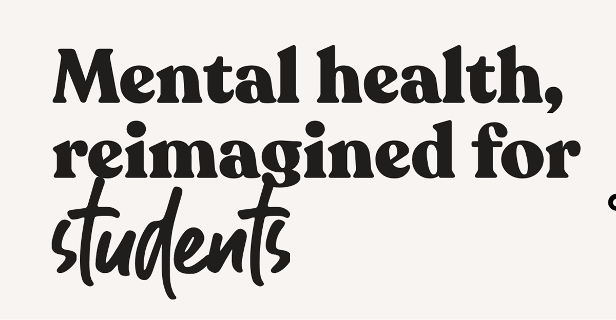
Instead of uniformly styled text, you could highlight a word by way of changing fonts.
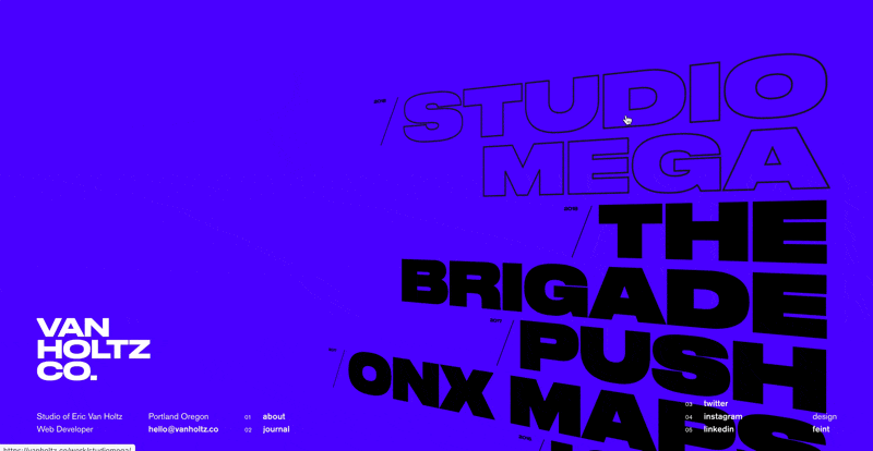
Instead of rectangular images, you could crop with an organic shape – while allowing some of the image to “spill out” from its container!

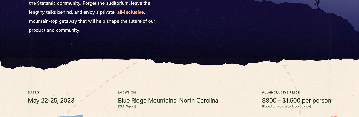
Instead of rectangular containers, you could make your section divider mimic a material that fits your brand.
These examples are all from the Visual Interest Table, a database of techniques for spicing up a design. It‘s included as a resource in Landing Page Academy, my course on designing beautiful, high-converting landing pages.
Of course, the above techniques are still readily achievable in Figma. If we wanted to move farther afield, we could look at what‘s impossible or virtually impossible in traditional vector editors.
And, interestingly enough, many of the techniques that are impossible in Figma are, at this moment, becoming dramatically easier, thanks to AI. We‘re on the threshold of the most massive design tool and workflow shift of the last few decades, and now is a particularly advantageous time to explore what‘s freshly possible.
In that spirit, the rest of this article is a handful of things that (a) are quite hard to do in Figma, and (b) that you may reasonably consider exploring adding in your own designs.
(Are there more ways than these 10? Of course there are. But in enumerating, one makes less intimidating. Enjoy ✌️)
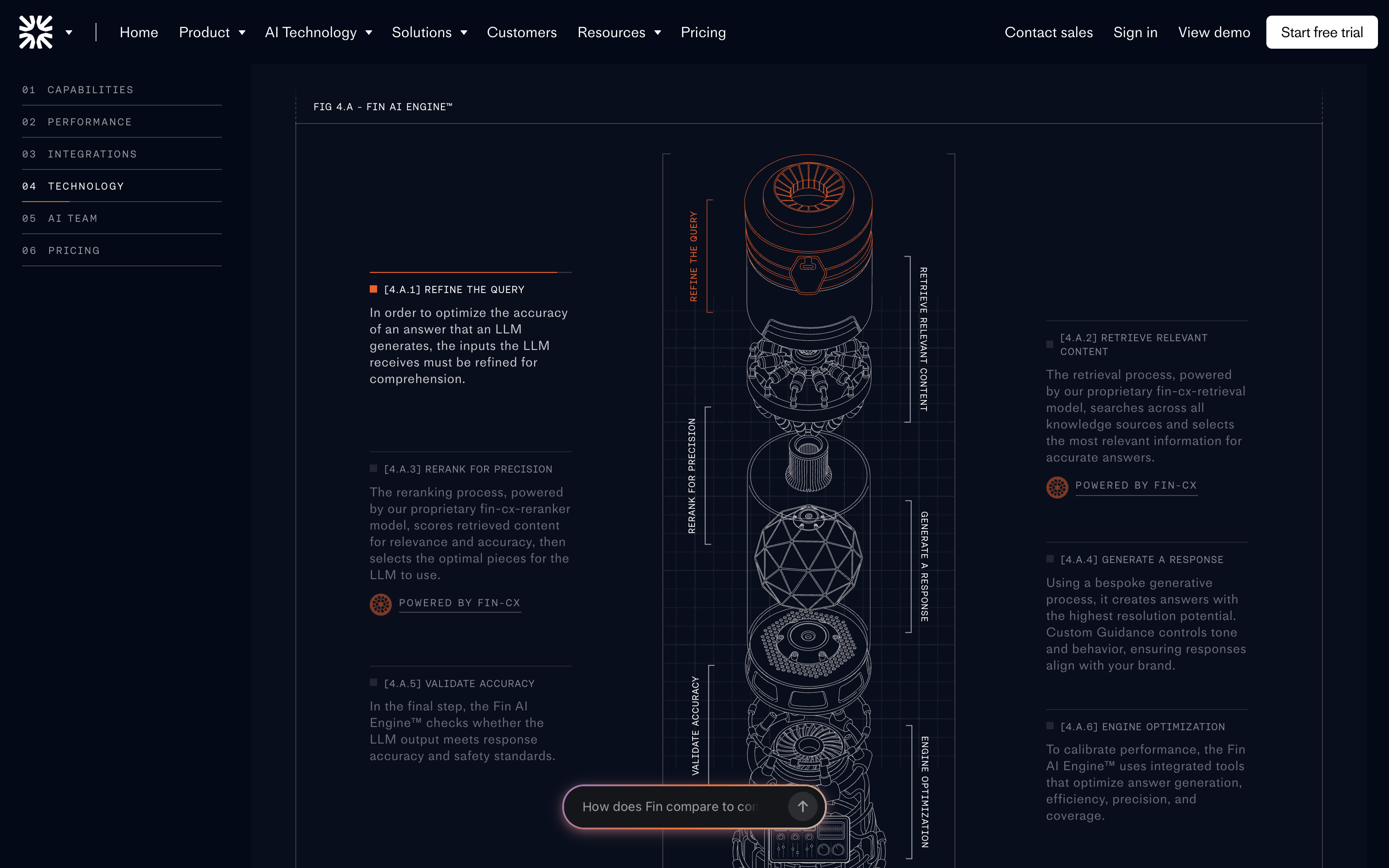
1/ Shaders and WebGL effects
A previously fairly-obscure technology, shaders are a way to create performant code-based drawings and animations to an HTML canvas element.
AI and new specialty tools are democratizing the ability to work with this technology.
Preferred tool: Unicorn Studio
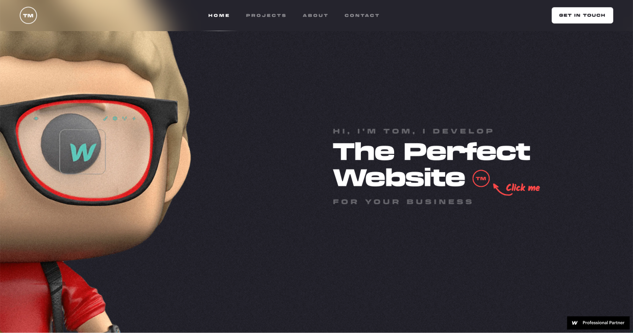
2/ 3-D imagery
Because the web is 2-D first, 3-D assets have always required complex specialty tools, like Blender. Now, AI-based tools (Meshy, Spline) are promising to make this easier – and, for an even quicker prototype, simply request a 3-D style from an AI image generator.
3/ 3-D front-end effects
As noted above, 3-D is a second-class citizen on the web. Nonetheless, with CSS and JS, you can skew, rotate, and move elements in 3 dimensions. In the broader context of the web, why do we hardly ever see these things? Perhaps because they’re all but impossible in Figma! A designer must think outside their design tools in order to even consider these effects.
Because of this, the bar is low. Even the most vanilla of 3-D effects can turn heads and looks fresh.
Preferred tool: designing with code in-browser

4/ Isometric illustration
Isometric illustration is the baby brother of true 3-D. It’s not easy to do in Figma, but, since there is no depth to it, it’s at least possible. That being said, I eagerly await an easy & powerful isometric-native tool.
Preferred tool: Easometric Figma plugin
5/ 3-D Animation
3-D and animation are both “hard in Figma”. Put them together, even more so. Blender (open source) and Cinema 4D are the industry standards here, but I’ve not gone down this rabbit hole yet, so I don’t personally have a recommendation 🤷♂️
6/ Front-end animation (SVG or HTML)
You don’t have to master Blender to include bold motion effects in your site. If what you want to animate can be created in Figma, then it’s almost certainly animatable via HTML – or, lesser-used but certainly powerful - SVG.
Props to Josh Comeau for his Whimsical Animations course, which turned me on to SVG animation. With SVG, you can draw in Figma, export as an SVG, and then animate in code – via LLM or by hand.
Preferred tool: Figma for static design + coded animations
7/ Custom video
As opposed to stock video, which is one-size-fits-many, there’s a certain proof-of-work in having a video made for your site only. There are many examples of this, and it’s by no means a rocket science-level example, but it’s worth calling out as Hard To Do in Figma.
I’m sure there are AI-based tools for e.g. inserting your product into a short video, but I’m not sure the leading workflows. Leave a comment if you are, and I’ll update this 🙂
8/ Custom photography
What photo wouldn’t belong on any site except yours? That’s a custom photo.
Even though this is perhaps the oldest, most basic technique on this list, high-quality, on-brand photos still feel under-utilized! Perhaps it’s because you need basically professional-grade photography to actually look sharp.
Here are a few of my favorite examples:
9/ Custom illustration
There are a number of places where illustration shines relative to photography:
- Friendlier brands
- More abstract products
- Cohesive and unique visual styles
Again, quality matters. And while basic illustration isn’t rare in Figma, next-level art skills are.
10/ Front-end effects
This is a catch-all for minimal-code effects that can make a big difference. Think creativity with respect to:
- Hover effects
- Scroll effects
- On-appear animations
This category sort of blends into 3-D front-end effects and front-end animation, but feels worth calling out on it’s own. To all the parallax effects and cutesy hoverstates of the web, I salute you 🫡
Where to from here?
So yes: I view design trends through the lens of supply and demand. What is commonplace becomes boring. What is rare (and well-done) turns heads.
Through that lense, the implication is obvious. We’re at a tipping point right now. Within the last year – or even the last few months – many of the techniques listed above have become dramatically easier and more accessible to designers.
Yet, (a) realizing this and (b) executing these techniques on-brand and at-quality is not going to happen overnight. There’ll be a lag, and in the interim, I believe individual designers have an opportunity to create things at a much higher level than they could’ve a short while ago.
(I always try to practice what I preach, so, as a personal project, I’m creating a blog – yes, in 2026… – but with SVG animations, WebGL effects, and AI-generated video that I simply would not have done “the old-fashioned way”)
From here:
- View a list of easy-to-do-in-Figma ways to spice up your designs
- Get access to the Visual Interest Table, my easy visual database of ways to spice up your designs – only in Landing Page Academy
- Sign up for my newsletter of free, original design tips
- And, if I missed any techniques, leave a comment below 🙂
Loved this email!!! This deserves to be in a ‘how-to content’ hall of fame!
Steven Young
Fractional CMO
This is the first time in my life that I truly, completely, incomparably appreciated a newsletter… I (platonically) love you! Seriously, you have the best content ever.
Marika
Designer, Head of Branding/Graphics
Design Hacks
Over 60,000 subscribed. No spam. Unsubscribe anytime.