The iOS 17 Design Guidelines: An Illustrated Guide
In this article, we’re going to cover basically everything you need to know to design an iPhone app following standard iOS 17 conventions and style.
Maybe you’ve never designed an iPhone app, and have no idea where to begin. Maybe you’ve designed a dozen, but still want one place to reference best practices. Heaven knows Apple’s Human Interface Guidelines are awful to try and read.
Here’s what we’ll cover today:
- iPhone screen sizes
- Page layout
- Typography
- Navigation
- UI elements
- App icons
- Other iOS conventions
- Downloads
- Further reading & resources
iPhone Screen Sizes
Here’s the full list of iPhone screen sizes (drag this link 👉iPhone Sizes👈 to your bookmark bar to save it; get the downloadable PDF below)
| Device | Frame Size (e.g. for Figma) |
Export Scaling |
|---|---|---|
| 15 Plus, 15 Pro Max, 14 Pro Max | 430 x 932 | @3x |
| 14 Plus, 13 Pro Max, 12 Pro Max | 428 x 926 | @3x |
| 11 Pro Max, XS Max | 414 x 896 | @3x |
| 11, XR | 414 x 896 | @2x |
| 8+, 7+, 6+, 6S+ | 414 x 736 | @3x* |
| 15 Pro, 15, 14 Pro | 393 x 852 | @3x |
| 14, 13, 13 Pro, 12, 12 Pro | 390 x 844 | @3x |
| 13 Mini, 12 Mini, 11 Pro, X, XS | 375 x 812 | @3x |
| SE (gen 3), SE (gen 2), 7, 6, 6s | 375 x 667 | @2x |
| 5, 5s, 5c, SE | 320 x 568 | @2x |
| 4, 4s | 320 x 480 | @2x |
| 1, 2, 3 | 320 x 480 | @1x |
*display on phone is technically 2.61x
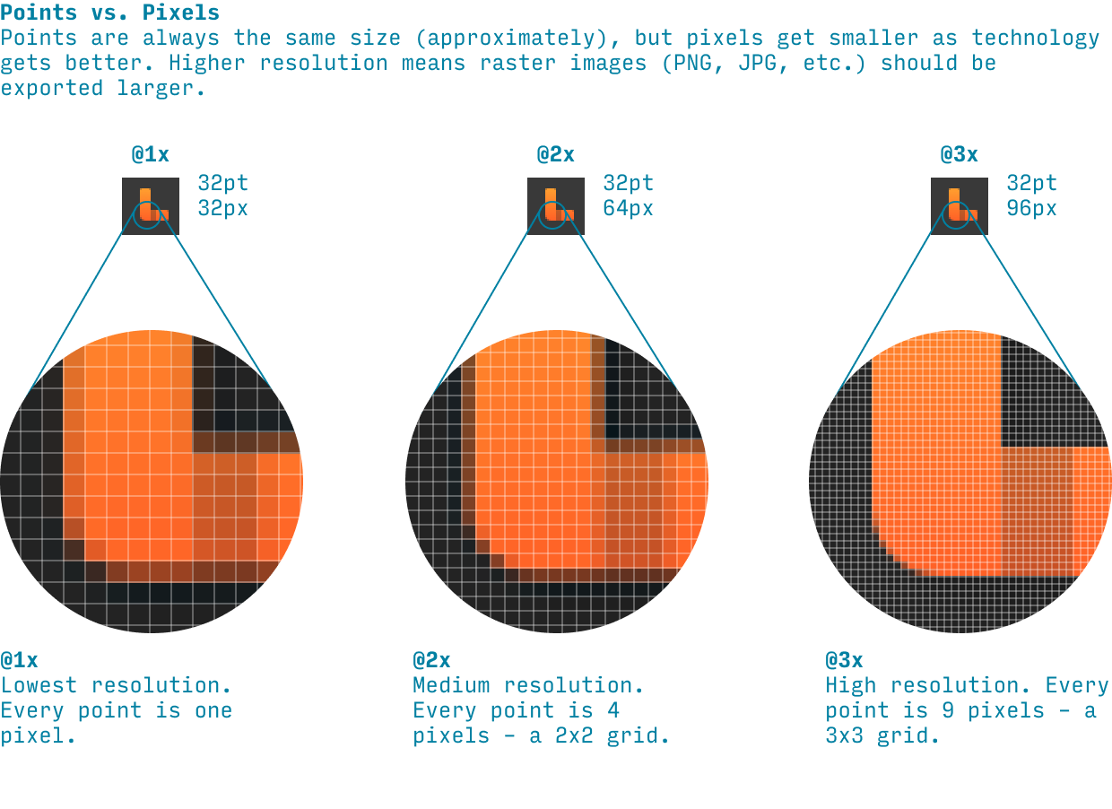
- Frame size. This is the “point size” or “@1x” size of a given device. I strongly recommend designing on frames of this size for a given device. (Here’s an explanation of points vs. pixels)
- Export scaling. This is how much bigger to make a raster image (PNG, JPG) when exporting to take maximum advantage of the higher resolution of some devices.
What size frame should I use for iPhone design?
There are a few things to keep in mind here:
- Prefererence smaller screens. A design that works well on a narrower screen (375pt) will almost certainly work well on a slightly wider screen (430pt) – but the reverse is not true. So it’s always better to design for narrower screens first, then double-check and adjust for larger screens. Since almost all sites/apps scroll vertically, height is irrelevant 👍
- Check your analytics. What screen size is most common for your audience? To check this in Google Analytics, search “Tech Details”, then scroll to the table and change “Browser” to “Screen resolution”.
- Absent anything else, start with 375x812. This is the smallest screen that might reasonably be fairly popular. But if you have a tech-saavy audience with newer iPhones, definitely get a glance at 390 (which is this site’s most common mobile width).
iOS Points vs. Pixels
A “point” is a measure for designers to compare the sizes of fonts and UI elements across iOS devices. A “pixel” is a tiny square of light that your iPhone screen is made up of. Smaller pixels mean a clearer image, which is great. But if you merely make your pixels smaller, everything on the screen would get smaller too! To balance this, designers measure the size of elements on the screen in points. Once technology was good enough such that pixels were roughly half as tall/wide as they started, we could just use a 2x2 square of pixels for every point (this is called @2x). And once pixels were roughly a third as tall/wide as they started, we could use a 3x3 square of pixels for every point.
Points is the unit that allows us to have higher resolution screens without all the elements on the page just shrinking. Yay, points! That being said, occasionally designers use the terms interchangeably, and you’ll just have to know from context which they mean. Boo, designers.
iPhone Page Layout
While different iOS apps have different layouts, many standard pages will have a layout something like the following:
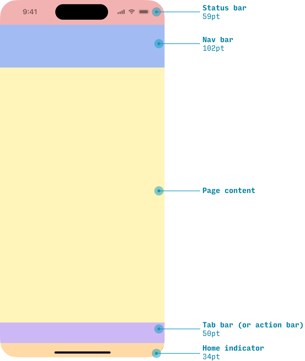
Note: in the downloads section below, I have an iPhone Figma template that has rulers dividing these page areas, plus the status bar and home indicator. It allows you to start filling in this framework of the page very quickly.
If you’re interested in a specific section of the page, you can skip ahead to that section:
iOS Status Bar
The status bar appears at the top of every page – except for some full-screen images, videos, or media.
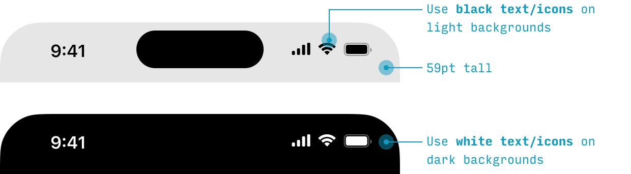
The status bar contains the time, signal, wifi, and battery indicators, and can be written (text and icons) in either black or white.
The background to the status bar can be any color – or even transparent. To find variations on a color that contrast suitably against white, use the Accessible Color Generator.
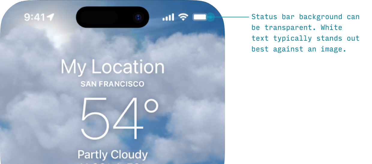
If you’re using a status bar on anything except the lightest of images, you’ll probably want to use white text.
Or, if you want a minimal status bar over a variety of images, use a background blur:
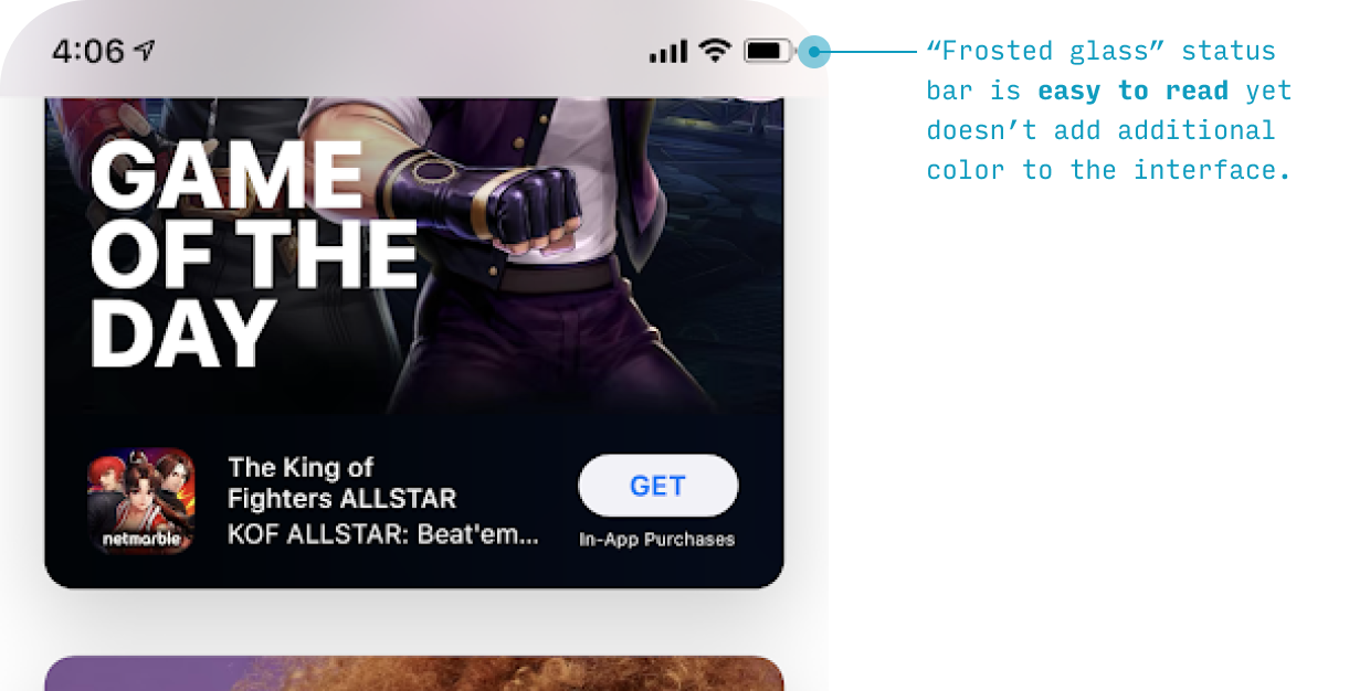
This “frosted glass”-style status bar doesn’t add any additional colors, borders, or needlessly attention-attracting elements to the interface – it merely blurs whatever colors are below it, making the text more readable.
In the example above, the light gray page background color is the “default” color of the frosted glass, meaning the text above it should be black (for contrast) – not white.
iOS Nav Bar
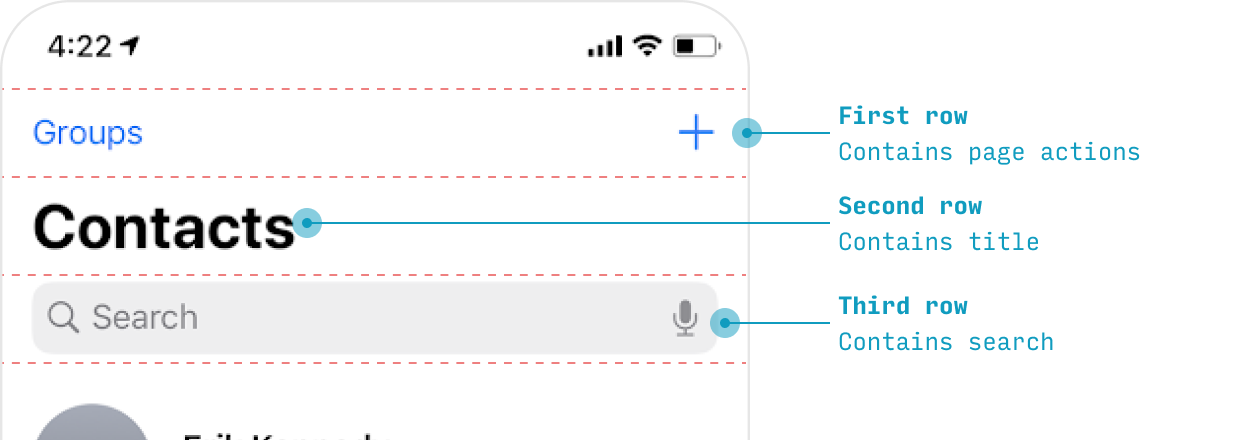
The nav bar is where the app displays navigation (surprise!), the page title, primary page actions, and – often – search.
You can think of the iOS nav bar as being comprised of up to three “rows”.
In my iPhone UI Figma Template, I include guides at all of these demarcating where these rows typically sit.
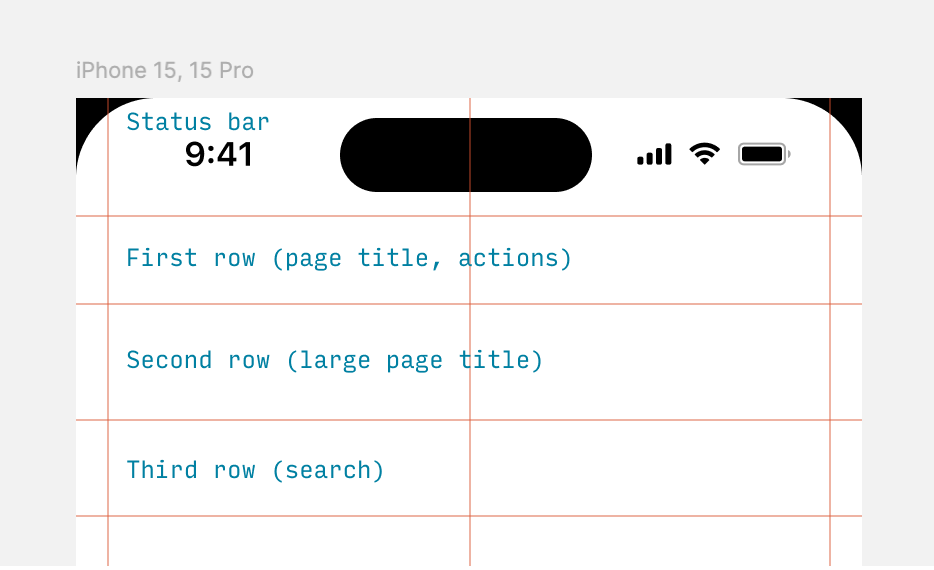
- Status bar: 59pt tall
- First row: 44pt tall
- Second row: 58pt tall
- Third row: 48pt tall
(These measurements are not always exact, and iOS default apps deviate from them somewhat, but they will get you started)
So an iPhone app will show one, two, or three rows, depending on (a) the needs of the page and (b) the scroll state.
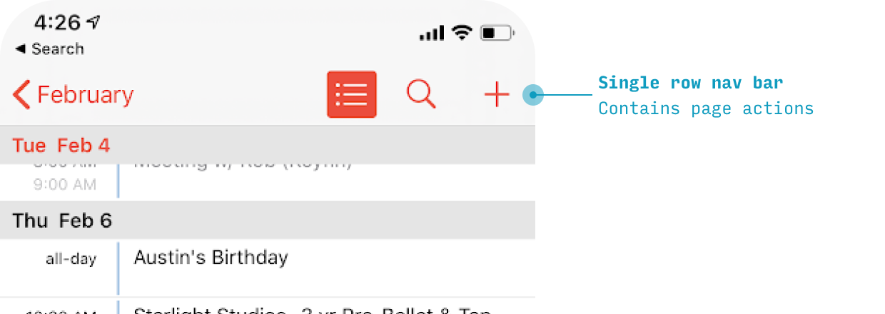
Use a single row if you just need to compactly display some page actions (even the page title is optional).
However, if you can afford the space, the default iOS app page layout contains two rows: one for page actions, and a second for a large page title.
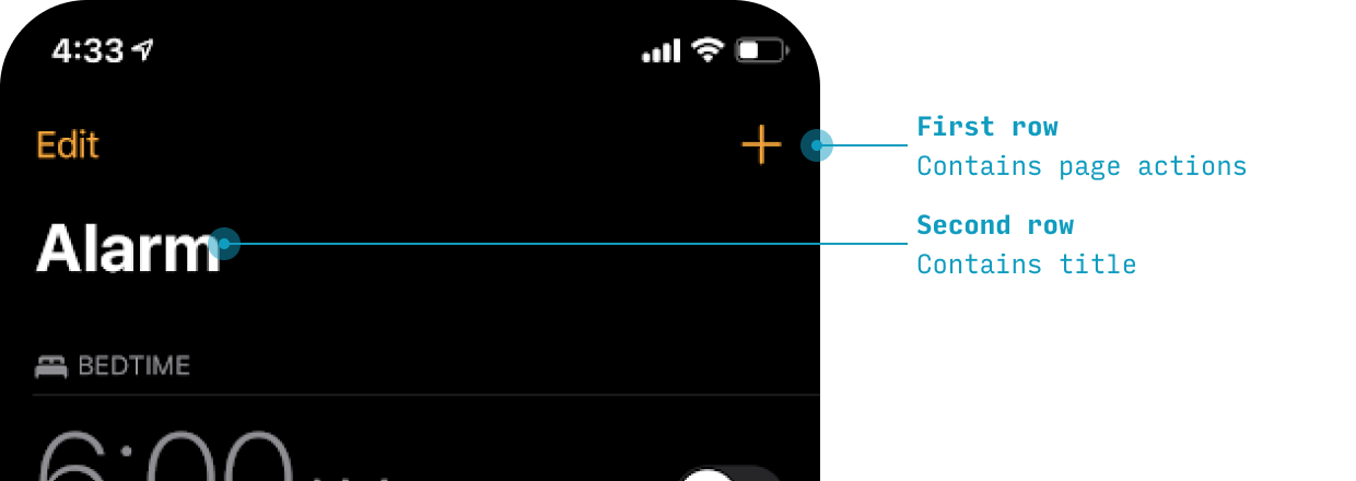
But if you need to show search, then you need a third row (even if the first row is left blank!).
Now the screenshots above only show the pre-scrolled behavior. As soon as the user starts scrolling, iOS specifies for some interesting behavior.
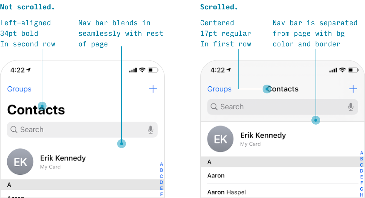
If a search bar is important to see at all times, it merely moves up from the third row to the second row while the app is scrolled.
If it’s less important, it will disappear entirely – only visible when the user is at the very top of the page.
When iOS nav bar rows disappear upon scrolling, they will re-appear when the user scrolls back to the top.
Note that the transitions between states is animated totally smoothly – a small, yet characteristic detail of the iOS style.
iOS Tab Bar
On iOS apps, primary destinations in the app are listed as tabs across the bottom.
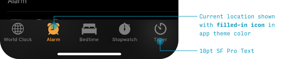
Let’s note a few things styling-wise:
- The selected icon is denoted with the app theme fill color
- The labels are 10-11pt text in SF, the default font
- The background can be ever-so-slightly translucent and have a background blur – the “frosted glass” effect, a la the nav bar
And a few notes on the behavior of the tab bar and its buttons:
- Different tabs remember their state. If you travel to a certain destination in one tab, switch to another tab, then switch back to the first tab, you’ll be where you left off in that tab – not the “main screen” for that tab
- If you tap the active tab, you’ll return to the “main screen” for that tab
- The tab bar is always visible within the app, except:
- When a keyboard is shown
- When a modal is open (during critical tasks, the user should focus on the task at hand rather than navigate to other parts of the app)
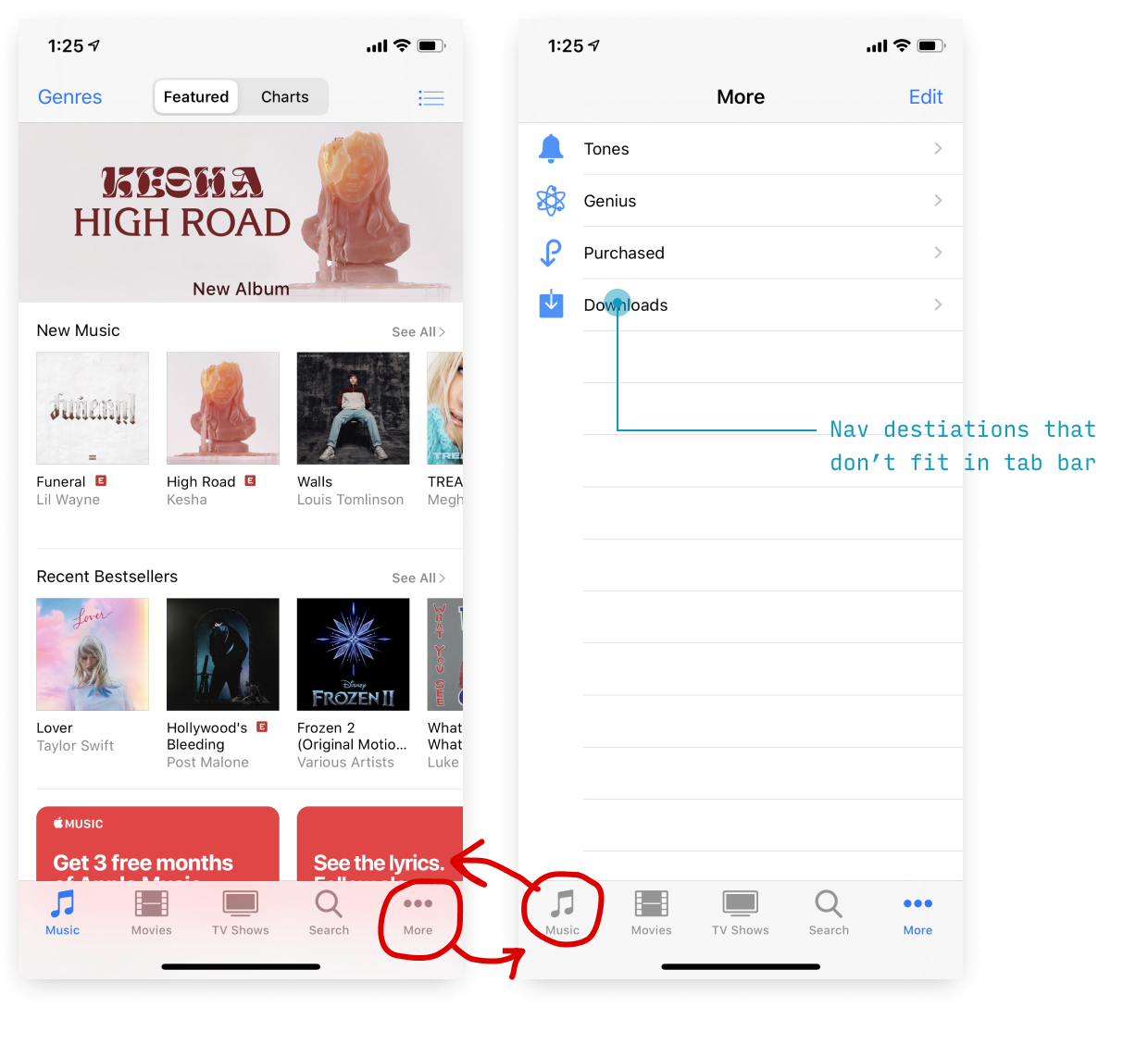
There should be 2-5 tabs in total. If you need to display more than 5, the fifth icons should be a “More” catch-all that shows other destinations on a quasi-picker screen when tapped.
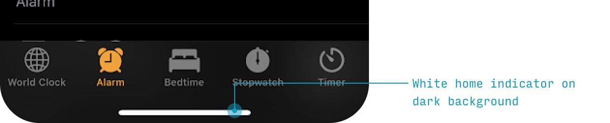
iOS Home Indicator
At the bottom of the screen is the home indicator – a thin, rounded bar omnipresent at the bottom of the screen (except for when you’re already on the home screen).
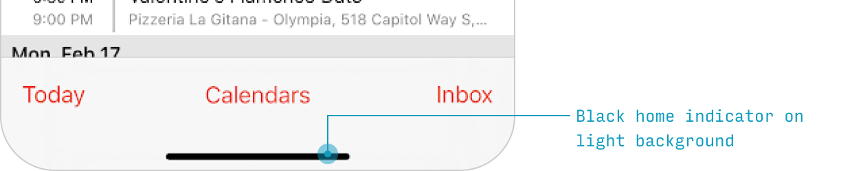
It is black on all light screens, but can be made white on darker screens.
And by dragging it up some amount, you can navigate between apps and to the home screen:
- Drag a short ways up: go to app switcher screen
- Drag a long ways up: go to home screen
Usually, the home indicator “owns” its own 34pt tall “box” that no other fixed elements can be shown in.
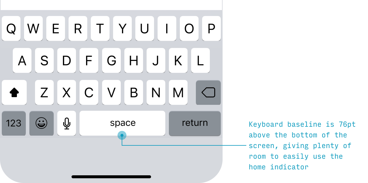
But scrollable lists can be shown scrolling under the home indicator – and you can even select the item directly under the home indicator by tapping. The home indicator only responds to swiping up.
Navigation in iOS Apps
Primary App Destinations
Navigating between the main areas of the app is covered in the Tab Bar section.
Navigating Back
On iOS, you can navigate backwards in 4 different ways, depending on the context.
| Method of Navigating Back | Context in Which it Works |
|---|---|
| Tap “Back” action on top-left of screen | Any screen on which a “Back" action appears |
| Swipe right from left edge of screen | Any screen on which a “Back” action appears |
| Tap “Cancel” or “Done” action on top of screen | Modal views |
| Swipe down on screen content | Modal or fullscreen (e.g. photos, other media) views |
The top 2 ways usually apply to the same screens.
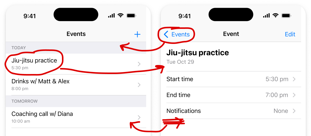
See the modals section below for more on how to navigate away from them.
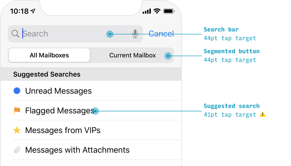
iOS Search
There are 3 primary entry points to search in Phone apps:
- The search bar in the nav bar
- A search icon in the nav bar
- A search icon in the tab bar
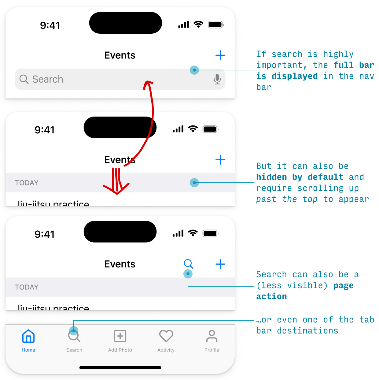
However, no matter where the search entry point is, the search experience looks fairly similar:
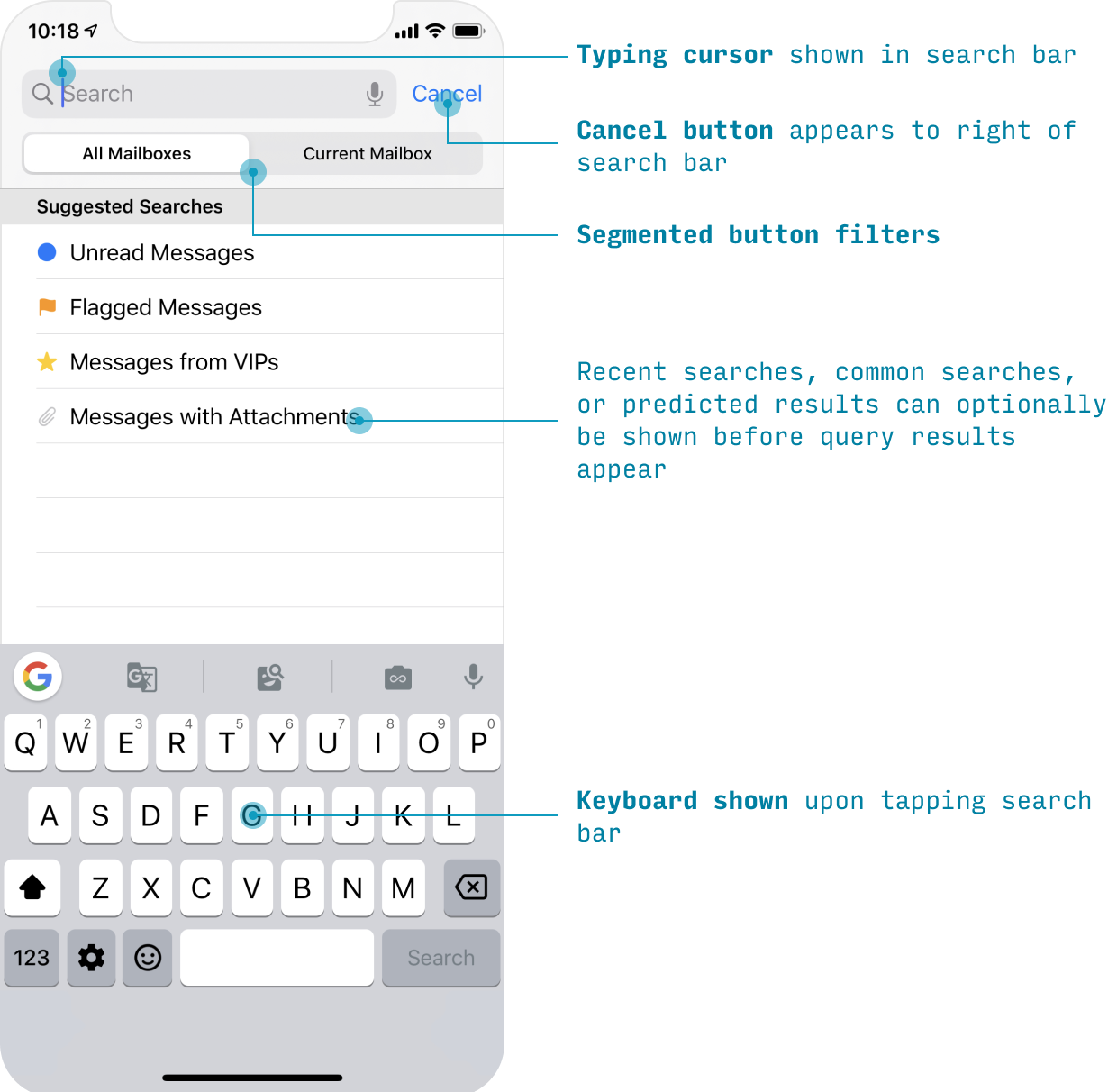
Optionally, you can show popular or recent searches below the search box. I cover some of the best practices for search experiences in my course on designing intuitive, easy-to-use apps, Learn UX Design.
iOS Modal Sheets
Some tasks involve a single screen – or a linear series of screens – that you want users to complete without totally leaving the context they were in.
We now have a perfect UI element for that: the modal sheet.
A modal sheet is a normal page that (a) slides up from the bottom covering almost all of the previous page, but (b) leaves the previous page visible, yet recessed, in the background.
Modals can be dismissed by:
- Pressing the “close”-like action at the top (above, it’s “Cancel” in the upper-right)
- Swiping down on the modal card itself
UI Elements & Controls
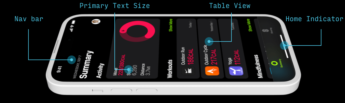
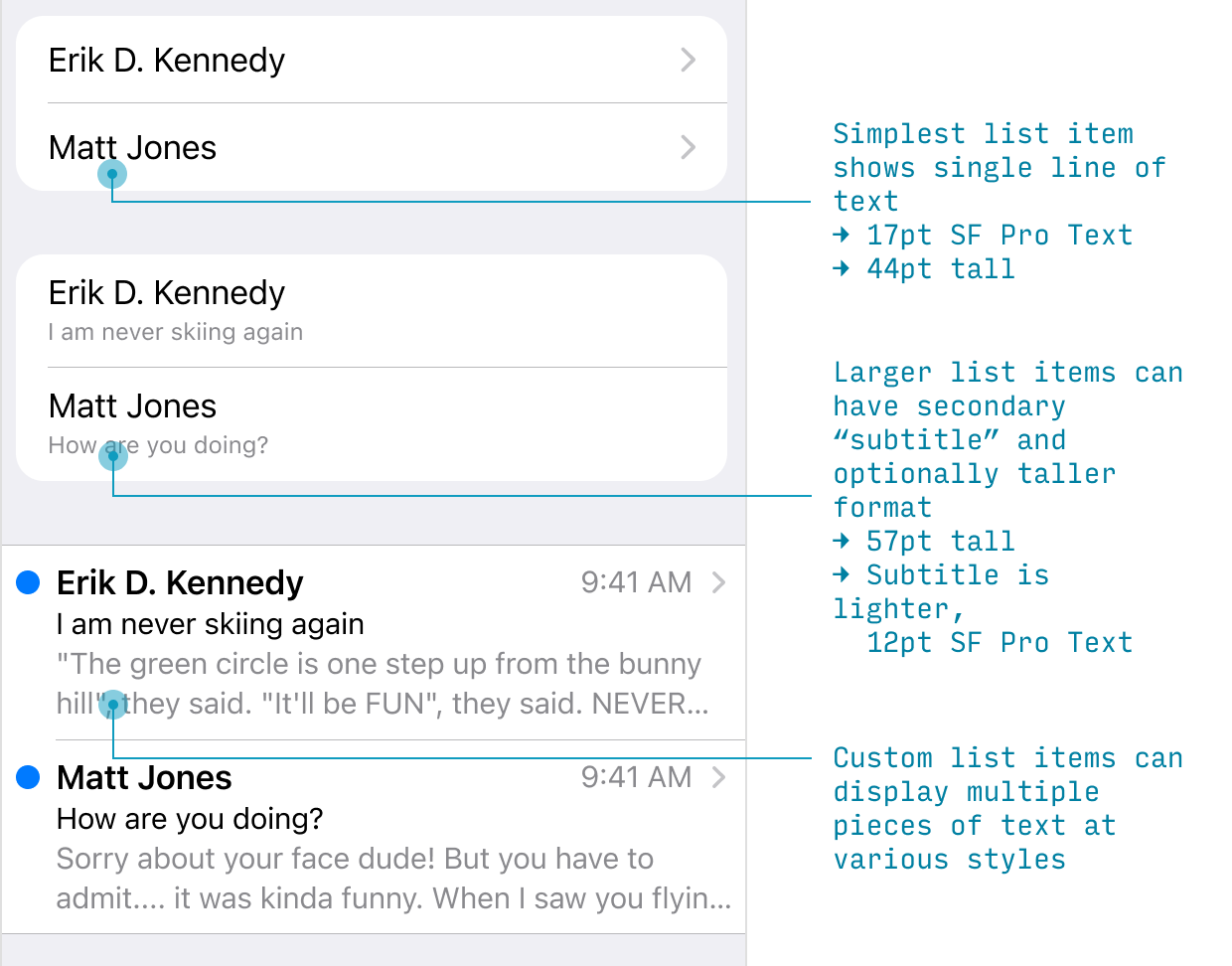
iOS Lists (AKA “Table Views”)
Remember: “90% of mobile design is list design”. If you want to get good at designing iPhone apps, learn how Apple thinks about its lists (or, as they say “Table Views”).
Any time you’re making a list on iPhone, you need to ask yourself three questions:
- What text do I want to display?
- Do I also want an icon/image?
- What goes in the right half of the cell?
Let’s cover each of these in turn.
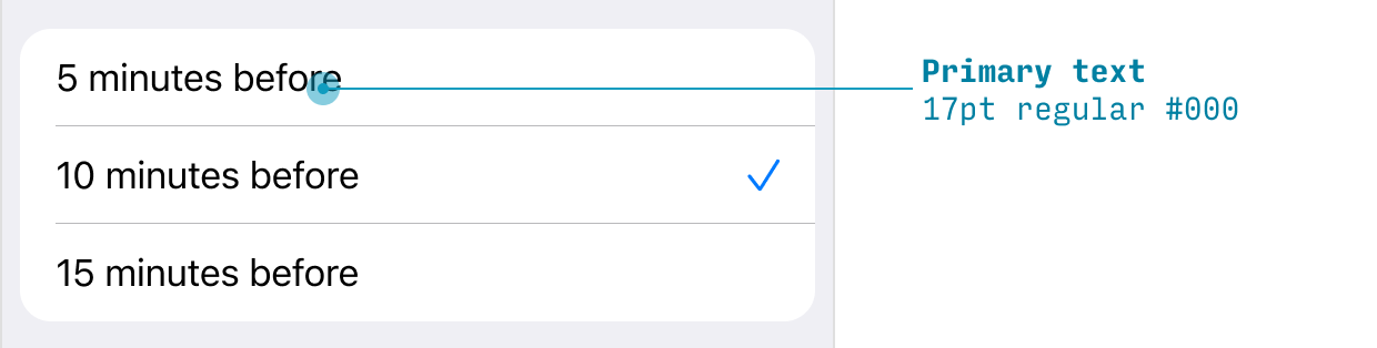
What text do you want to display on each list item? You can choose:
- Only primary text (17pt regular)
- Primary text (17pt regular) with secondary text (15pt or 12pt regular, depending on emphasis needed)
- Custom layout – e.g. primary text (17pt regular), secondary text (15pt regular BUT LIGHTER) and tertiary text (15 regular BUT LIGHTER STILL)
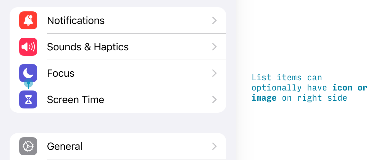
To the left of the text, you can optionally display an icon or image.
Finally, there are a handful of options for the right-hand side of a list item:
- A (right-pointing) chevron. Almost the default, this lets users know they’ll be navigating to another screen
- Text and a chevron. This means the user can navigate to another screen to choose the value to be shown here
- A checkmark. Allows the user to choose between one of the list items in that group (Note: not multi-choice, as web checkbox lists are)
- Switch. Allows the user to toggle the property that list item refers to on or off.
- Text buttons. Use a system color to link to another page or flow. Use red text to represent a “destructive action” – turning something off, deleting it, removing it, etc.
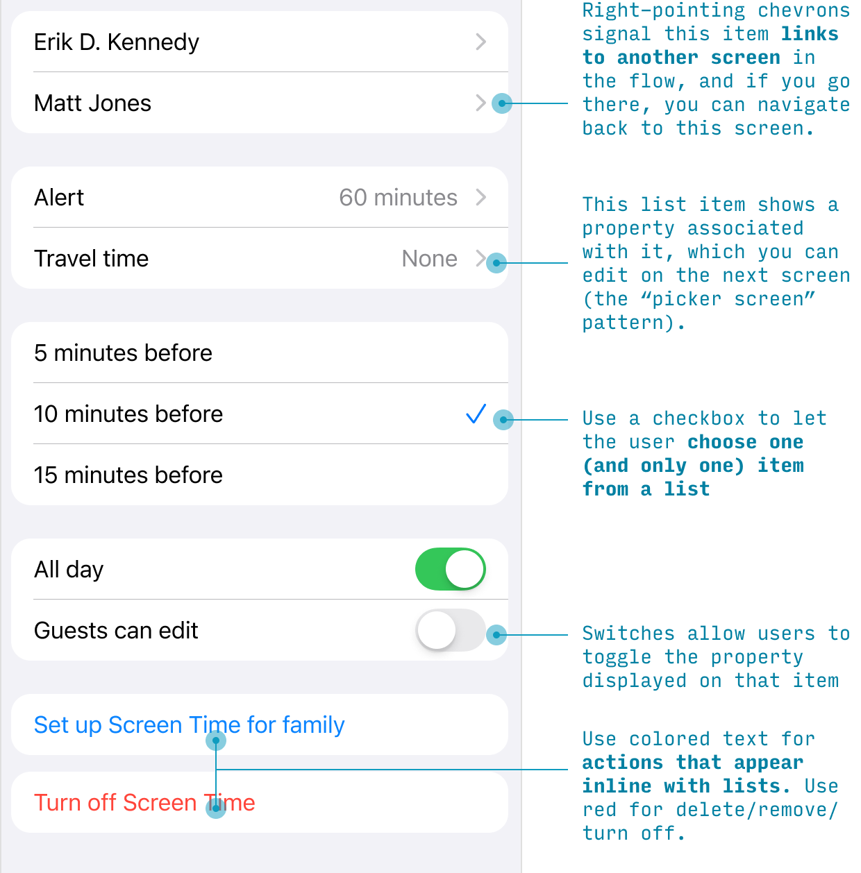
There are more iOS paradigms for what you can do with lists not covered here – but this is an overview of some of the most common ways to using lists. For more, check out input controls.
iOS Buttons
Usually we think of buttons as being colored rectangles with centered text – and iPhone apps certainly use those kinds. But if you’re coming from the world of web design, you might be surprised to realize that many buttons on iOS are simply either (a) icons or (b) colored text – in either (a) the nav bar (at the top of the screen) or (b) action bar (at the bottom of the screen).
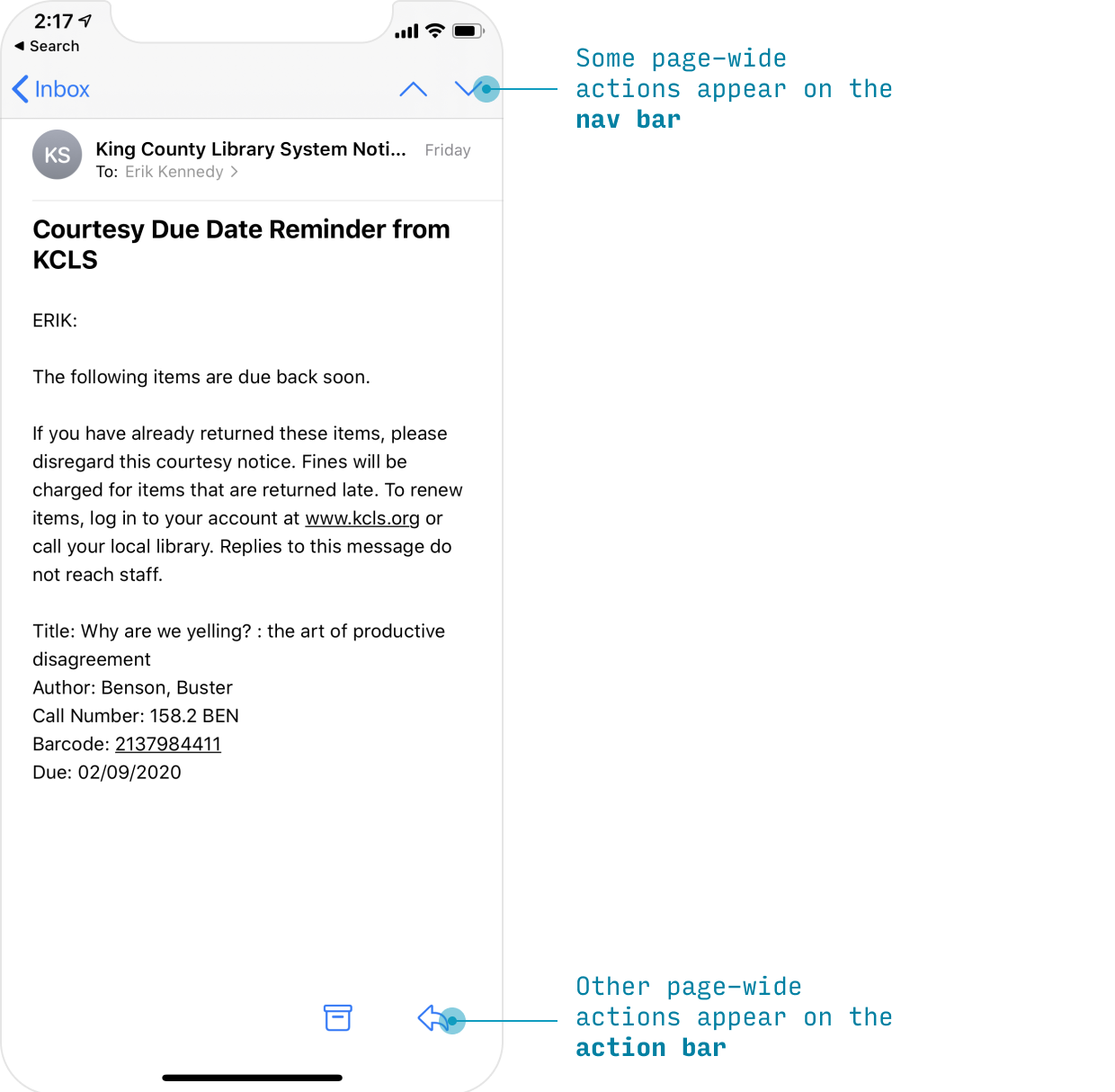
However, iOS does have on-page buttons as well.
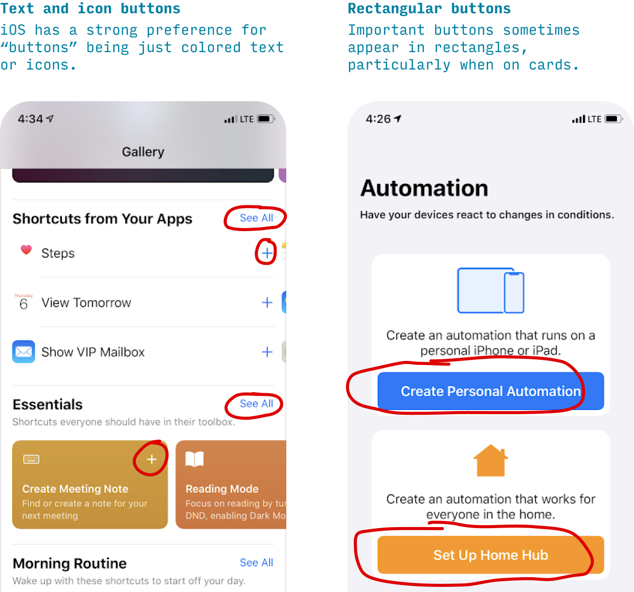
Because page-wide actions appear on fixed menus (the nav bar or action bar), many on-page buttons apply only to a certain part of the page – and hence will appear on cards.
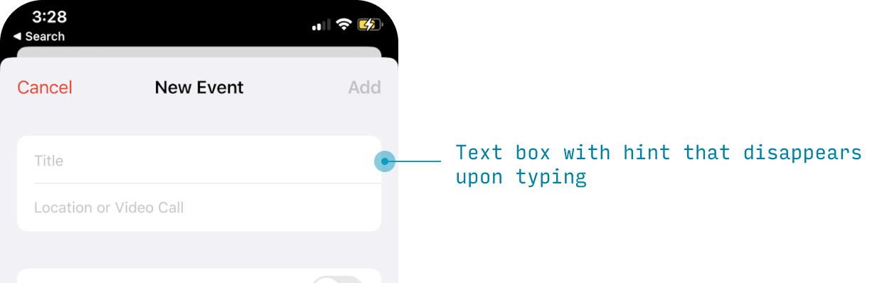
Input Controls on iOS
One non-obvious thing about how iOS apps do input controls is they’re almost all styled as list items.
iOS Text Boxes
Text inputs appear like a list item with a hint that disappears on typing.
iOS Switches
Switches appear within a list item with the label on the left and the binary choice switch on the right.
iOS Date and/or Time Pickers
Dates and times have a special light gray button treatment to signify that they’re special.
Tap one, and you’ll see a date (or time) picker control appear in place.
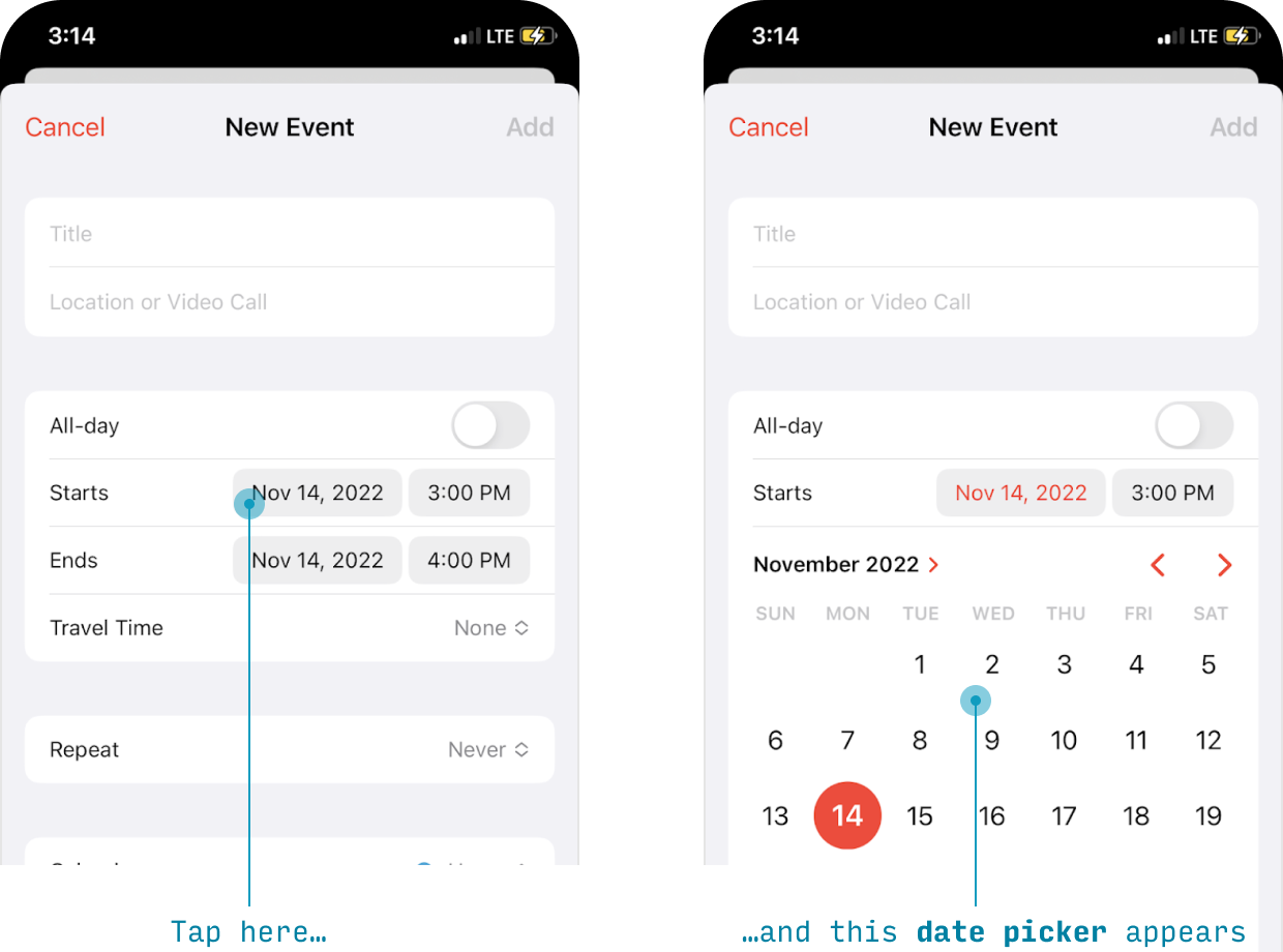
These controls can pick (a) just a time, (b) just a date, (c) both a time and a date, or (d) some other custom value. And there’s also a “spinner” style layout you can use (not pictured).
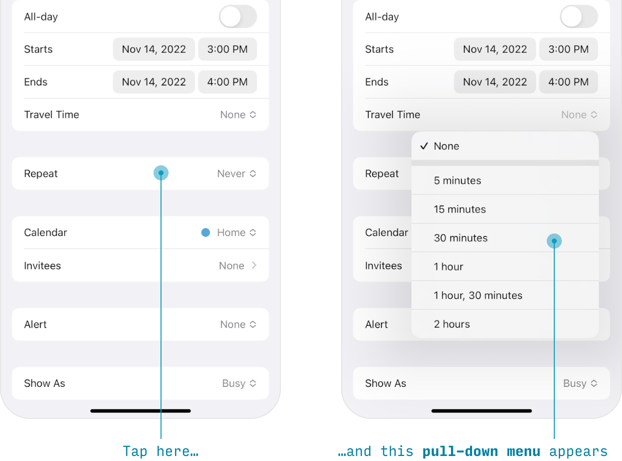
Pull-Down Menus
A newer control in iOS is the pull-down menu, which shows some extra options/actions without navigating to a different screen – much like a dropdown control on web browsers.
iOS Picker screens
The pull-down menu (above) is useful if you need to display a fairly short list of options, but for anything more complex, try the picker screen pattern.
The whole idea is that you have something resembling a list item, but it actually leads to another page where you pick the value.
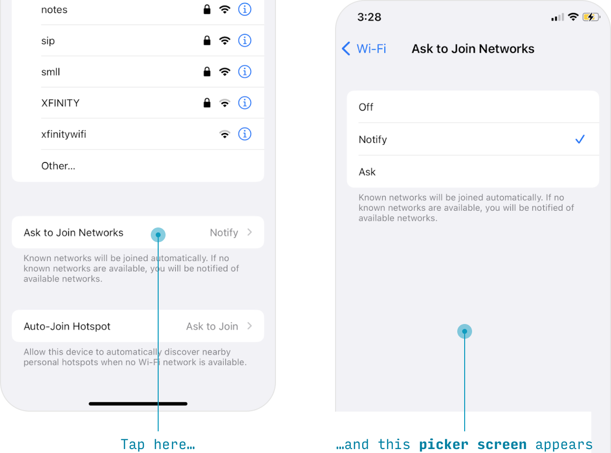
So, the ingredients:
(1) A single list item with a label, value, and chevron leads to (2) a page with many options in a list, one of which can be selected, and will show this state with a checkmark.
Once you’ve made your selection, you can navigate back with a swipe or by pressing the button in the upper-left.
Typography in iOS Apps
For more on iOS typography (and, in particular, font sizes), see my full article on it here.
iOS has a distinctive paradigm for styling text. Perhaps the most surprising lesson is that where many design systems style with size or uppercase, iOS styles with weight or color. We’ll unpack this lesson looking at many of the text styles across iPhone apps. Here’s a quick reference in case you want to skip ahead:
| Element Type | Style |
|---|---|
| Page title (unscrolled) | 34pt bold #000 |
| Page title (scrolled) | 17pt medium #000 |
| Paragraph text, List item titles, Links |
17pt regular #000 |
| Secondary text | 15pt regular #3C3C43 at 60% opacity |
| Tertiary text, Captions |
13pt regular #3C3C43 at 60% opacity |
| Buttons, Text input controls |
17pt normal, various colors |
| Action bar labels | 10pt regular #8A8A8E |
Title Text Styling for iPhone Apps
Page titles are written in two distinct ways on iPhone apps.
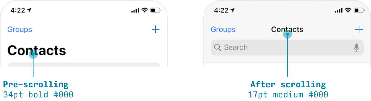
When the user hasn’t scrolled yet (or has scrolled, but then scrolled back to the top):
- Size: 34pt
- Font weight: bold
- Color: #000
- Dark mode color: #FFF
- Alignment: left
When the user has scrolled down:
- Size: 17pt
- Font weight: medium
- Color: #000
- Dark mode color: #FFF
- Alignment: center
Default Text Styling for iPhone Apps
The “default style” for text on iPhone apps is:
- Size: 17pt
- Font weight: normal
- Color: #000
- Dark mode color: #FFF
You can get a lot of mileage by making slight tweaks to this basic style.
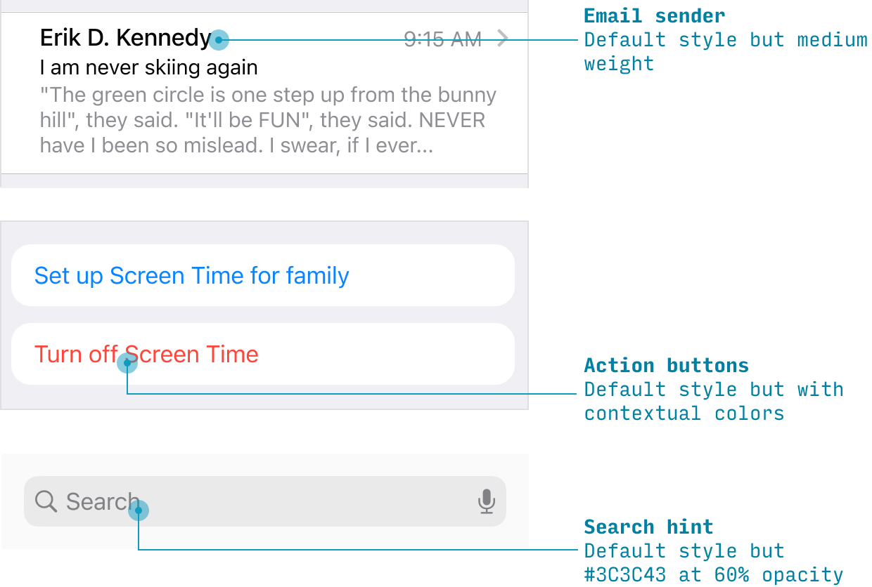
For instance, while normal list items are written with the default text style, the Mail app shows email senders in bold – as it helps the sender’s name stand out from the subject line and preview.
Likewise, text-based link buttons are basically the default text, but with different colors.
And search field hint text is the default text, but a lighter gray.
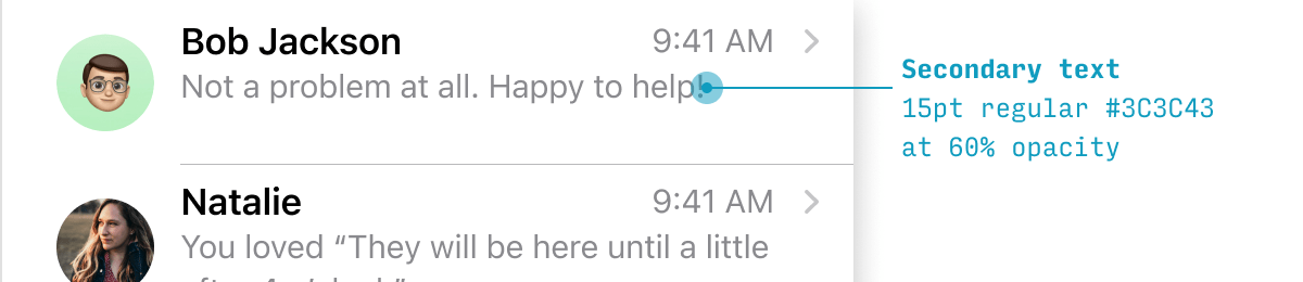
Secondary Text Styling for iPhone Apps
iOS apps have a standardized style for any supporting “secondary” text.
- Size: 15pt
- Font weight: normal
- Color: #3C3C43 at 60% opacity
- Dark mode color: #EBEBF5 at 60% opacity
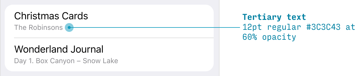
Tertiary Text & Captions Styling for iPhone Apps
Any explanatory “captions” are given an even smaller, lighter treatment than secondary text.
- Size: 12pt
- Font weight: normal
- Color: #C3C43 at 60% opacity
- Dark mode color: #EBEBF5 at 60% opacity
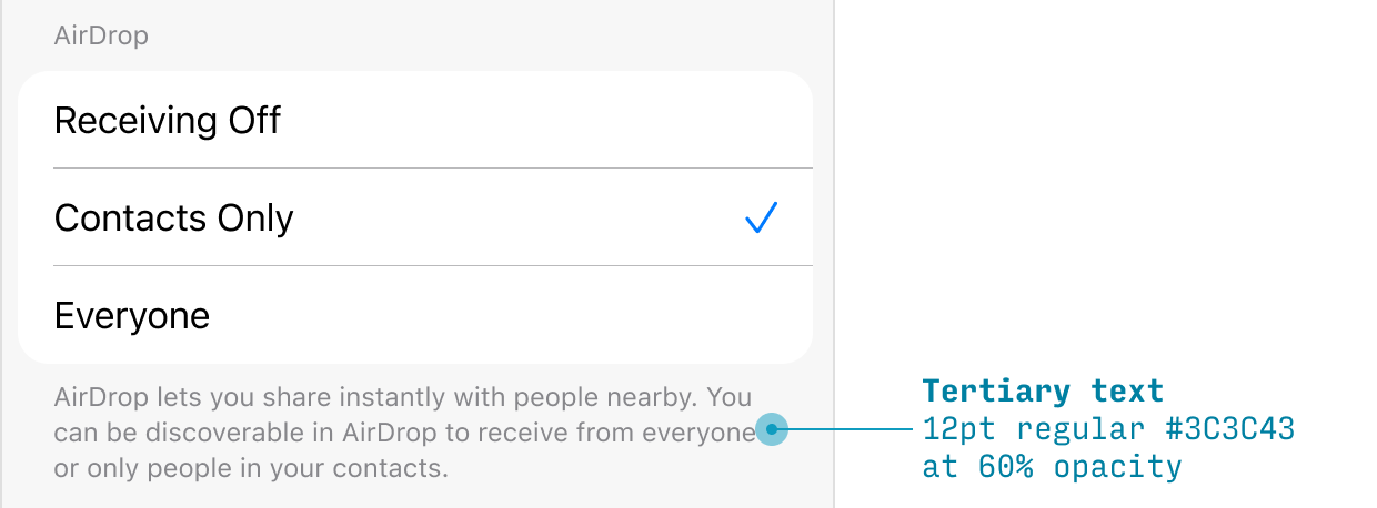
Also note that sometimes this tertiary size is used in a secondary manner – i.e. there’s only size 17 and size 12, with no size 15 text in between them.
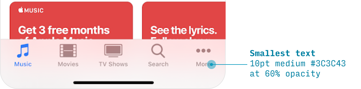
Minimum Text Size on iPhone Apps
With any design system, it can save you a lot of headache to just define a minimum size. For iPhone apps, that’s the action bar labels, at 10pt:
- Size: 10pt
- Font weight: normal
- Color: #999 (when unselected)
- Dark mode color: #757575 (when unselected)
iOS App Icons
iOS shows app icons in a variety of different places at a variety of different sizes. So there are two ways to go about generating all the sizes needed:
- Create a 1024x1024px icon and let Apple downscale it as necessary
- Individually create the specific sizes
What sizes do you need? For an iPhone app:
| Size | Usage |
|---|---|
| 87x87px | Settings |
| 114x114px | Notifications |
| 120x120px | Spotlight search |
| 180x180px | Home screen |
| 1024x1024px | iOS App Store |
Since the point of @3x phones is that you can’t see rasterization details, I no longer think it’s necessary to hand-craft every single icon size (unless you have want to e.g. remove tiny details in smaller icon versions). That being said, at least make sure the 180x180px homescreen icon is sharp. That will be the most seen, by far.
For more, see Apple’s official guidance.
The iOS Superellipse (AKA “Squircle”) Icon Shape
Even though you should always export your icons as squares, Apple will cut out the corners using a type of shape called a superellipse (where there’s a gentle transition from the curved part of the shape to the flat part).
This is sometimes called a “squircle”. I don’t make the rules 🤷♂️
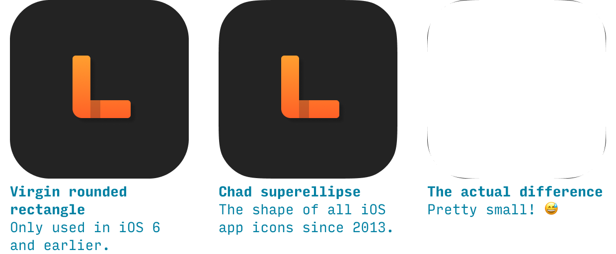
This means if your icon has a border, you’ll want to make sure it’s a superellipse, not a rounded rectangle.
Here’s how to create a superellipse/squircle in Figma and in Sketch:
How to create an Apple icon superellipse/squircle in Figma
- Create a square using the Rectangle menu item or shortcut “r”
- Change the corner radius to the length of one size multiplied by 0.222
- Open the Independent Corners menu (just to the right of the corner radius setting)
- Set Corner Smoothing to the “iOS” indicator, located at 61%
How to create an Apple icon superellipse/squircle in Sketch
- Create a square using the Insert menu or shortcut “r”
- Change the corner radius to the length of one size multiplied by 0.222
- Change “Radius (Round Corners)” to “Radius (Smooth Corners)”
Other iOS Conventions
There are a couple other things you should probably know about if you’re designing an iPhone app. I will just go ahead and list them here:
iOS Tap Target Size
Everything the user should be able to tap on – every button, every slider, every input control – should be at least 44x44 pts in size.
The only exception where it’s really excusable to break this is text links. In paragraph text, each line of text will likely be quite a bit shorter than 44pt. That means that (a) your links will have tap target of less than 44pt size and (b) if there are links in the same position in two consecutive lines of text, it will be pretty difficult for users to tap them accurately. While this can’t always be avoided, it’s worth knowing about this as something to minimize.
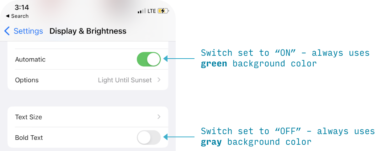
Dark Mode iOS Design Guidelines
iOS has an OS-level “dark mode” setting, where participating apps have (generally) dark backgrounds and light text, instead of light backgrounds and dark text.
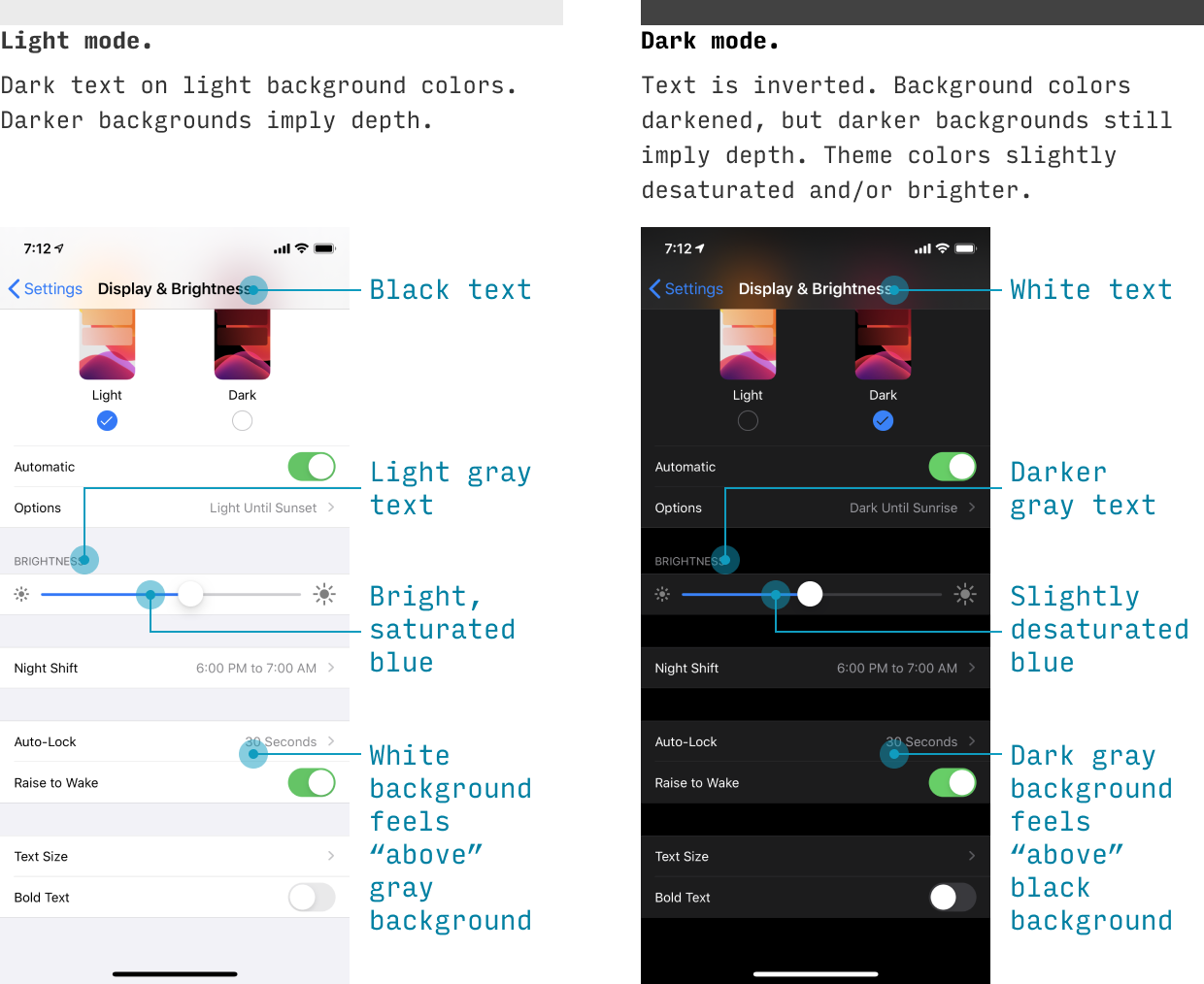
While iOS will automatically transition to the dark version if you’re using native controls and colors, you should understand the general principles of dark mode for any custom UI you do. Here are a few simple guidelines:
- Text colors are inverted. It’s a bit of an oversimplification, but black text becomes white, dark gray text becomes light gray text, and middle gray text stays basically the same. If you look at the typography styles above, you’ll notice iOS actually drops a few extra shades and simplifies the text colors for their dark theme. If you can’t tell whether you should make a middle-brightness gray darker or lighter, go with the option that has a higher contrast text contrast against its background.
- Background colors are shifted. Unlike text, where darker colors become lighter, the background colors are all just shifted darker. If a background color was lighter in light mode, it’s still lighter in dark mode. Why? Because light comes from the sky. If you understand that, you’ll understand we’re relying on background color for depth cues (unlike text). And so it works in a totally different way.
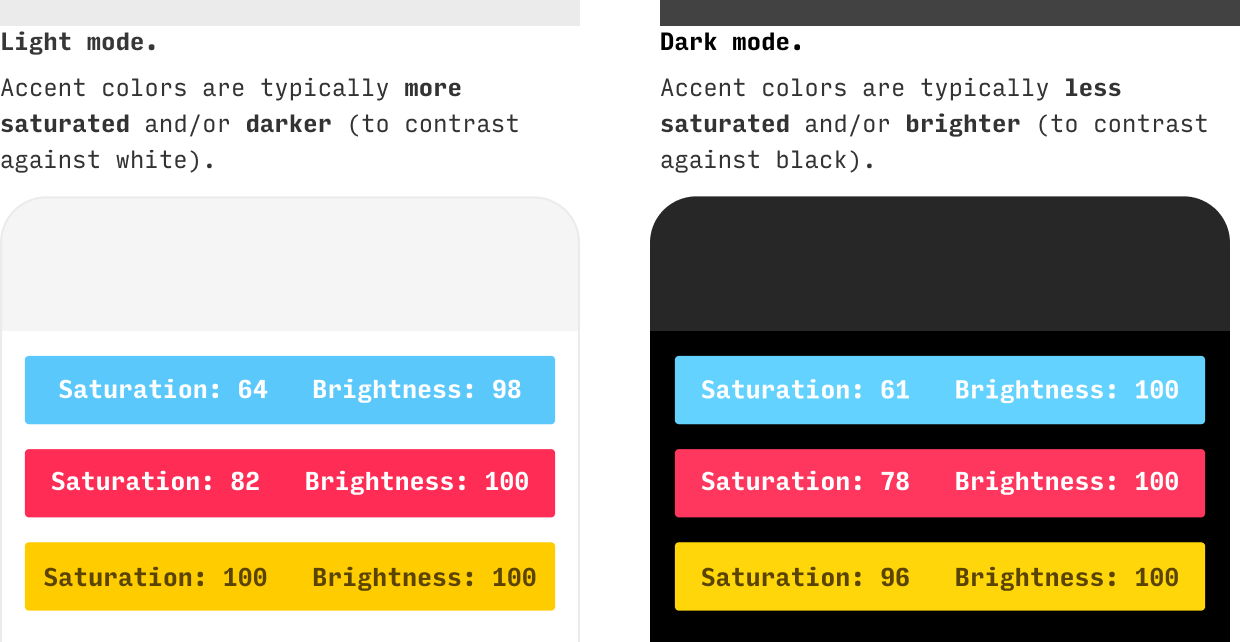
- Theme colors are translated to pop against dark. Any accent colors that you were previously using on light backgrounds now need to pop similarly against dark backgrounds. Since white has a brightness of 100% and black has a brightness of 0%, this often means you’ll be lowering the brightness of bright colors (and, in my greater theory of color adjustments, raising their saturations).
Creating dark UI is its own topic, deserving of its own guide – and its one of the things I cover in a lot more depth in Learn UI Design.
Downloads
I’ve created a few resources for easy reference. Links and descriptions below 😎
iPhone Screen Size Cheatsheet
Pixels, points, inches, oh my. This is a quick guide to each version’s iPhone’s screen size and resolution.
iPhone Design Template
This Figma file (which you could also open in Sketch 😎) includes all iPhone 15, 14, 13, and 12 models with (a) rulers to make off common sections of the screen, (b) a mask with the notch and rounded corners, and (c) an easy-to-recolor, single-layer status bar.
Further Resources for iPhone App Design
Apple’s Human Interface Guidelines for iOS. Apple’s own standards are pretty difficult to read through, in my opinion. Fortunately, they have a search, so as long as you know the right term, you’ll eventually find what you need. Anyhow, gotta include this link. If you’re designing an iPhone app, you’re going to be here anyways!
iOS vs. Android App UI Design: The Complete Guide. OK, let’s say you think you’re going to be making an Android version of your iPhone app at some point. Best to start thinking about some of the design differences now. Who knows – you may end up stealing some great ideas from Android design principles. This article actually covers a few iOS design paradigms that I didn’t get to here. Worth the read!
The iOS Font Size Guidelines. One of the most unexpected parts of getting good at UI design is developing an intuitive sense of what font sizes to use. So, to help with that, I wrote the world’s most comprehensive guide to font sizes. One part is one iOS apps, and if you’ve gotten this far, you should probably read that too 😜
Wrapping It Up
Did I miss anything? Something look wrong? Give me a shout at erik@learnui.design. I’ll be continually updating this guide to be the most accurate and human-readable guide on the web for creating iPhone apps.
One Final Note 😎
If this is your first time here, you might also be interested in:
- Design Hacks, a 60,000+ person newsletter with original design articles aimed at giving you tactical advice to improve your UX/UI skills.
- Learn UI Design, my full-length online video course on user interface design
Some people have some really nice stuff to say about the newsletter.
Thank you for your newsletter. It’s possibly the best newsletter I’ve received since 1999, when I started freelancing.
Tricia Littlefield
Founder, TheSimpleWeb
Each time I receive an email from you, I'm like ‘Damn, this is a long email! No way will I read all of this’, then I began to read and I'm like ‘Damn, this is so freaking brillant’ and read it all.
Jean-Philippe
UX Strategist, Freelance
Design Hacks
Over 60,000 subscribed. No spam. Unsubscribe anytime.