Avenir: Free Alternatives & Similar Fonts
If you’re looking for free alternatives to Avenir, here are 6 of the highest-quality look-alikes and similar fonts.
- Eau (best overall)
- Figtree (new and underused)
- Manrope
- Nunito (great for body text)
- Mulish
- Montserrat (best overall)
For each, I’ll mention the advantages, disadvantages, and why you might choose it. Ready? Let’s get started.
You’re reading Free Font Alternatives: The Ultimate Guide. Quickly navigate to other fonts: Intro · Apercu · Avenir · Circular · DIN · Futura · Gotham · Helvetica · Proxima Nova · Times New Roman
1. Eau
The clean-cut Eau is a fantastic font on its own, and a great free alternative to Avenir.
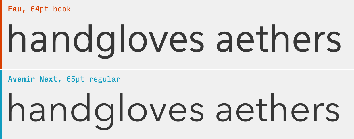
Eau has a certain neutrality that it shares with Avenir. Try as I might, many of the other fonts on this page can’t say that!
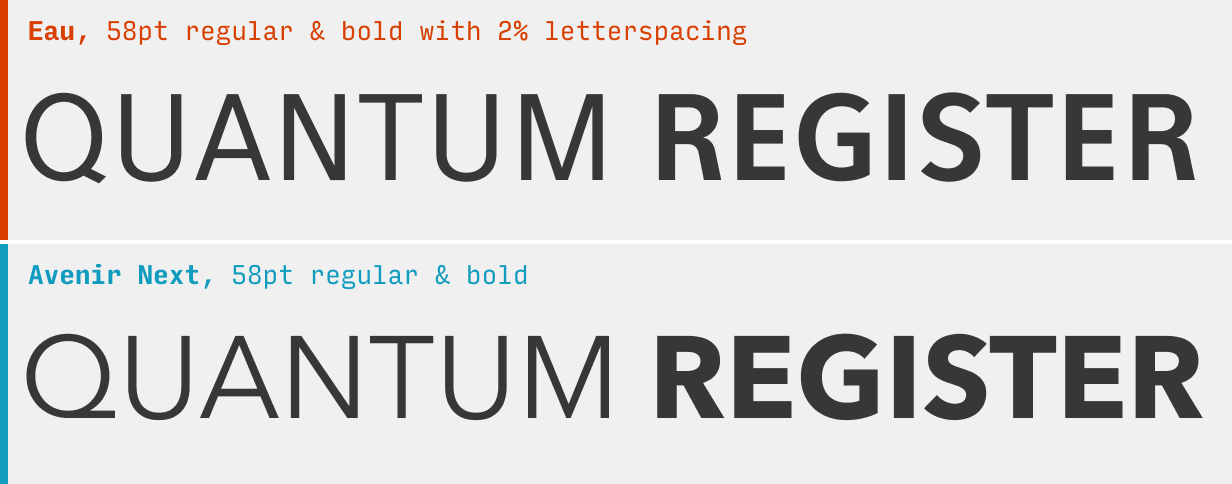
On the whole, Eau has slightly narrower letterforms and a darker normal weight.
What it’s got: 3 weights + italics
Get it at: Eau at Font Squirrel
2. Figtree
Figtree – a free font designed by yours truly – has a lot of similarities to Avenir.
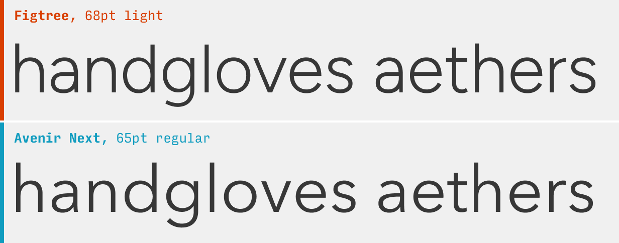
Figtree is definitely friendlier than Avenir. The way the terminals swoop in glyphs like “t”, “y”, and “f” give Figtree a more energetic vibe. However, those characteristics fade out at smaller sizes, so if you wanted to use Avenir for text sizes only, then Figtree is an even better option 🙂
What it’s got: 7 weights + italics; also available as a variable font
Get it at: Figtree at Google Fonts
3. Manrope
The underused Manrope is quite similar to Avenir.
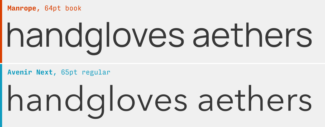
The biggest drawback is Manrope’s (current) lack of italics. Apart from that, it’s a very reasonable replacement, albeit with slightly more compact letterforms and closed counters (the gaps in “a”, “c”, & “e”).
What it’s got: 7 weights, no italics; also available as a variable font
Get it at: Manrope at Google Fonts
4. Nunito
The free Nunito reads a bit like a “softened” Avenir.
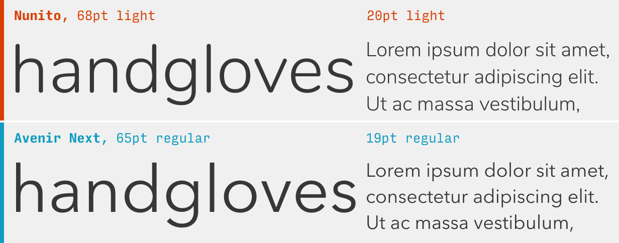
“Wait a second”, you might be thinking. “Why is there a rounded font on this list!?” And I hear you. Here’s the deal. Yes, Nunito is technically a rounded font, meaning it’s not even really in the same category as Avenir. But if you use it at small sizes in particular, you’ll notice that there’s a lot of similarities in their flavor. Think of it like a softer alternative more than some bezier-for-bezier rip of the original.
What it’s got: 7 weights + italics
Get it at: Nunito at Google Fonts
5. Mulish
Neutral, simple Mulish makes an interesting alternative to Avenir.
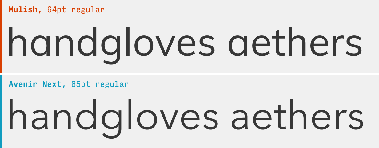
With the glaring exception of the single-storey “a”, Mulish has a lot of the same character as Avenir – easy-going, geometric simplicity, wide counters, etc. It’s worth an honorable mention, even though the “a” rubs me the wrong way!
What it’s got: 8 weights + italics; also available as a variable font
Get it at: Mulish at Google Fonts
6. Montserrat
Though recognizable in its own right, the popular Montserrat might be the best replacement for Avenir – though it is a bit friendlier than Avenir. And as one of the most used fonts in the world, it might be too recognizable in its own right.
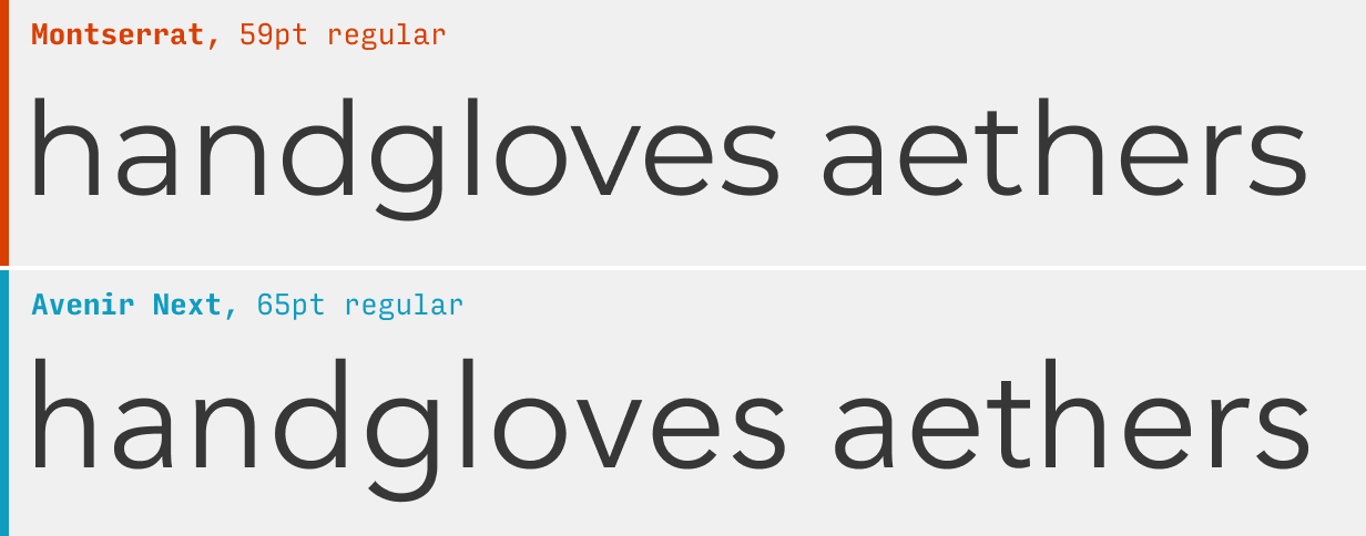
Avenir and Montserrat are both clean, geometric sans serif fonts with clean, simple letterforms and relaxed spacing. Avenir’s letterforms are a bit narrower on the whole. Since Montserrat is on Google Fonts, it’s particularly easy to use in your own project.
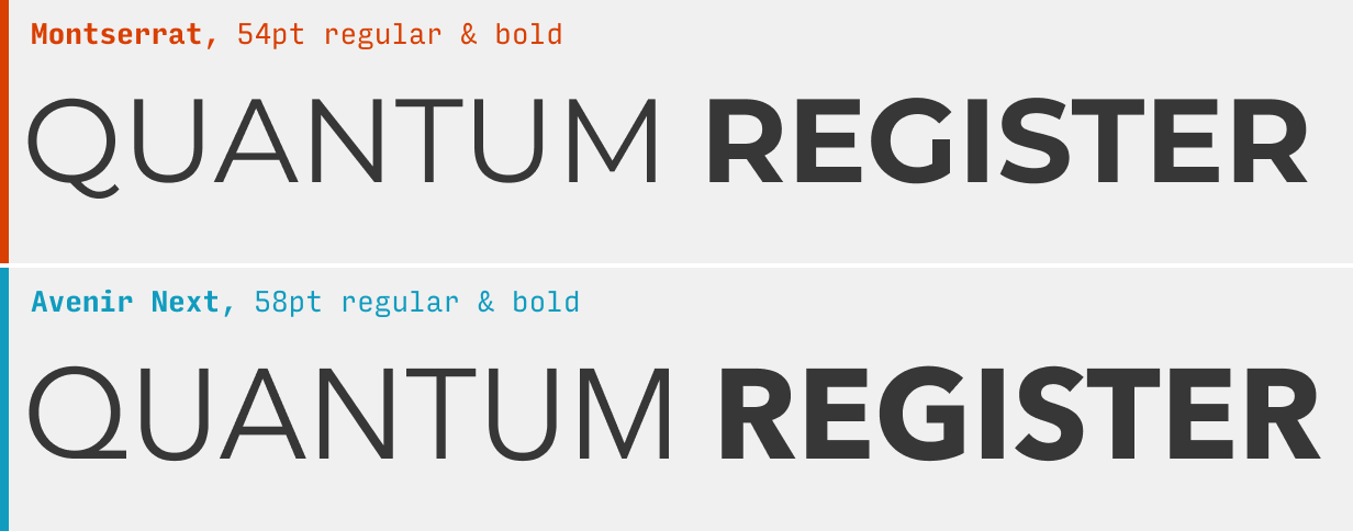
It’s worth noting that in uppercase, both the overall feel (Montserrat is punchy and stocky) and the unique letterforms of each (Avenir’s “Q”, Monserrat’s “G”) set the two apart a bit more.
What it’s got: 9 weights + italics
Get it at: Montserrat at Google Fonts
Other Avenir Alternatives
If you’re looking to branch out from Avenir, it’s worth checking out some of the other alternatives in this guide. For instance, the Gotham alternatives fall into a very similar category, and the Helvetica alternatives are simply another flavor of clean and simple. For something more friendly, try the Circular alternatives.
You’re reading Free Font Alternatives: The Ultimate Guide. Quickly navigate to other fonts: Intro · Apercu · Avenir · Circular · DIN · Futura · Gotham · Helvetica · Proxima Nova · Times New Roman
The Top 10 for UI Design
Get a PDF of the 10 best free fonts for web/mobile app design (including which free fonts not to use).
Practical design tutorials. Over 60,000 subscribed. One-click unsubscribe.