Helvetica: Free Alternatives & Similar Fonts
If you’re looking for free alternatives to Helvetica, here are 7 of the highest-quality look-alikes and similar fonts.
- Inter (go-to recommendation)
- Roboto
- Arimo
- Nimbus Sans
- TeX Gyre Heros (closest match)
- Work Sans (slightly quirkier)
- IBM Plex Sans
- Archivo (underused modern option 😎)
For each, I’ll mention the advantages, disadvantages, and why you might choose it. Ready? Let’s get started.
You’re reading Free Font Alternatives: The Ultimate Guide. Quickly navigate to other fonts: Intro · Apercu · Avenir · Circular · DIN · Futura · Gotham · Helvetica · Proxima Nova · Times New Roman
1. Inter
Designer Rasmus Andersson’s Inter is a fantastic open source alternative to Helvetica.
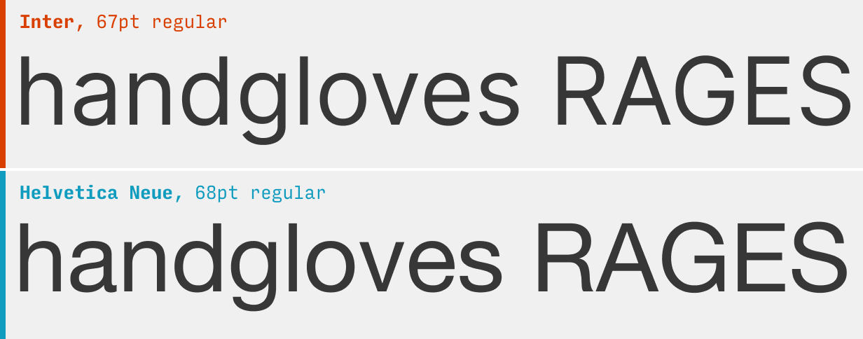
Inter is optimized for viewing on screens, making it – honestly – better than Helvetica for UI design. It naturally has more generous spacing than other neo-grotesques like Helvetica, meaning you can add negative letter-spacing at large sizes, which gives it a tighter, punchier feeling.
Perhaps the biggest difference between Inter and Helvetica is that the ends of Helvetica’s letterforms (it’s terminals) are almost strictly horizontal or vertical. This gives it a very crisp, clean appearance – which isn’t quite as present in Inter. On the other hand? Helvetica’s less legible at small sizes.
What it’s got: 9 weights + italics; also available as a variable font
Get it at: Inter at Google Fonts
2. Roboto
The popular default Android font, Roboto, is open-source and free to use.
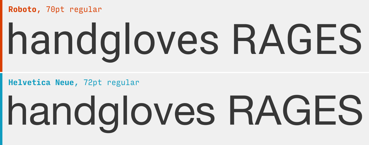
Roboto is by no means a deadringer for Helvetica, but as another workhorse option in the same category of typefaces, I can’t not mention it.
Use font-feature-settings: "ss03" 1; in your CSS to swap out a more Helvetica-like “R” (pictured above). More on alternate character styles.
Since Roboto’s letterforms are slightly thinner and therefore more compact, I feel it works best for busy, important UI where space is of the essence and cannot be wasted.
What it’s got: 6 weights + italics
Get it at: Roboto at Google Fonts
3. Arimo
Steve Mattheson’s Arimo was designed as a fresh take on Arial, but works perfectly as a cross-platform Helvetica replacement.
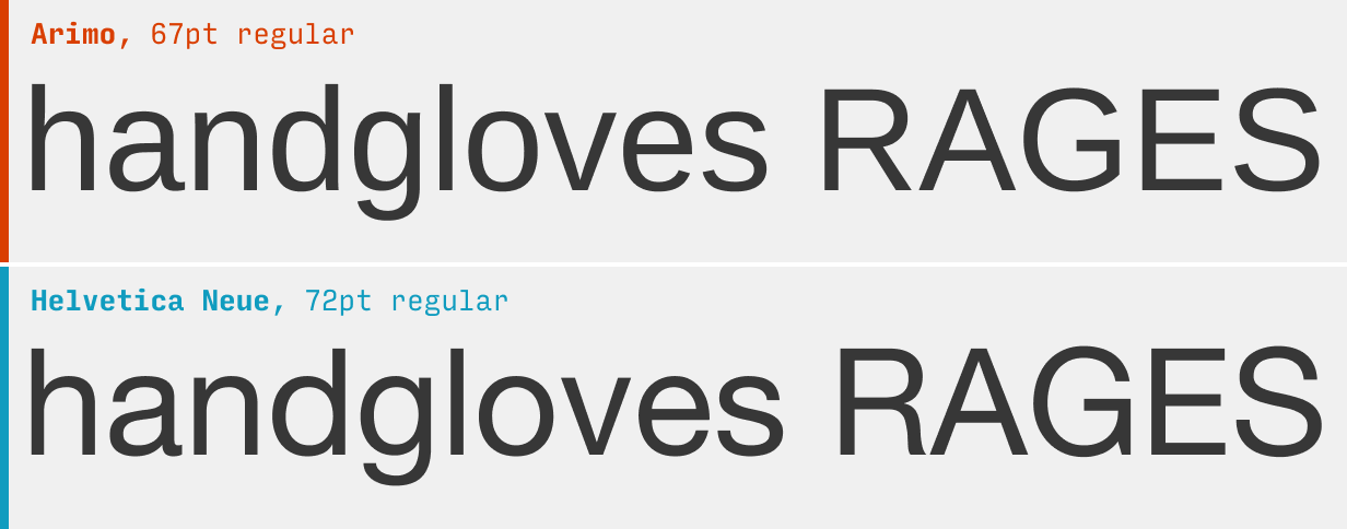
Arimo has quite a slightly taller letterforms than Helvetica, but is otherwise a fairly decent replacement. If you’re looking to use any lighter weights, beware – Arimo doesn’t have anything lighter than the normal weight (pictured above).
What it’s got: 4 weights + italics; also available as a variable font
Get it at: Arimo at Google Fonts
4. Nimbus Sans
Designed by type foundry URW, Nimbus Sans is a great Helvetica replacement.
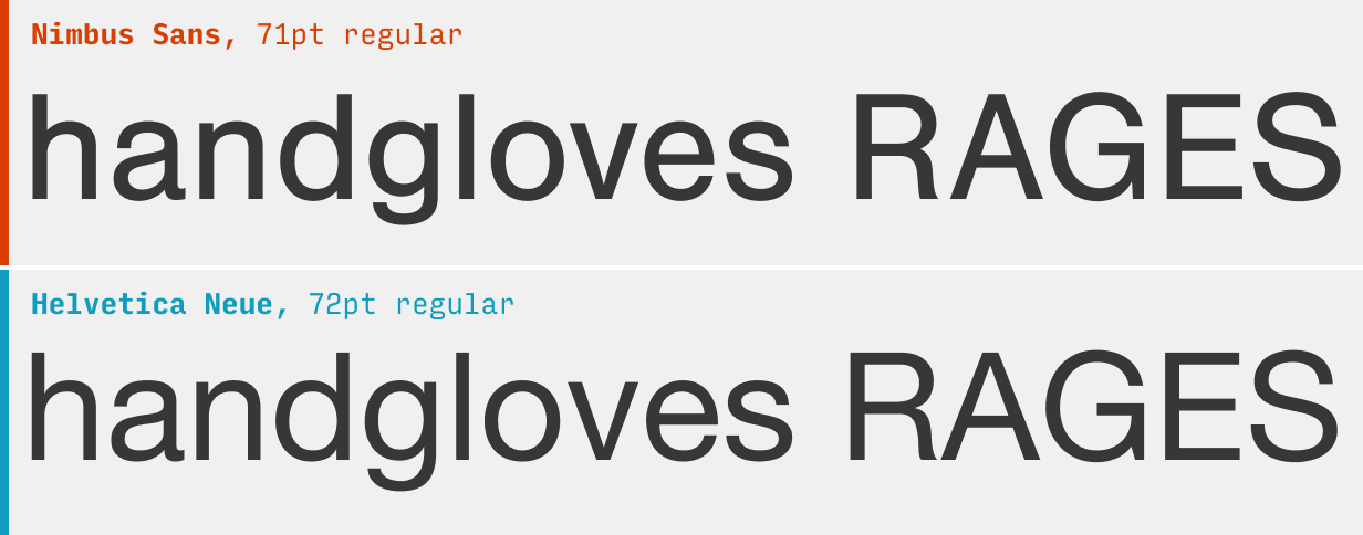
Nimbus Sans is based directly on Helvetica, and you can see that it matches even in features that other fonts on this page don’t – the letterforms end in horizontal and vertical terminals, the leg of the “R” has a graceful bend to it, the “G” has a little descending spur, etc. One big change: it’s darker – which, in the world of typography, means the letterforms are thicker at a given size, and therefore appear slightly darker when you squint at large blocks of text. You might consider beefing up the line-height or lightening the text color to compensate, but that’s up to you.
Note: if you have an Adobe Fonts acount (via Creative Cloud), you can also get a much more fully-featured Nimbus Sans with 4 weights, plus extended and condensed settings.
What it’s got: 2 weights + italics
Get it at: Font Squirrel
5. TeX Gyre Heros
TeX Gyre Heros includes a few improvements on Helvetica, but is basically a deadringer.
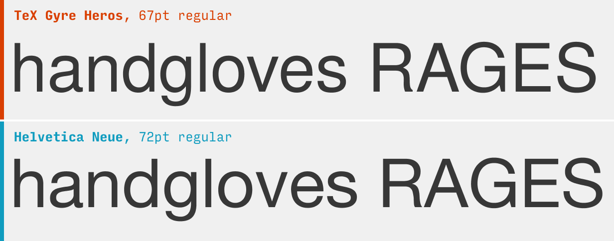
This one is based on Nimbus Sans, which was in turn based on Helvetica. And you know what? It’s basically dead-on. As long as you only need two weights, it’s got you covered.
What it’s got: 2 weights + italics + condensed setting (2 weights)
Get it at: Font Squirrel
6. Work Sans
Wei Huang’s Work Sans is a fantastic option when you need a bit more personality.
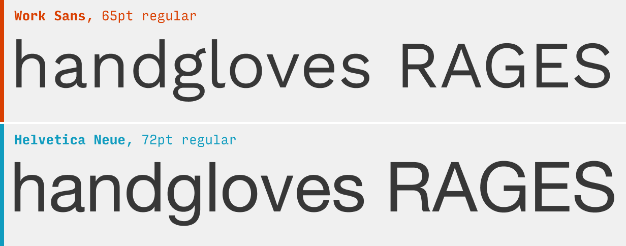
A quirkier and more friendly grotesque, Work Sans is a fantastic choice when you need a bit more personality. Note its relaxed spacing and almost goofy details – e.g. the ear of the “g” and the floppy tail of the “a”.
What it’s got: 9 weights + italics; also available as a variable font
Get it at: Work Sans on Google Fonts
7. IBM Plex Sans
The solid IBM Plex Sans is like a more technical feeling Helvetica.
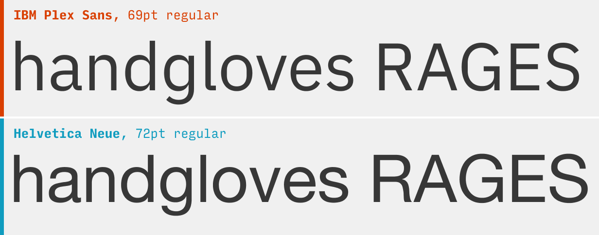
The slightly squared-off letterforms and right angles (see the tail of the “a”, the bend of the “l”, etc.) make IBM Plex Sans feel technical and scientific. Yet the letterforms have a clear relation to Helvetica’s. The open counters (the gaps in letters like “a”, “c”, and “e”) make it even more legible than its predecessor.
Note: type afficionados may reel at the “g” – doesn’t IBM Plex Sans normally have a two-storey “g”!? Well, yes. But thanks to alternate character styles, you can use font-feature-settings: "ss02" 1; in your CSS to swap out a more Helvetica-like “g”, should you fancy 😉.
What it’s got: 9 weights + italics + matching condensed, mono, and serif fonts
Get it at: IBM Plex Sans at Google Fonts
8. Archivo
The underused Archivo is a modern, somewhat quirkier Helvetica replacement.

To be honest, I can’t get enough of this font. There’s many facets to it:
- The perfectly horizontal & vertical terminals (“a”, “e”, “s”) give a precise, crisp feeling (like Helvetica)
- But Archivo’s squared-off letterforms are even more technical-feeling
- Letterforms like the “g” are packed with character
- The variable font allows you to modify the width too, so you achieve a whole other range of styles with those
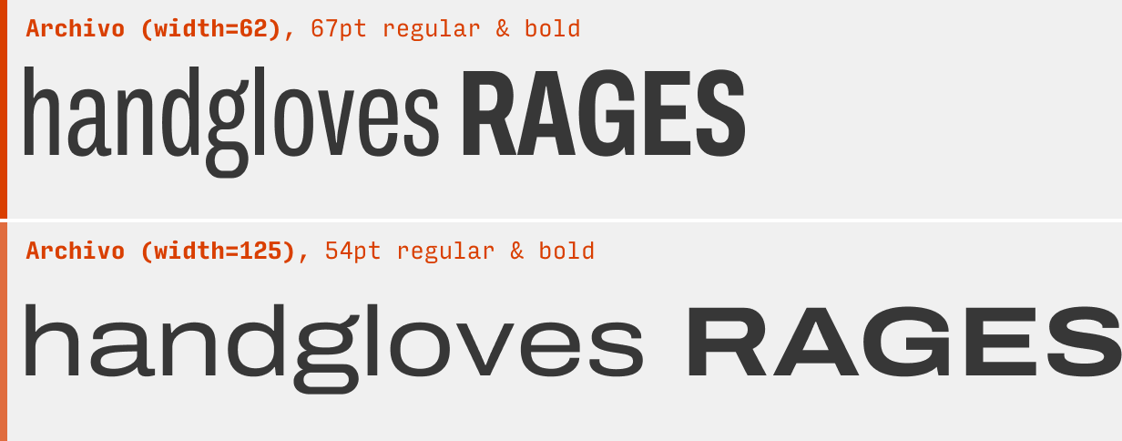
Spoiler: this is one I picked for the “Top 10 Free Fonts for UI Design” ebook you can get below 😎
What it’s got: 9 weights + italics; also available as a variable font with weight and width axes
Get it at: Archivo at Google Fonts
Other Helvetica Alternatives
If you’re looking to branch out from Helvetica, it’s worth checking out some of the other alternatives in this guide. For instance, the Apercu alternatives are generally more quirky and fun, the DIN alternatives are more tough and angular, and the Proxima Nova alternatives are even cleaner and simpler.
You’re reading Free Font Alternatives: The Ultimate Guide. Quickly navigate to other fonts: Intro · Apercu · Avenir · Circular · DIN · Futura · Gotham · Helvetica · Proxima Nova · Times New Roman
The Top 10 for UI Design
Get a PDF of the 10 best free fonts for web/mobile app design (including which free fonts not to use).
Practical design tutorials. Over 60,000 subscribed. One-click unsubscribe.